This article is brought to you by Datawrapper, a data visualization tool for creating charts, maps, and tables. Learn more.
Putting daily temperature ranges in context

Hi! This is Gregor, CTO of Datawrapper. Last month I published an interactive explainer about what “normal weather” means on my personal website. It featured a series of charts. For this week’s Weekly Chart, I’ll try to reproduce one of them with Datawrapper.
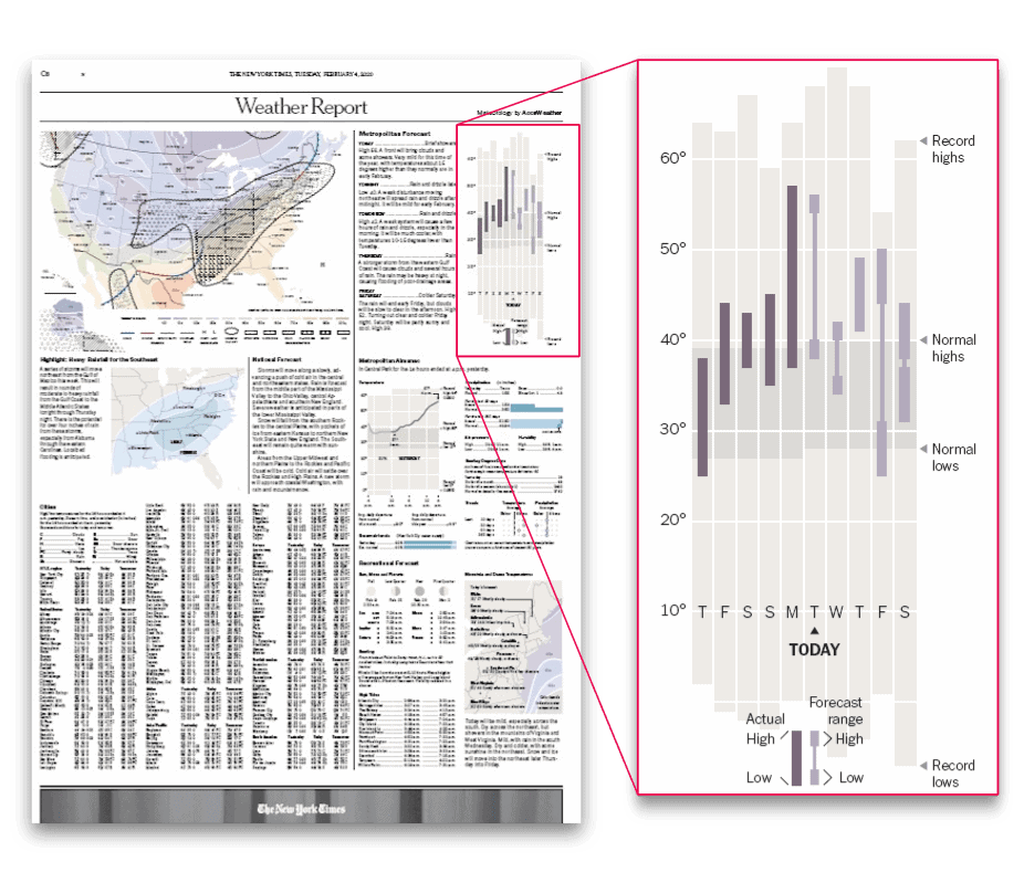
The chart is heavily inspired by the classic New York Times weather chart. Every day, the New York Times is publishing a small version of it on their “Weather Report” page, and I really like how it’s putting the daily weather and forecast into a meterological context.
So, here we go with my Datawrapper version of the chart:
I decided to use the Datawrapper line chart to create this chart. For the normal and record ranges I used the Fill area between lines feature we added last year (here’s a quick tutorial).
Adding the vertical lines for daily temperature ranges was a little more tricky. To do so, I used the fact that our line charts are splitting lines when there are missing values in the dataset. To insert these missing values between the days I had to split up each day into multiple rows.
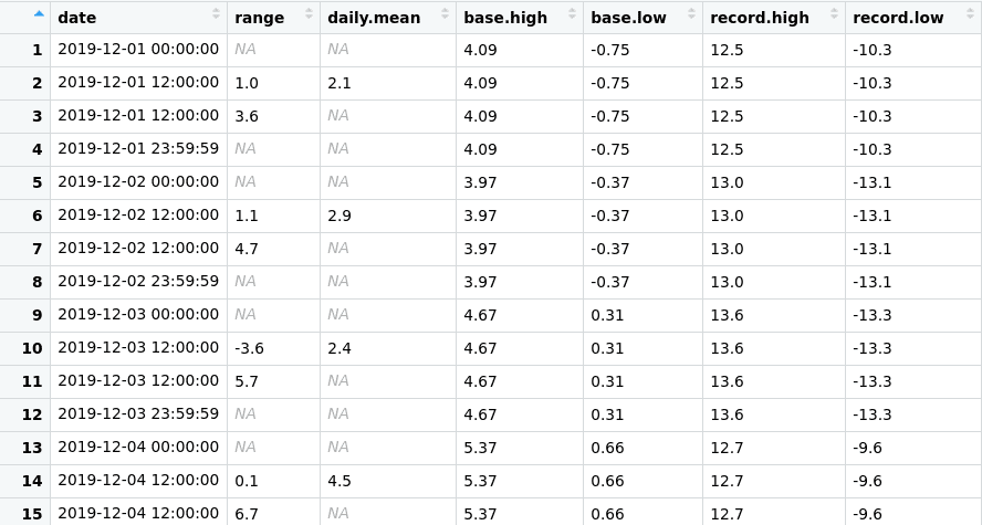
As you see in the table, for every day there are four rows with different timestamps in the dataset:
- At
00:00:00for the start of the day, with anNAvalue in the columnsrangeanddaily.mean. - At
12:00:00for the “center” of the day, with the lower daily temperature range. I also used this row for the dots representing the daily average. - Another row at
12:00:00represents the upper daily range. Using the exact same time is what makes the line vertical. - At
23:59:59for the end of the day, with anotherNAvalue forrangeanddaily.mean.
The values for the normal and record temperature ranges are repeated for each of the rows to get un-interrupted area fills. To only show circles on the daily averages I set the line width to zero and activated line symbols on every point only for the daily.mean column.
If you’re interested in how I created the dataset, take a look at the R script I used on Github.
That’s it for this week! To play around with the chart yourself, click on “Edit this chart” in the top right corner of the visualization to open an editable copy in Datawrapper. We’ll see you next week!


Comments