This article is brought to you by Datawrapper, a data visualization tool for creating charts, maps, and tables. Learn more.
Play games and get rich (if your name is Ninja)
The dual measure chart, explained

A few months ago, I wrote an article explaining why Datawrapper doesn’t let you create charts with two axes. I wrote that there is only one kind of dual axis chart I can advocate for: The one that uses the second axis to show another measure for the same time series (e.g. temperature in Fahrenheit and Celsius). Turns out, there is another type of chart I had not considered. One that shows two measures with two lines, but on the same scale. I stumbled upon an example of this chart two days ago on our chart gallery River. It was created by Luke Christou, editor of Final Kill for his article about the Twitch star Ninja:
Let’s have a look at some stats about Ninja, Twitch’s most successful video game streamer. Ninja has 9,993,000 followers that occasionally watch him play the game Fortnite. Of these 10 million followers, more than 200,000 subscribe to his channel – meaning, they pay Twitch $5 a month to get extra perks, and Ninja keeps half of that money. According to Luke Christou, “Ninja, as the most followed gamer on streaming platform Twitch, is among the highest earners in esports.” In his article, Luke breaks down how much Ninja probably earns through Twitch, YouTube, tournament prizes and sponsorship deals.
So why did the number of Ninja’s subscribers (and therefore his earnings) go down again? Because in June, Ninja didn’t stream for two days. The job of a professional video game streamer is hard. I’m sure Ninja will recover.
Chart Choices
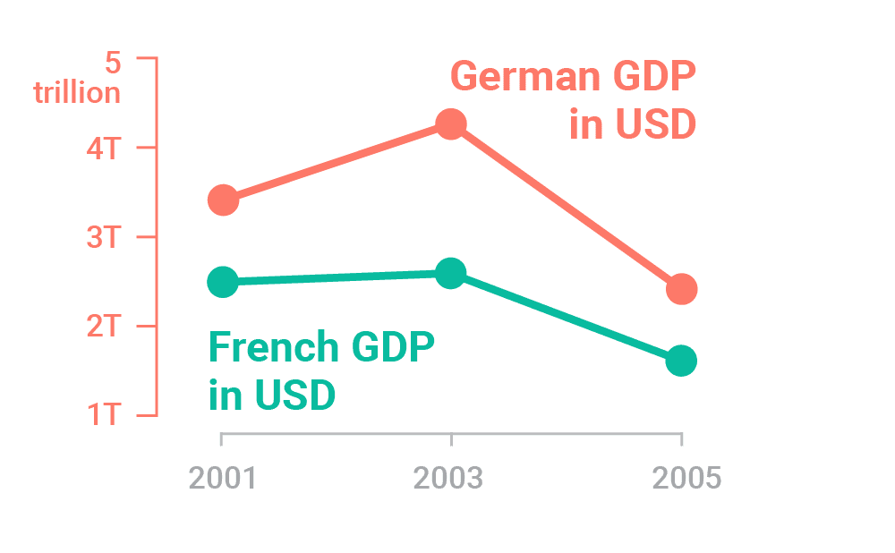
So what’s so special about Luke’s chart? I’ll try to explain how Luke’s chart is different from the charts we’ve talked about in past blog posts. Let’s start with a normal line chart. A line chart that has one axis and shows two lines (= variables): The German GDP and the French GDP. Both variables are measured & shown in US Dollars. That’s the chart on the left in the following image.
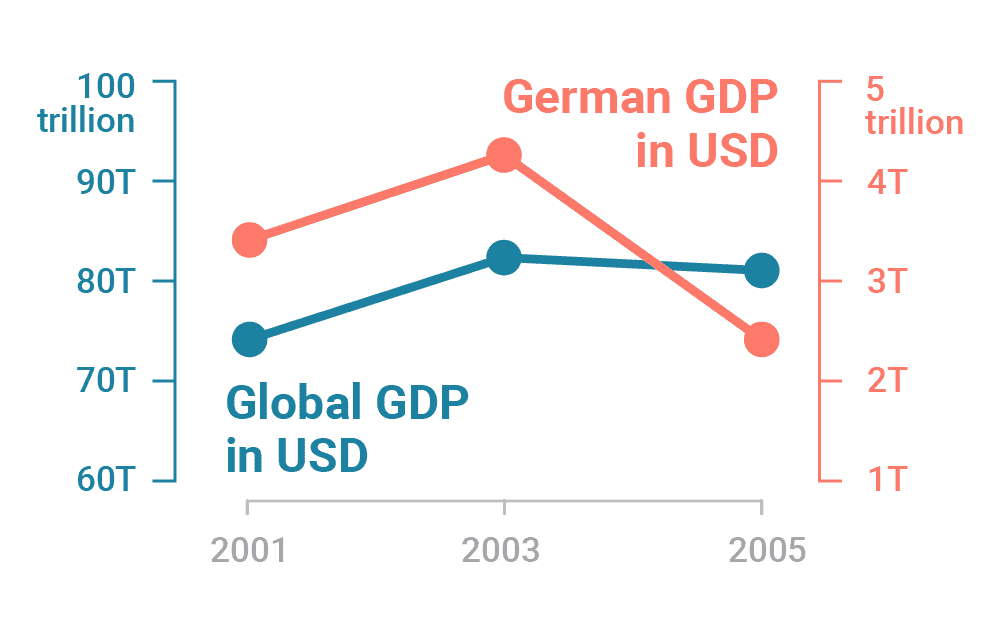
On the right, we see the classic dual axis chart. It also comes with two lines (=variables). But because they show numbers in completely different scopes (60-100 trillion and 1-5 trillion), we’ll need different scales and therefore two axes. The chart still shows the two GDPs in one measure, though: US-Dollars.
1 axis, 2 variables, 1 measure (USD):
2 axes, 2 variables, 1 measure (USD):
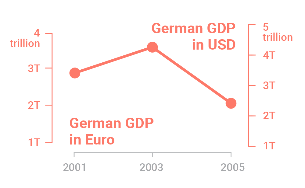
But we already know a way of showing two measurements: We can create a chart with one time series (e.g. the temperature in the last three days) and use the two axes to show different measurements (e.g. Celsius and Fahrenheit). Here we do this on the left. Note how the scopes of the axes are actually not that different (1-4 trillion and 1-5 trillion):
2 axes, 1 variable, 2 measures (USD&Euro):
1 axis, 2 variables, 2 measures (USD&hours):
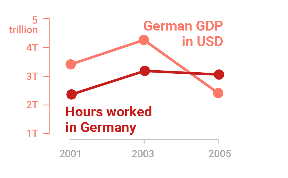
Here’s the coup: If we want to show two different measurements on a similar scale for two different variables, like on the right, we don’t need two axes.
That’s what Luke’s chart does. It shows two variables (subscribers and earnings) in two measurements (people and US-Dollars), but on the same scale (0-600,000). It’s not a dual axis chart, it’s a dual measure chart. I think that’s ingenious.
If you want to know more about how video game players earn that much money, visit Luke Christou’s article on Final Kill. And if you’ve missed my reasoning against dual axis charts, you’ll find it here. I’ll see you next week!


Comments