

The world could be your oyster, but it depends on your passport
October 10th, 2024
4 min
This article is brought to you by Datawrapper, a data visualization tool for creating charts, maps, and tables. Learn more.
How little design decisions can go a long way
Three days ago, the great Kate Rabinowitz posted a visualization by The Sun on Twitter:
The Sun is getting into the data journo game strong pic.twitter.com/3n8IPL7F9v
Kate Rabinowitz (@dataKateR) August 20, 2018
I like this chart. I find it poetic to think about one’s life as a line that just keeps going and going. In most line charts, perfectly straight lines are a rare sight. But when it comes to age, anything else but a straight line would be a miracle. We’re aging at a very, very consistent rate.
Although when starring at this chart, I saw potential for improvement. I wanted to see not only the aging of the Hollywood star, but also of their partners. Maybe Leo with his short interests wouldn’t be the perfect person to chart. So I randomly chose Johnny Depp instead:
I was happy with this chart type (it’s called a “Lexis Diagram” in demography). It shows well how other people join our “lifeline” with their own histories, become friends and partners and grow older with us.
But something still bugged me. I don’t think most Western people see their lives going up, from the bottom (left) to the top (right). In our culture, time “moves” from left to right. So if asked, I assume that most people would draw their lifelines from left to right. Like this:
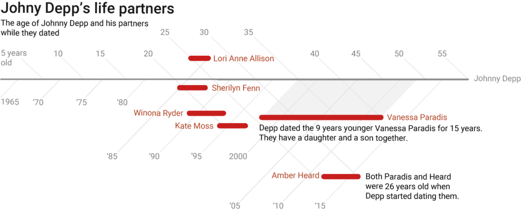
This chart fails horribly. In fact, I was surprised how much it fails; how much less the chart becomes readable just because I rotated the chart by 45 degrees. The rotated grid is simply not intuitive. The bars overlap vertically, so it looks like Johnny Depp dated more than one person at the same time. And the bar suggests that Vanessa Paradis was together with Depp while he was 30 to 45 (not 35 to 50). This chart would need to abandon the age dimension to work well.
The difference in design between the two charts is a simple 45° rotation. But there are worlds between the usefulness of the first and second chart. Sometimes, little design decisions can improve a chart massively. Or, you know, worsen.
Edit 24/08: Franck Lebeau created a chart that still shows Depp’s life from left to right, but fixes all the problems of the second chart:
I just had the same thought. So I sketches it, and it ended up with the following chart : pic.twitter.com/SSTOTIKqkz
— Franck Lebeau (@_Kcnarf) August 24, 2018
Genius! Thanks, Franck.
You will find a very similar chart on page 168 of Alberto Cairo’s “The Truthful Art”. Totally coincidentally, we will read exactly this book next in our Data Vis Book Club. Join us: You can find more information about the book club in this article. And I’ll see you next week!


Comments