

French people are losing confidence in the Paris Olympics
March 28th, 2024
3 min
This article is brought to you by Datawrapper, a data visualization tool for creating charts, maps, and tables. Learn more.
The Consumer Price Index, explained
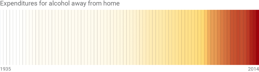
This week, we’ll transform some data on US alcohol sales – data that wants to make us believe that US-Americans spent 800 times more on alcohol in 2014 than in 1935. As we’ll find out, this incredible increase exists mainly thanks to two other phenomena, which we will get rid of. We’ll adjust for purchasing power and take population into account to arrive at the following useful pattern:
Be aware that the chart doesn’t show drinking behavior, but the price (including taxes) for that behavior. Other charts show that the peak of drinking in the 20th century was actually in 1980. And the chart above starts in 1935, two years after the Prohibition ended (this banned the production, importation & sale of alcohol for thirteen years in the US): The most interesting part of the history – the sales before the prohibition and the huge gap – is left out.
If you download alcohol expenditure data from the US Department of Agriculture for any year before 1997, the prices in the data are nominal. And every time you see the word “nominal” in a data description, your internal alarm system should start urgently blinking red. Nominal Dollars are Dollars as you’ve paid (or received) them back then. If you paid $1 for chocolate in 2000, the data will list this as “$1”.
“Well, what’s the problem?” you might ask. The problem is that prices increase, and by far more than you’d probably expect. That same chocolate from 2000 costs $1.50 today. And for $1.50, you could have bought four of the same chocolate bars in 1970.
So if we plot our nominal alcohol sales, the increase in price is so huge that it hides subtle patterns. The following heat map shows that. The higher the sales, the darker the red:
But luckily, there’s a great little index called the “Consumer Price Index”. How does it work? Imagine some people go shopping every month. Every month they buy exactly the same things: The same shoes, the same house, the same chocolate. Then they check how much the price of the same goods changed compared to last month. And there it is, there’s your Consumer Price Index (CPI).
The US Bureau of Labor Statistics created a tool called CPI Inflation Calculator that gives you back the adjusted price. If we use this tool on our alcohol sales prices[1] – here’s the spreadsheet – and plot a heat map again, we start to see patterns:
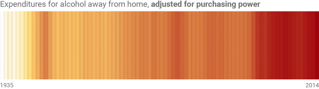
We can see a peak in the 1940s – but since around the 70s, Americans have spent more money on alcohol than in the 40s. That’s true. But did we just prove that Americans are drinking more and more?
Here’s another truth: There were only 140 million US-Americans in the 40s, but more than 200 million in 1970 (and almost 320 million in 2014). Like the nominal prices, the population increased. And like with the nominal prices, we need to get rid of the population increase in the data to see the actual pattern:
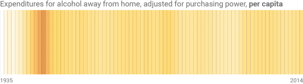
Finally we have data that we can work with! It’s the same one that you can find in the chart above. This week, we were not able to see patterns in the “raw” data since they were “polluted” by two other phenomena. Our data didn’t just tell us something about alcohol sales, but also about price changes and the increase of the US population. Only after calculating them out, our data became useful.
In case you missed it, I announced a new Data Vis Book Club edition this week: We will read Cole Nussbaumer Knaflic’s “Storytelling with Data” and discuss it on the 30th of October. You can find more information in this blog post. It would be great to have you on board. I’ll see you next week!
To do so, we can use the IMPORTXML formula to get the results directly from the CPI Inflation Calculator into our Google Sheets. This is how it works: Open a Google Sheet. Put the year in cell A1, e.g. 1935; and the price from back then in A2. Then you can use the following formula in cell A3: =IMPORTXML("https://data.bls.gov/cgi-bin/cpicalc.pl?cost1="&A2&"&year1="&$A1&"01&year2=201808","//span[@id='answer']"). This formula opens the website of the CPI Inflation Calculator with our cost from A2 and the year from A1 (“193501”, for January 1935) already filled in. Then we ask the calculator to give us back the adjusted price in August 2018 (201808). The Google Sheets will get this adjusted price from a div with the id answer. To see the formula in action, head over to the Google Sheets I’ve used to calculate the adjusted prices for the chart above. And to learn how to target specific elements on a website, visit this explanation of XPath.↩︎


Comments