This article is brought to you by Datawrapper, a data visualization tool for creating charts, maps, and tables. Learn more.
Using up more than we offer
Visual variables, explained

After creating charts week after week, I think it’s time to open it up a bit. This week’s Weekly Chart isn’t created by me. It’s created by French information designer Edith Maulandi, whose chart I stumbled upon two days ago. I liked it a lot (I’ll tell you why in a second), so I fine-tuned it a bit, and here it is:
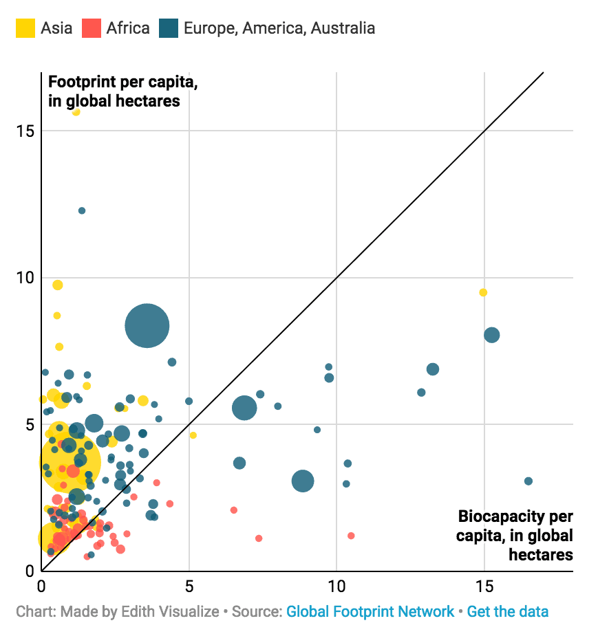
We can see one black line dividing this planet’s countries in two: At the top (in red) are the ones that use more bio resources than they provide. I like to think of these countries as the ones with “more people & industry than nature”: China, India, Germany, Qatar, the US. At the bottom are the (literally) green countries: Brazil, Canada, countries in North Europe, and some third world countries. They provide more bio resources than they use. And yeah, as we can see, there are more red countries than green ones. It doesn’t come as a surprise, but it’s worth a reminder.
Visual Variables
Why do I like this chart? Because it reminds me that sometimes, less is more. Sometimes, not all visual variables need to encode different data variables, just because it can be done. Let me explain:
All charts offer different options to show data. The most basic ones are the axes: We can show data values on our y- and x-axis, like the biocapacity and the footprint. In a scatterplot, we can also represent our data with the size of the circles (in Edith’s chart up there, they show the total ecological footprint), or with colors, or with the shape. So we have lots of things that can show our data, like position, size, color, and shape. Data vis academics like to call these things “visual variables”[1]. And if these visual variables show us data, then they “encode” the data. We can say: “We have lots of visual variables that can encode our data variables”.
I like to make full use of these data variables. Oh, the color doesn’t encode something exciting yet? Heck yeah, let’s use it to make clear on which continent these countries are! Maybe that will give us some extra insights!!11
Bad idea.
A chart that’s hard to read:
A chart that’s easier to read:
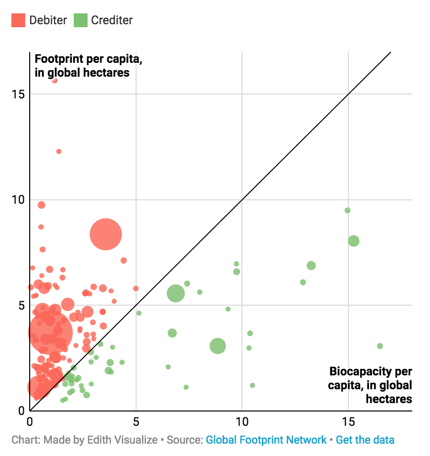
Edith’s chart shows that it can be a great idea to not use visual variables to show something new, but to enforce a statement we already made with another visual variable. The red and green color is not necessary for her chart. We already know that we can divide countries between good and evil between “creditors” and “debtors” thanks to their position above or below the line. But hey, it helps to make that a bit clearer. It’s always nice to reduce the time it takes our readers to understand a chart. And this chart is not about continents anyway, but about the fact that there are far more debtors than creditors. The color helps to make that clear.
Thanks again to Edith for giving me her permission to use the chart. Follow her on her “journey to understand the world through data visualization”, and check out her portfolio. Until next week!
- To quote Tamara Munzner on this one: “There are many, many synonyms for visual channel: nearly any combination of visual, graphical, perceptual, retinal for the first word, and channel, attribute, dimension, variable, feature and carrier for the second word.” from: Tamara Munzner. Visualization Analysis and Design. A K Peters Visualization Series, CRC Press, 2014, page 96. ↩︎


Comments