
Remind readers of the colors in your data visualization
October 11th, 2023
12 min
This article is brought to you by Datawrapper, a data visualization tool for creating charts, maps, and tables. Learn more.
The best of Datawrapper charts 2018, part 4
Oh hi there, 2019! The new year just started – but the old one had a lot to offer. So we’ll continue our look back at the most innovative Datawrapper charts 2018 a little longer (here are part 1, part 2, part 3). This week, we’re analyzing a chart by Raúl Sánchez González, a data journalist at the Spanish news site eldiario.es:
I’ll let Raúl do the explaining of what we can see here:
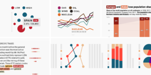
This chart shows the percentage of protection orders for women rejected by each court [in Spain]. A protection order is a court order to protect a woman from his partner or ex-partner in a situation involving alleged domestic violence. The size of each bubble shows the total number of processed orders (2013 to 2017) and we grouped the bubbles by regions (each line).
Our investigation reveals that women involved in domestic violence situation are more likely to obtain a protection order in some areas and courts of the country than in others.
Raúl uses a powerful data vis technique in this chart: Double encoding. The color in Raúl’s chart shows the same as the position (the share of rejected protection orders). One could think that the color is not necessary. But it is. The color helps the position in making itself understandable. That’s especially helpful in this chart because the “intuitive” reading of the position-encoding doesn’t work: Going more to the right doesn’t mean “better” like we’re used to in many cases; it means “worse” (= more rejections). The strong red at the right (and the calming blue at the left) help us understand that.
Make sure to visit Raúl’s chart in its natural habitat together with many other compelling charts and maps (including a cartogram of Spain). And follow him on Twitter (@raulsanchezglez) to keep up to date about his latest visualizations. Also, in case you’re curious how Raúl created this chart, hover over it and click on “Edit this chart” to go right into the chart creation process. I’ll see you next week!
Comments