This article is brought to you by Datawrapper, a data visualization tool for creating charts, maps, and tables. Learn more.
When marrying in Wyoming, buy a car
Indexed charts, explained
This week, I proudly present what might be the most underwhelming looking Weekly Chart to date. Just two lines. Oh, and it’s not just its look. The content is also not interesting, like, at all. The data comes from a blog called Spurious Correlations, that tries to find correlations between…everything.
The original chart on Spurious Correlations has two different y-axes. I talked at length about the problems of dual axis charts on Tuesday, and why it’s not possible to create them with Datawrapper. I also showed four alternatives to dual axis charts – one of them being an indexed chart. In this Weekly Chart, I’ll explain what that is and how to create one.
Indexed Charts – what they are
An indexed chart can tell us how two variables changed over time, even if they have completely different number ranges. And the magnitude of numbers are very different in our data set: The marriage rate moves between 8 and 10 marriages per 1000 people. The car sales are between 5 million and 9 million cars. There’s no way we could show these diverse numbers on the same scale.
Indexing a chart ignores the absolute values and looks at the relative change. In the year 2000, did the marriage rate and the car sales go up or down compared with 1999, and by how many percent? The marriage rate went up by 1% and the car sales went up by 2%. When we turn absolute numbers into relative numbers, we can compare them on the same axis.
Indexed Charts – how to make one
“Relative change” means that we need a “base” number we want to compare our values to. This base number should be the same for all our variables (marriage rate and car sales, in our case), and is in many cases replaces the first value in a line chart (1999). It doesn’t really matter which number that base number is for our 1999 values. It could be 133,394,283 – but hey, it’s easier to compare relative change with percentages, so 100 makes sense.

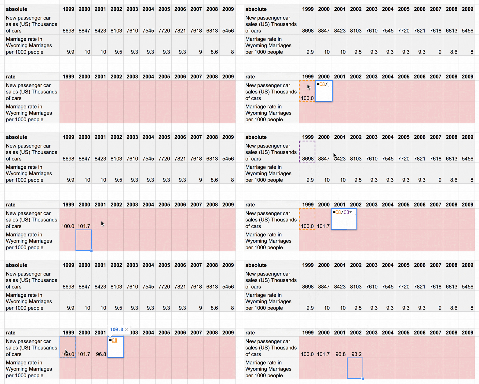
Once we set our base number (100), we calculate the change between the 1999 value and the 2000 value, then the change between the 1999 value and the 2001 value, etc. There’s nothing fancy here. It’s just a simple percentage calculation: Dividing 100 by the 1999 value, then multiplying it with the 2000 value.[1]
And voila! You successfully indexed your values. Here’s a video of my screen while I silently walk through the whole process:
Scroll down to the footnotes to learn how to …um…calculate percentages. And I’ll see you next week! With more indices.
Calculating percentages is lots of fun. I like to think of it this way: First, you split 100 by the first value, then you multiply your new-born pieces by the second value. So if our first value is 9000, you’re slicing 100 into 9000 little pieces (yeah, I’m a visual-thinking person). It’s like chopping carrots. Your chopped pieces have the size of 0.01. You can think of it as a new unit. And then you multiply this new unit with the second value, e.g. 10,000. Imagine that you sit on a pile of 0.01-pieces, and you gather 10,000 of them together and sum them up. 10,000 * 0.01-pieces are 111,11. That’s it! Your second value is 11% bigger than your first value.
Another example: Your first value is 4, your second value is 3. So you chop one carrot (100) into four pieces (100/4=25), and then you gather three of them together (25*3=75). So your second value is 75% as big as the first value. Carrots! Chopping! Lots of fun.
By the way, there’s a faster way to calculate all these relative values than to type in the same formula again and again. You can use the
$sign in your formula like=100/$C3*D4and then drag the little blue square at the bottom to apply it to other cells. All values in your formula will change automatically (e.g. fromD4toD5orE4), except the 100 and the$C-part. Like this:
 ↩︎
↩︎


Comments