This article is brought to you by Datawrapper, a data visualization tool for creating charts, maps, and tables. Learn more.
How to read a log scale: Growth rate
Part 1: Same distance, same growth rate
This is part 1 of a series that explains log scales. Visit part 2 and part 3.
As promised last week, we will have a closer look at the logarithmic scale this week. I won’t get into mathematical details to explain what a logarithm is, I won’t even explain when we should use log scales instead of linear scales. This and next week, I’ll just explain what log scales can tell us.
We start slowly. Here’s a chart that’s not on a log scale – not yet:
We will transform it to a chart with a log scale in a minute (in Datawrapper, that means clicking on a checkbox). First, let’s learn some basics about log scales, to understand what we can read in them:
Log scales show relative values
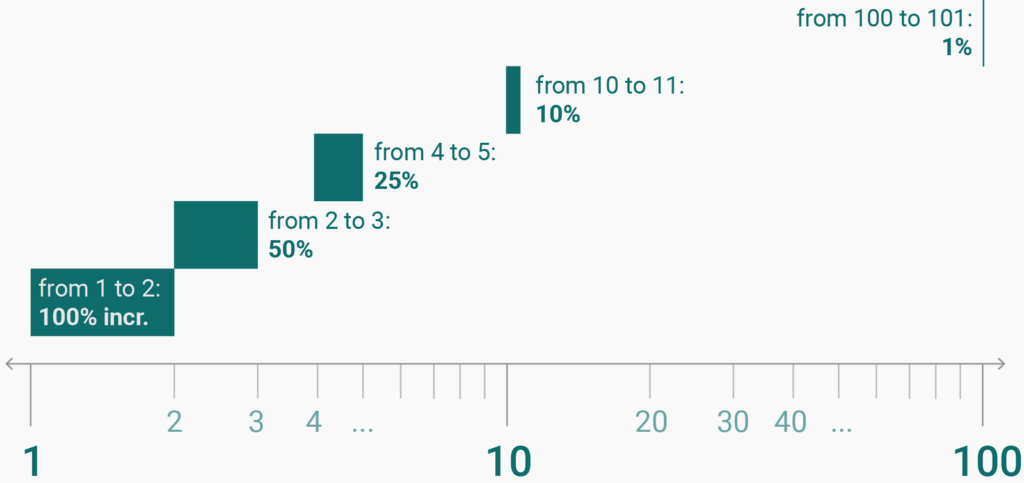
Log scales show relative values instead of absolute ones. Log scales don’t care about the fact that 101 minus 100 equals the same as 2 minus 1. Instead, they are concerned with percentages: between 100 and 101 is a 1% increase, while between 1 and 2 is a 100% increase. So on a log scale, the distance between 100 and 101 is roughly 1% of the distance between 1 and 2:

The same distance on a log scale shows the same rate
So what do same distances on a log scale show? They show the same percentage growth or decline. Imagine you eat candy for money and your business grows yearly by 100%. That means every year you eat twice as many candies than you ate the previous year.
In year zero, you start by eating 1 candy.
In the 1st year, you eat 2 candies. The year after that, you eat 4 candies. In the 3rd year, you eat 8 candies. By year 5, you eat 32 candies, and on your 25th anniversary, you would be eating 33.5 million candies.
On a linear scale, a line chart plotting these numbers would go insanely high very quickly. On a log scale, each of these amounts takes up the same space, because, in each year, the number of candies grows at a fixed rate (100%).

How to read a log scaled chart
Let’s see what that means for our chart. Here, the log scale can show us two things that the linear scale can’t show us: First, the drop of short-term arrivals in the second world war. That wasn’t a stark drop in absolute numbers (that’s why we can’t see it in the chart up there), but it was a stark drop in relative numbers:
How stark? Well, we know by now that the same unit on a log scale represents the same growth rate. Let’s have a closer look then: The drop during the second world war is almost as “deep” as the growth afterward is “high”. In April 1942, only 40 people visited New Zealand. Three years earlier, there were 33 times as many tourists, 1310 of them. It took ten years to get back to that number of 1300 tourists (for April) – that’s the brown range in our chart. But the growth didn’t stop there. Within 32 years, the number of tourists in New Zealand grew again by 33 times and reached 45.7k tourists in 1984 – that’s the blue range.
The blue range has the same height as the brown range because both ranges represent a 33-fold increase; no matter their absolute values. So during the second world war, the arrivals in New Zealand dropped almost by the same rate between 1939 and 1942 as they increased between 1952 and 1984. That’s something the log scale can tell us and the linear scale can’t.
The log scale also shows us something about the arrivals each season. We can see that the ups and downs get smaller over time. So we can conclude that seasonal increase and decrease of arrivals each year happened at a higher rate before the Second World War than after the Second World War, and at an even lower rate since approximately 1985.
Next week, we’ll explore magnitudes, and how log scales are ideal to show exponential growth. Visit the article here.


Comments