

French people are losing confidence in the Paris Olympics
March 28th, 2024
3 min
This article is brought to you by Datawrapper, a data visualization tool for creating charts, maps, and tables. Learn more.
Part 3: What Mike Bostock means
This is part 3 of a series that explains log scales. Visit part 1 and part 2.
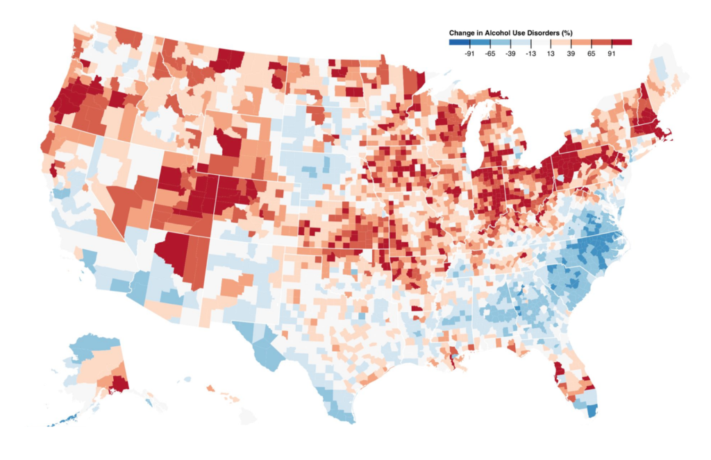
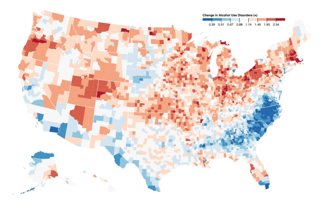
A few weeks back, I read a tweet by Mike Bostock, a very influential voice in the data vis scene. “Don’t compare percentage change on a linear scale,” he said, “Use a log scale instead. -50% (0.5×) is as big a change as +100% (2×).” He attached two maps with the same data, but one of them was on a linear scale (left) while the other one was on a log scale (right):
I scratched my head. Why is -50% as much as +100%? I’m not a math genius, so it took me some time to understand what that was all about. In this Weekly Chart, we’ll explore what Mike means – and when not to follow his advice.
Edit: After I published this article, Mike dug up the absolute values of this data and published this excellent explanation of different ways to compare two values with each other on a map. You can basically stop reading this blog post and head over to his one.
Let’s imagine a county with four people with Alcohol Use Disorder in 1980. By 2014, that number sunk to two people. One can say that the 1980 number halved, or that it decreased by 50%, or one can say that the number is 0.5 times as big (since 4 × 0.5 = 2; it’s the same as 4 ÷ 2).
Let’s imagine a second county in which the 1980 number of four cases doubled to eight cases by 2014. It increased by 100%. The number is now two times as big (4 × 2 = 8).
So why does Mike Bostock declare that 50% and 100% is the same change? Because with change, he doesn’t mean the percentage change, but the rate change. The percentage change for our counties is -50% and +100%. But their rate change is ×2 and ÷2. The difference between 2 and 4, and the difference between 4 and 8 is the same growth rate (as you might remember from the Weekly Chart two weeks ago).
And that’s why Mike wants to show these numbers on a log scale. Only on a log scale, the same rate changes are shown with the same distances:
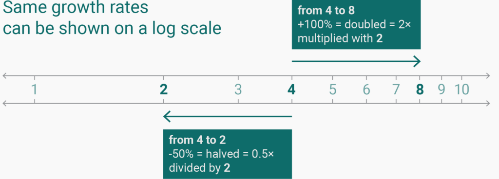
We can calculate that. Do you remember the log10x formula from school? We can plug our “0.5 times” and “2 times” in there. If we do that, the percentage change of -50% (= 0.5 times) in our first county will be shown on the chart with a distance of -0.301 (= log100.5). The 100% increase in our second county will be shown with a distance of 0.301 (= log102). Boom! -0.301 and 0.301 is the same distance away from zero.
Here are all the percentage changes that we can see in the map, but shown in a scatter plot that compares the linear percentage values with the log values:
Well, that depends on what we want to show. (Yes, I know that this is the answer to 90% of chart-related questions, but it’s simply true 90% of the time.)
If we want to show how many people are affected, we should consider showing these percentage changes on a linear scale. If we show the changes of people with Alcohol Use Disorder between 1980 and 2014 in our first and second county with a log scale, they will be shown with the same 0.301–distance. But the number of people affected is different: In the first county, 2 fewer people are affected. In the second county, 4 more people are effected. On a linear scale, the distance between 2 and 4 will be twice as big. The same distance/unit represents the same number of people (if our base number is the same). So on e.g. an unemployment chart, showing percentage changes on a linear scale makes sense.
But there are charts where the growth rate is more important than the percentage change. Stock prices are a good example, since the change in price is more important than the absolute increase in US-Dollars.
Not so much, really. Maps are a special case: Darker means “more” and brighter means “less”; but it’s impossible for a normal human being to read the underlying numbers on a map solely based on the colors.
In addition, our number of stops, the kind of stops and the specific colors we use all play into how the data will be perceived. It’s very easy to create the two maps that Mike showed in his tweet (and that I showed at the beginning of this article) even if we keep the numbers on a linear scale. We can just tweak the number of stops. You can try that out for yourself if you hover over the interactive map up there and click on “Edit this chart” in the upper-right corner.
Like so often in chart design, it comes down to common sense, thinking about what we want to show and a general attitude to show the data truthfully. Knowing the difference between log scales and linear scales can help us to make better choices when it comes to designing charts. But as a general rule, the linear scale will work best most of the time, especially when we present data about people. See you next week!


Comments