

French people are losing confidence in the Paris Olympics
March 28th, 2024
3 min
This article is brought to you by Datawrapper, a data visualization tool for creating charts, maps, and tables. Learn more.
150 years ago, a Russian called Dmitry Mendeleev created perhaps the most printed chart to date. Fifteen years ago, I looked at it in my older brother’s chemistry textbook, attracted by its curious shape. An hour ago, I built it in Datawrapper: The periodic table of chemical elements.
Even if you’ve read the Weekly Chart just a few times, you probably know that I’m a big, big fan of scatterplots. They’re just…shapes on a plane. Dots in a coordinate system. And so is the periodic table: Each element finds their place in a group (x-axis) and period (y-axis).
When creating the chart and gathering data, I was particularly fascinated to learn that only a few chemical elements make up more than 90% of the mass of the universe and the human body. So I placed this information in the scatterplot tooltips. It’s great to find out that e.g. Neon makes up 0.13% of the universe. But it doesn’t really bring the message across at a glance. A small multiple pie or donut chart is a far better choice to show the big picture (sadly, Neon does not make an appearence here):
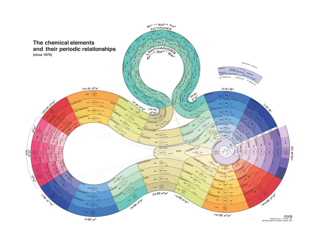
Mendeleev’s periodic table is just one way to display the chemical elements. There have been many attempts to show them differently, as shown in this Wikipedia article about alternative periodic tables. Here are my two favorites: This black & white minimalist line drawing…
…and this organically shaped taste of futurism:
By the way, here’s a little Datawrapper trick: If you hover over “before Mendeleev” in the color key of the scatterplot above, you will see that they include the ones that appear when you hover over “BC”. To achieve this effect, I downloaded the “BC” elements twice and put the duplicates in the “before Mendeleev” category. To see what I mean, hover over the scatterplot and click on “Edit this chart” in the top right corner. I’ll see you next week!


Comments