

The world could be your oyster, but it depends on your passport
October 10th, 2024
4 min
This article is brought to you by Datawrapper, a data visualization tool for creating charts, maps, and tables. Learn more.
How high do people live?
The scatterplot is a great chart type. I’m a fan. The concept is that you place dots in a coordinate system – and that’s so basic that you can create lots of other chart types out of the scatterplot. A few weeks ago, we made a dot plot out of a scatterplot. This week, we’re using the scatterplot
This week also marks the first week in which I’m rebuilding another chart. The original is by Bill Rankin, a historian, geographer & book author. Visit his website to browse through his many fascinating mapping and charting projects.
This chart belongs in the category “no real surprises here, but it’s fascinating to have such an overview”. It’s a simple chart, but it makes me feel a bit in awe of the power of charts and maps in general. Every single human can be found in this chart. There’s a reason why I asked Bill if I can recreate his chart in Datawrapper.
Rebuilding Bill’s chart made me think actively about every single element that he added to the chart and every decision he made. I would not have chosen pink as my text color, but hey, it works well. Here’s the original chart:
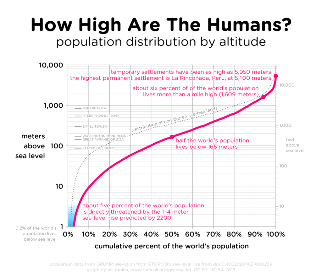
You can see that Bill used a logarithmic scale. Why did I decide to use a linear scale for the altitude? To be honest, I was torn. Bill’s log scale highlights beautifully what’s going on in the lower altitudes. Most people live on these elevation levels, so putting the focus there makes sense. Using a log scale results in enough space to label the 1-4m range and to place some annotations about buildings on the left side of the chart.
But log scales are never intuitive. It’s hard for readers to understand how the data “really” looks like. That actually, yes, we have a typical long tail, and a lot of people live on low altitudes while only ca. 13% of the world population lives on altitudes over 1000m.
So when choosing a log scale instead of a linear scale, we’re trading “seeing the important parts of the chart better” for “seeing the overall picture” – at least in this case. Once again we see that creating charts is about priorities, goals and (in the best case) very conscious decisions.
Edit 03/08/2018: Francis Gagnon had an interesting take on this chart: “To me, the order of the axis is not intuitive. I see a quick climb at the end, suggesting to my eye that a lot of people appear at high altitudes – but it’s the opposite! So I inverted the axis.” Find his chart here.
Next week, we’ll focus a bit more on these log scales. What do they show exactly? We’ll find out.


Comments