
New in symbol and choropleth maps: cropped view and inset maps
April 12th, 2024
3 min
This article is brought to you by Datawrapper, a data visualization tool for creating charts, maps, and tables. Learn more.
Release notes
Just in time for the holidays we managed to release the next big update. It introduces a fullscreen mode, customizable colors, static image export, and filled line charts. Of course, we also fixed a number of bugs. Now let’s have a detailed look at the new features:
Every chart now has a fullscreen button in the upper right, that appears as the user moves the mouse over the chart. Using that button the chart can be set in fullscreen mode. This works on modern browsers only. For older browsers the button links to the fullscreen version to open in a new tab.
In contrast to the the Datawrapper beta, the new fullscreen mode don’t just opens a larger version of the chart. Instead it opens a version with bigger font sizes and more white space around the chart, for an optimized display.
While we originally wanted to discourage the use of fancy colors in charts, we saw that there are some special cases where colors really can help reading a chart. The most prominent example are political parties, for which every reader already knows the color.
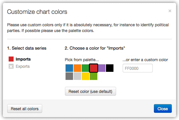
To help users using a consistent set of colors across multiple charts, every chart theme now supports a set of ‘secondary’ colors, which are selectable in the custom color dialog. For instance, a theme for a German newspaper can already include colors for political parties in Germany, so editors don’t have to enter hex-codes each time.
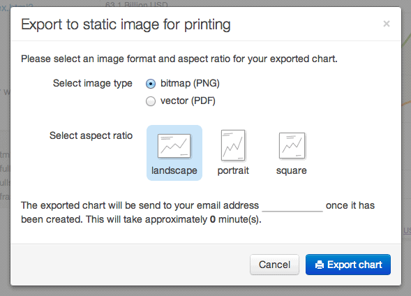
Datawrapper 1.1 includes a new feature that allows users to export their charts as static images. We use PhantomJS in the backend to render the interactive charts to PNG or PDF. Since this rendering process consumes some resources, we send the resulting images out via email once they have been created. The processing time depends on the actual use of the feature, but shouldn’t exceed a couple of minutes.
You find this feature in the last step of the chart creation process.
Not to confuse with stacked area charts (which should be avoided in general), a filled line chart is a chart with exactly two lines with the space between the lines filled with the corresponding color.
While the major information is still conveyed by the lines, the filling somehow underlines the relation between the two lines. This makes sense for all kinds of oppositional measures, such as imports and exports, immigration and emigration, costs and gains etc.
Here’s an example showing exports and imports of goods from the US to United Kingdom. As you may notice we also improved the tooltips you see while moving the mouse over the chart.
We hope you enjoy the new version, and wish you all great holidays.
The Datawrapper team.


Comments