
This article is brought to you by Datawrapper, a data visualization tool for creating charts, maps, and tables. Learn more.
Best Practice: The Guardian Data Blog
How a small data team can make a difference

For starters, there are different levels of data-driven reporting: Data Stories, Data Interactives and Data Apps. While a bit randomly separated, the structure helps to understand what journalists and others can do by using data.
- Data Stories: Reports, articles, where data structures and enhances the reporting.
- Data Interactives: More complex, deeper, but at the same time more work demanding visualizations.
- Data Apps: Defined by potentially large datasets, with features and functions designed to let users explore.
Working under deadline only highly specialized teams of editors, coders and designers can come up with fancy, super-detailed Data Interactives regularly. Data Apps require even more time, though if done well have a long shelf life.
In comes Datawrapper, as a tool to make producing Data Stories a bit simpler: It’s designed to not stand in the way for data-driven reporting, making it as simple as possible for editors to use data to enhance the depth of the articles. But while creating a chart with us is really simple, don’t be fooled: Coming up with good charts needs experience and knowledge about data sources. Plus, a lot of time is spent on checking the data.
Charts from the Guardian Data Blog
How this approach is done can be seen at the Guardian Data Blog: The (small, but highly productive) team uses Datawrapper charts extensively.Here are two examples. One reporting about the budget for the 2013 UK government budget, the other covering the effects of Margaret Thatchers reign over England. Both add substance and depth to the topics. Screenshots are linked to the original posts.
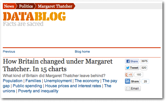
Link: http://www.guardian.co.uk/politics/datablog/2013/apr/08/britain-changed-margaret-thatcher-charts
A variation, usable for complex topics with a lot of different aspects is to create a list of tabs – for easy navigation through a collection of charts.
Here is how the Data Blog reported about the UK Budget for 2013, with a number of charts.
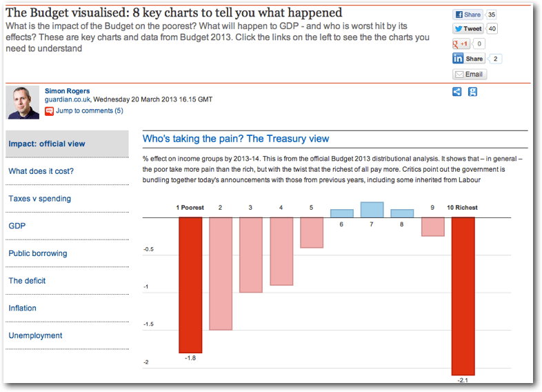
Link: http://www.guardian.co.uk/news/datablog/interactive/2013/mar/20/budget-visualised-key-charts
Liked this article? Maybe your friends will too:
NEWSLETTER
Sign up to our newsletters to get notified about everything new on our blog.


Comments