
This article is brought to you by Datawrapper, a data visualization tool for creating charts, maps, and tables. Learn more.
New York City Department of Health: “Datawrapper was the backbone of our COVID reporting”
How Datawrapper is helping a big public health department to meet the challenges of the pandemic.

Quality data reporting has always been important to public health departments, but COVID-19 took things to a whole new level. Matthew Montesano experienced the shift firsthand in his job as a data communication specialist for the New York City Department of Health and Mental Hygiene.

Along with the department’s team of epidemiologists, analysts, and data communicators, he’s been working throughout the pandemic to keep policy makers, journalists, and the public informed with the latest numbers — and as he puts it, “Datawrapper was vital to being able to rapidly develop and deploy our COVID-19 reporting at NYC Health.” Matthew was kind enough to answer a few questions for us about how his department has handled the challenges of the past two years.
Hi Matthew! Could you tell us a bit about how COVID-19 changed your work with data visualization?
Matthew: Public health agencies often report or update data annually, with multi-year lags to allow for data completeness, cleaning, analysis, and reporting. Updating daily, with much shorter lags, was crucial for COVID data. A lot of public agencies also don’t have extensive experience with rapidly assembling and deploying technical products.
Those two problems really collided with COVID data communications, and Datawrapper was poised to solve them both. A no-code interface to develop charts that can be dropped onto any webpage, and charts, tables, and maps that can be connected to a live data source, all with excellent default designs: all of this was central to our ability to communicate COVID-19 data.
How did NYC Health use Datawrapper to handle daily COVID-19 data, and how did that help your team?
Extensively! We built nearly all of the data visualizations on our COVID data reporting webpages using Datawrapper. This let us rely on Datawrapper’s excellent out-of-the-box designs and good functionality. We could rapidly prototype and deploy, we could easily iterate on live material, and we could quickly train new staff being rotated onto emergency response assignments.
For the most part, we were our own data source — we were providing the files that our charts were reading. We fed our charts with CSVs that we stored in a GitHub repo, which wound up being a very, very useful workflow for us. It was easy for us to update everything daily; easy for us to store our summary data in the open and securely differentiate between identifiable source data in our databases and published summary CSVs; and easy for us to provide a lot of documentation.

We’ve seen many users store data on the development platform GitHub. How did connecting GitHub and Datawrapper help serve your particular audience?
As we understood it, our audience had a great need for explanations. Some explanations could be done with chart design (explaining if data is trending upward or downward, or if something is good or bad), but some explanations had to be done with the rest of our data communication strategy. All eyes were on COVID data so we had to explain metrics, sources, definitions, etc. We used documentation in a GitHub repo to provide these more complex answers to more detail-oriented users — distinctions like deduplication in test positivity (the difference between the percent of tests that return positive, and the percent of people tested who tested positive) or the difference between report date and date of event.

Essentially, we had a need to sort of bifurcate what we were communicating, and to whom, and it was particularly helpful to have this split-stack of Datawrapper + webpages, and files on GitHub + documentation. Our files fed the webpage, but we could keep the webpages and visualizations as simple as possible, focused on what people needed for initial understanding, and dump tons more information into the GitHub documentation. (Plus use “Issues” and other GitHub features to respond to inquiries; plus store all historical versions of data files; plus allow people to programmatically access the data…; etc.)
What what went well in COVID-19 reporting and what were the challenges?
A lot went well — Datawrapper was the backbone of our COVID reporting, and COVID data reporting was probably the most high-profile, successful digital product our department has ever done. In an era when our web traffic was an order of magnitude higher than before, COVID data pages made up about half of our web traffic. I think it was because we tried to make the data easy to access, understand, and use, and that helped answer New Yorkers’ questions about what was happening with COVID-19 and shine a light on how the pandemic was affecting our city.
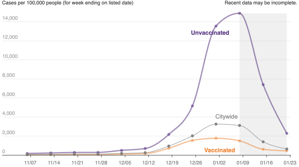
There is an interesting difference between explanation-focused data visualization and monitoring-focused visualization, with COVID data often being in the latter. It’s hard to design a message into your chart when that message might change week to week. Especially in this automated environment, when we were reporting data by ZIP code, there are instances where there’s simply not one story in the data that we can highlight in a visualization; there are so many stories, and those stories change. Datawrapper tables were a very, very powerful tool for allowing a bit of exploration on an otherwise explanatory platform. They let us visualize extensively within the table and let users sort by column and search by location.
Through testing with our city’s digital accessibility coordinator, we also realized that we could leverage tables to ensure that the data were accessible to people who use screen readers. That was another big advantage of using Datawrapper and its tables — most common visualization platforms make digital accessibility very, very difficult.
Because of the model established by our work on COVID-19, Datawrapper has become a bit of a darling tool within the agency. More people are using good strategy and design as essential components of communicating data — and more people are using Datawrapper to help them do that.
Thanks so much to Matthew for taking the time to answer our questions! To learn more about his work at the NYC Department of Health, visit their website and GitHub.
Liked this article? Maybe your friends will too:
NEWSLETTER
Sign up to our newsletters to get notified about everything new on our blog.


Comments