Read “How to lie with maps” by Mark Monmonier with us!
January 29th, 2025
6 min
This article is brought to you by Datawrapper, a data visualization tool for creating charts, maps, and tables. Learn more.
(And buggy.)
It was really an awesome sight… all those words coming from all over the world, with so many thoughts, reflections and wisdom!
Tiago Maranhao
I felt like I was in the middle of a beautiful brain.
Sara Wood
Five weeks ago, I posted a blog post to announce a digital book club for data visualization books. The first book we read was “The Visual Display of Quantitative Information” by Edward Tufte.
For the next four weeks, I retweeted people’s reading experience as @datavisclub – a Twitter account which has 1000 followers by now 😱.
We all read the book,
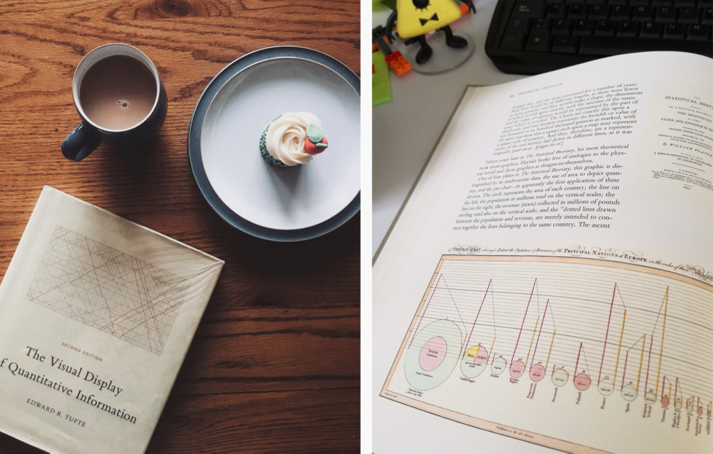
we took notes,
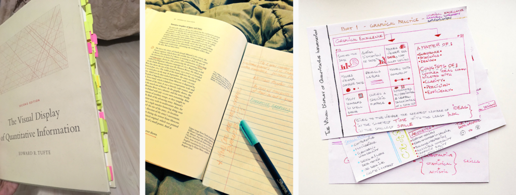
and then, last Tuesday, we got comfortable in front of our computers:

And the amazing thing happened: We all met. Digitally. At the same time. In a notepad, in which everyone started to discuss what they got out of reading Tufte’s book: notes.datawrapper.de/p/bookclub-tufte
We were more than 50 Tufte readers, from all over Europe and North America – and even two peeps from South America:
You can find our whole conversation here: notes.datawrapper.de/p/bookclub-tufte. It’s still possible to type around in there and see the chat messages.
(Since we found that people use automatic translator programs in the notepad, it might be broken by the time you visit it. You can either use the clock symbol at the top to go back in time to a clean version. Or, if you want to see the notes in its original colors, visit this locked Google Docs document.)
The whole experience was short-lived because our hosted notepad (=Etherpad) crashed from time to time. As Elijah Meeks put it:
It was too beautiful/popular to survive.
— Elijah Meeks (elijahmeeks.bsky.social) (@Elijah_Meeks) August 14, 2018
But it was magical to see all these people type at the same time. Sharing their opinions. Building a non-linear conversation, in which everyone talks at the same time, but still everyone is heard. A river of voices. It was fun to perceive how book club attendees typed their own opinions, then read the ones from others and reacted to them.
Apropos reactions; here are some about the general experience:
Can’t get back in but enjoyed that even more than I thought I would, thank you
— Martin (@martin_squires) August 14, 2018
I was inside this beautiful data vis brain! 🧠😍 Y’all, if you’re interested in data vis, you should join the Data Vis Book Club. Thank you for the initiative @datavisclub – this was a super inspiring experience! Looking forward to the next book. 📕#datavis #Datavisualization https://t.co/o9hIJlUqQ6
— Amelia Antzée is on Bluesky (@Antzee_) August 14, 2018
In good company today at the @datavisclub Have you ever attended an online written book club? An interesting experience, and our comments will not fly away as they are here: https://t.co/nDZ9nZgNq5 🙂 #dataviz #datavisclub pic.twitter.com/vTs1en5Xjf
— Victòria Oliveres (@VictriaVic) August 14, 2018
So what did we discuss? Here’s a summary of answers to each of the four questions I asked the book club attendees:
In general, book club attendees found it a well-written and well-designed book: “Inspiring, beautiful, well written and edited: it’s got the substantive, the statistical and the artistic skills expressed in every page” said @muxevola. And Michal Mokwinski found that “compared to other data viz books it a very light lecture – this does not mean it’s not full of valuable information.”
Michael was also amazed that the book is still useful today: “I thought [Tufte]’s living in the past…It turned out that the book can be applied to today’s tools.”
Some attendees were surprised by Tufte’s strong opinions: “I didn’t expect Tufte to be so opinionated – even scathing at times”, said @hilarys728. Not everyone appreciated these opinions: “Tufte tries to make too many absolute theorems.”, “a one-sided view.”, “Good ideas. Silly ratios. Chartjunk sillier than expected.”
So what’s the main message of the book? According to Alexander Naylor, it’s “more of a guide for restraint in some respects”. And another book club attendee summed it up wonderfully: “Complex data. Simple visualizations.”
This question quickly lead to discussions – and more questions. For example, are Tufte’s redesigns actually better than the originals? “I personally think most of his redesigns fail horribly,” one participant told us. “I even went around my workspace asking people what they could see in some graphs (especially on the redesigned boxplot) and almost no one understood what was being conveyed”,
Another Tufte concept that book club attendees discussed was sparklines. Why did they not catch on? The experiences ranged from “I use Excel’s sparklines a lot. They can be pretty effective” to “I have used them sometimes and clients say they don’t see the data very well🤷 They miss the point of the sparkline, I guess they are not for everyone!”
Even more controversial were tables: Some book club attendees were very happy to see Tufte advocate for them: “I appreciated the idea that sometimes tables are the best option for displaying data.” Another person added: “Sometimes, tables are best!”
But people like Sian Williams Page disagreed: “Tufte’s advocacy of supertables surprised me (pg179). Especially his view that they are good at pulling a reader in. I can see how they are useful from an ease-of-looking-up-a-value point of view, but for an intriguing way of presenting a large dataset? Surely this is where well-designed visualizations can shine” Anneli Joplin added: “I’ve been wondering about that too – how often is it that the ACTUAL numerical value is the key takeaway?”. And Inga Silkworth “wrote a note next to that table saying ‘I don’t want to look at hundreds of numbers in a table’.”
This question didn’t lead to as many discussions about Tufte as expected, but it was great to see everyone’s favorite data visualization. A lot of good ones were mentioned:
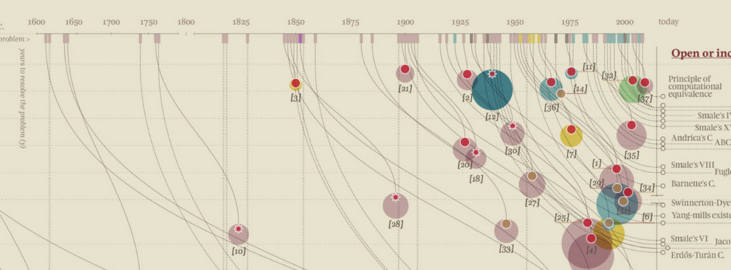


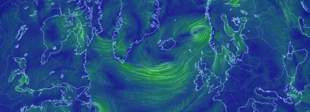
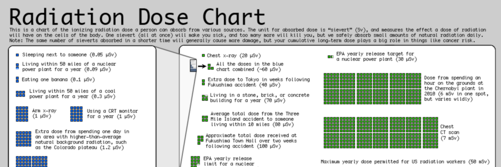
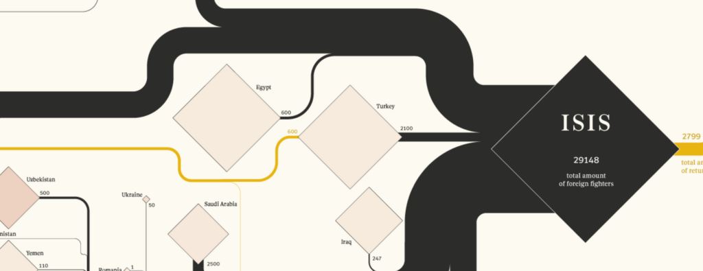
Bram Zandbelt mentioned that his favorite visualization in the book was the one about frequency-of-repair records for cars on p. 174:
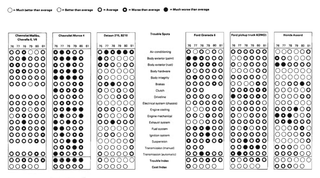
Shane Cone agreed and found it “shockingly good. Extremely easy to get the takeaway at a glance, but also easy to read in depth if you want. In fact, maybe that is a guiding principle going forward: Make your chart available / consumable to any level of interest. I can, in 5 seconds, see which car breaks down the most. Or, in 2 minutes, see how one car compares to the average on every part.”
The last question dealt with concrete takeaways for charts we will build in the future. The point that was mentioned most often was to simplify and to clean up the chart: “I’ll be (even) more conscious about whether each element on my charts serves a purpose.”, “Less clutter”, “increase my data-to-ink-ratio”, “I will think about the question my chart is attempting to answer or clarify” and “I’m going to think harder about what interactive elements are really needed for my web-based viz.”
Another takeaway for the future was to be more considerate with the elements that do exist on the chart. Book club attendees wanted to think about “what kind of annotations to add to graphics”, “make editing a larger part of my process”, “think more about gridlines, which role they play in my graphics” and “enrich my graphics with some multifunctioning elements when the right occasion turns out.”
And then there’s Ada Kepinska, who wants to “ask myself if it would appeal to ‘connoisseurs of the graphically preposterous.’ (p.118). Consider starting a club with that name.” Go, Ada!
Boy, that whole endeavor was fun. So much fun, indeed, that we’re immediately starting with two more books to read. Visit the blog post “Read Tamara Munzner & Alberto Cairo with us” to learn more, and join the book club!
Comments