How a flower became the main character of the late Pleistocene
November 7th, 2024
4 min
This article is brought to you by Datawrapper, a data visualization tool for creating charts, maps, and tables. Learn more.
Maps are not objective, but a version of reality. When creating them, lots of choices are made: What to map, how to map and whether or not to use a map in the first place. Here we’ll try to find guidelines to all of these questions, for a specific subset of maps: Choropleth maps (the ones in which each region is filled with a color that represents a value). If you feel inspired after the read, you can create choropleth maps for free with our data visualization tool Datawrapper.
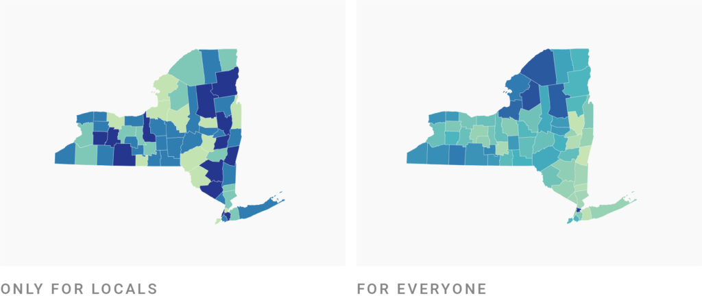
Choropleth maps are great to show clear regional pattern in the data, or for local data. Regional patterns could be an unusually high unemployment rate in neighboring counties, or the contrast between cities and rural areas. If your data doesn’t show a clear regional pattern, consider another chart type for your data. However, readers love to find themselves on a map. If you’re mapping an area in which your readers live, do consider a map even if they are no regional patterns.
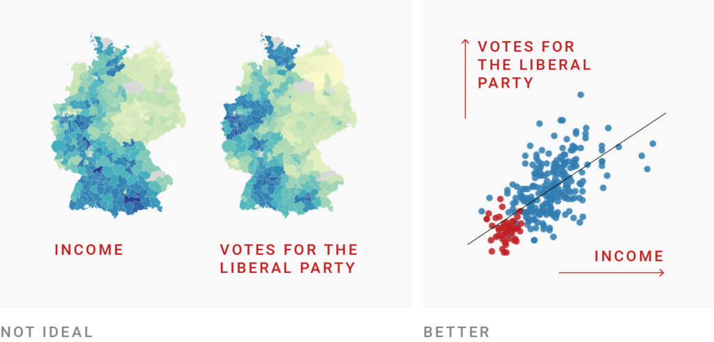
Choropleth maps work best when showing just one variable. This variable could be the difference between two variables (e.g. the change of the unemployment rate from last year to this year). But if you want to show the correlation between values, choropleth maps might be not your best choice. Consider a dotplot or scatterplot instead.
Choropleth maps are great to see the big picture, but not for subtle differences. Readers will have a hard time perceiving the small differences between colors on your map. In addition, the intervals between the colors are not necessarily the same intervals between the values in your data. That makes it easier to recognize patterns in the map, but makes it harder to compare the exact values of regions with each other. If you want to point out the numeric differences between regions, consider another chart type, a table or text instead. That also applies if your most important regions are too small to be shown on a map:

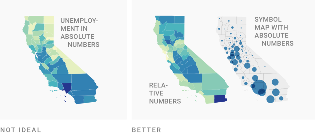
Choropleth maps work best for relative data. It would not be useful to map the absolute number of unemployed people in each county, since we can’t compare that data without knowing the counties’ population. The unemployment rate (the number of unemployed people per 100 citizens) is more comparable. If you want to map absolute data, consider a symbol map instead. Be aware though, that this will often just answer the question “Where do most people live?”.
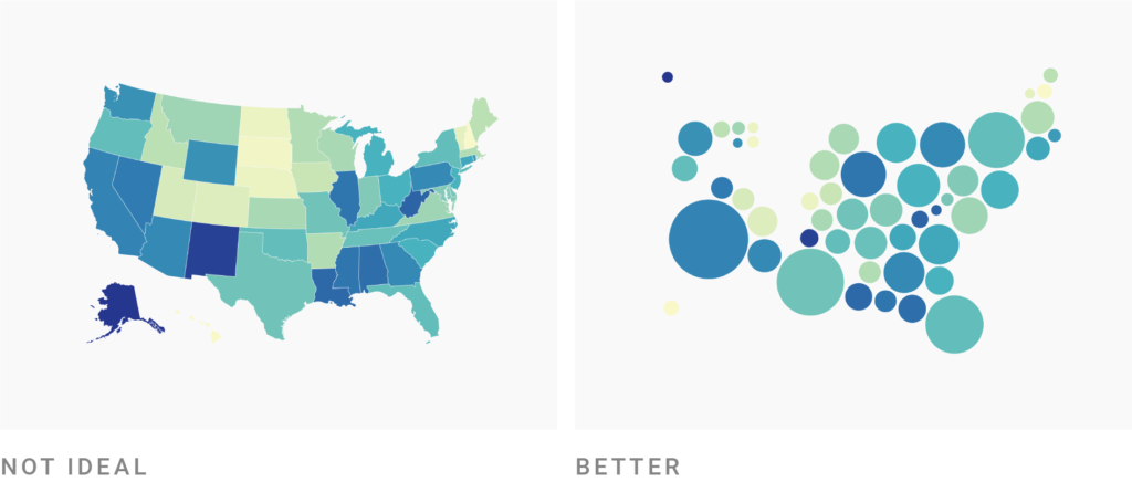
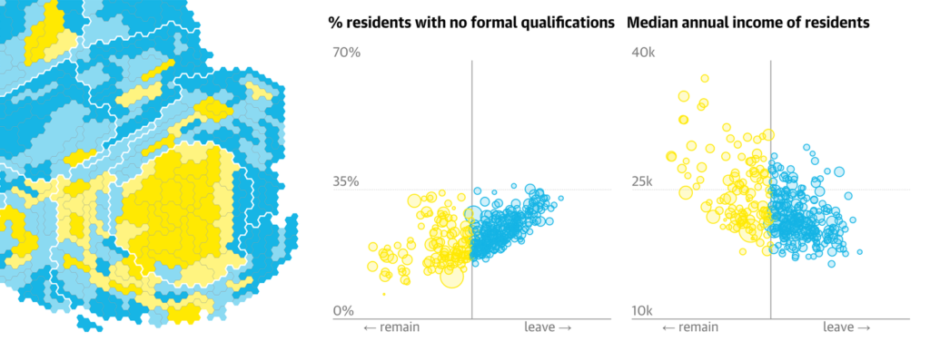
Consider cartograms if it’s important how many people are affected. Choropleth maps show us how much geographic area is affected. On some maps this means that large regions where only a few people live take up a lot of space on the screen. Population cartograms, on the other hand, drive more attention to populated areas. In countries with a very different population density in each state, cartograms can offer a more honest view of the data. However, be aware that cartograms make it harder for readers to recognize regions, so they work best if readers are familiar with the geography.
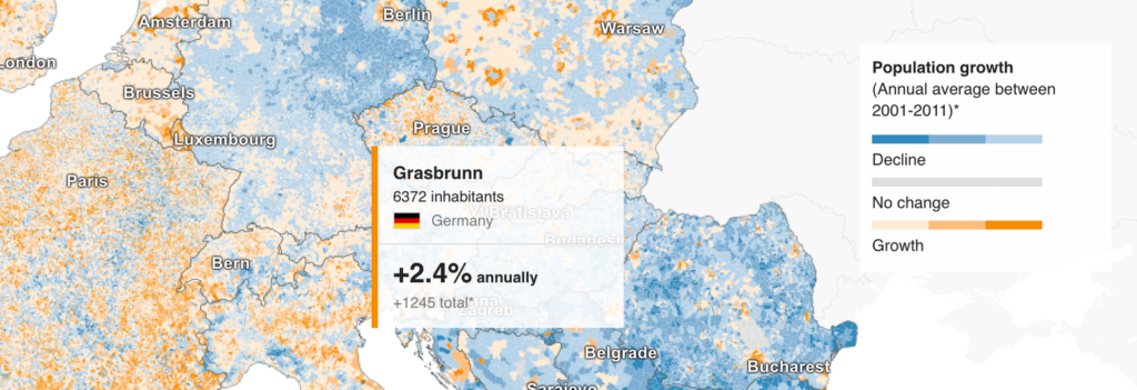
Consider choosing the smallest units possible. If you can use counties instead of states or NUTS2 regions instead of European countries, consider doing so. It will give readers a more refined image of the data and will let them spot more regional pattern. There are exceptions: For example, a state map is more informative in the winner-takes-it-all-system in the US presidential elections.
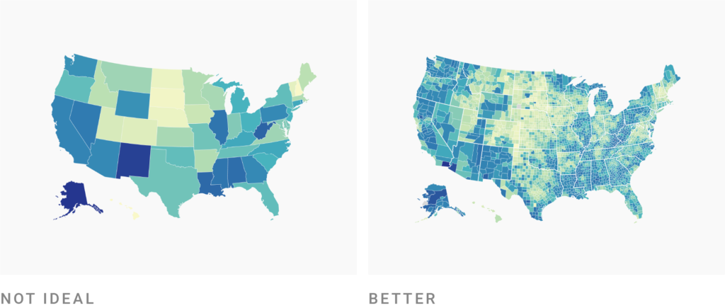
Make sure to use the right color scheme for your data. There are three different kinds of color schemes for maps: Sequential (e.g. from bright blue to dark blue), diverging (e.g. from red via white to blue) and qualitative/categorical (e.g. one green color, one blue color). Consider a sequential color scheme if you want to drive the attention to the high values, e.g. for unemployment rates. Consider a diverging scheme if you want to drive the attention to both extremes of the scale, e.g. too show the difference in votes between two competing parties. With any color scheme, do use colorblind-friendly colors.
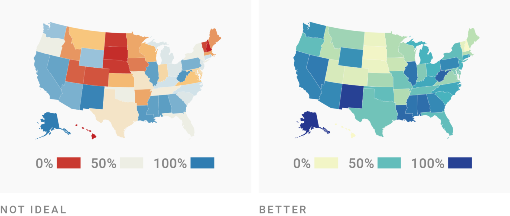
Make sure there is a lightness difference in your sequential/diverging color schemes. A gradient from a light color to a dark color enables your readers to quickly spot the regions with low and high values. Using different colors can increase the contrast, but shouldn’t be overdone. In the case of a diverging color scheme, the color in the middle should be the lightest one and the extremes should be the darkest ones. If you’re unsure, use the Datawrapper defaults or use the ColorBrewer palettes.
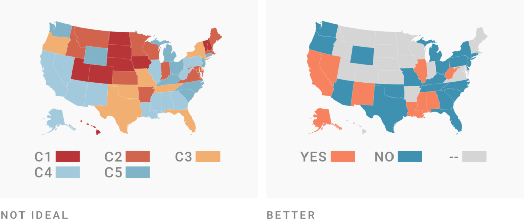
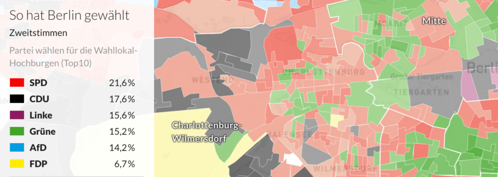
Consider using as few as possible colors in your qualitative color schemes. The more colors you use in your map, the harder it becomes for your readers to remember what they mean. Using only three colors means that your reader won’t need to check your color key too often. The colors shouldn’t give the idea of a sequential or diverging color scheme, if your data isn’t ordered in any way. You can use more than three colors if the reader already knows your color encoding, e.g. with colors of political parties.
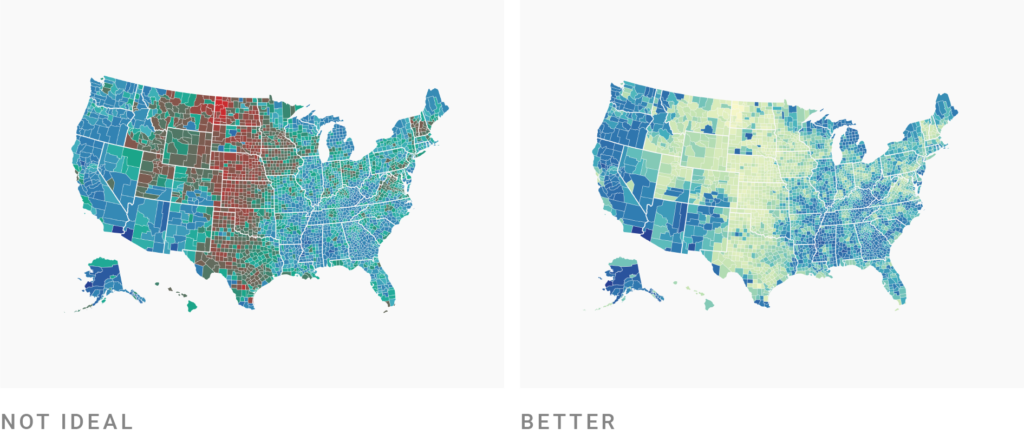
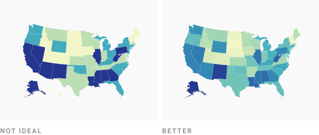
Make sure that readers see all the differences in the data. Regions with different underlying data values should have different colors. Reserve your brightest and darkest colors for the extremes. Also, take your time when choosing the number of “stops”. They decide how dramatic the contrast between your low and high values appear. Make sure to use stops to make regional patterns visible, but not to overly blow up the difference between regions.
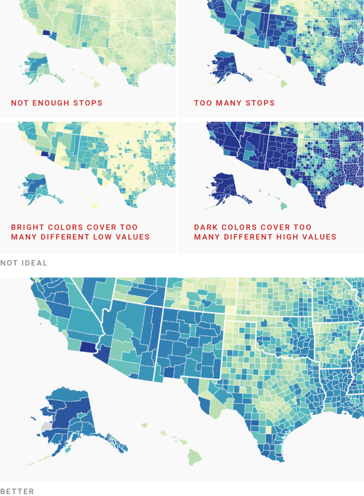
Consider using a continuous color scale instead of discrete color steps. A map with “discrete steps” assigns all your values to one of e.g. five distinctively different color shades. If you want readers to immediately see the range of values a region falls in, discrete steps are a good choice. However, discrete steps sacrifice nuance for that quick readability. A continuous color scale lets readers compare neighboring regions, even if they would fall in one color shade on a map with discrete steps. And if you enable tooltips on your map, readers can access the exact values anyway.
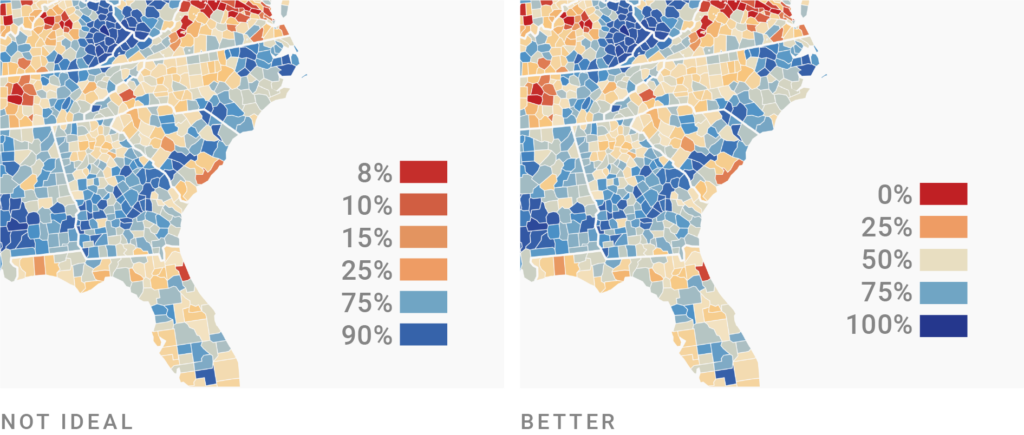
Spend time thinking about your color key. Color keys are crucial for readers to understand your map. Make sure that they are quickly decipherable: Keys for sequential color schemes should show the colors for the lowest and highest values; plus two to four colors in between. To be not overly confusing, the key should show the colors for values with the same interval (e.g. 0, 25, 50 instead of 0, 15, 50). In the case of a diverging color scheme, the key should also display the center value.
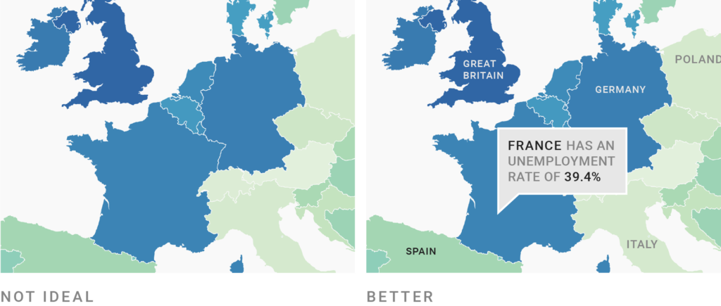
Consider using tooltips and labels. Tooltips are a great option to communicate the name and the underlying value of each region, since they will be hard to read otherwise. Tooltips also work well to communicate extra information about regions and remind reader’s what they’re seeing. Labels get more important the less your readers will know about the area you’re mapping.
The Guardian: EU referendum: full results and analysis. Shows the use of a cartogram (a big yellow London) and scatterplots for geographical data:
Berliner Morgenpost: Where the population of Europe is growing – and where it’s declining. Shows the importance of small units to see regional patterns:
Berliner Morgenpost: Alle Stimmen der 1779 Wahllokale. A election results map. Shows that it can be ok to have more than three color hues if readers know the color encoding:
Comments