

New: Stay organized with a more powerful, faster visualization archive
June 25th, 2024
3 min
This article is brought to you by Datawrapper, a data visualization tool for creating charts, maps, and tables. Learn more.
Let readers see your charts, maps, and tables with a dark background
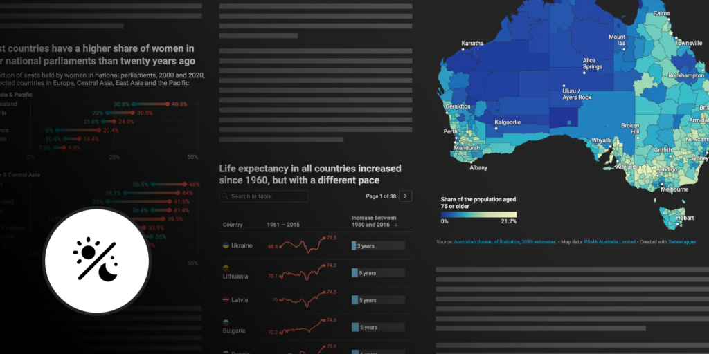
We’re sure most of you are already familiar with the trend towards supporting dark mode — that’s when websites and apps appear dark with light text, instead of the familiar white with dark text. It gives our eyes a much-needed break from bright screens.
Many of our users’ websites already support dark mode, and starting today, Datawrapper visualizations will too: It’s now possible to embed charts, maps, and tables that adapt to a dark background.
Dark mode visualizations are available to all our users and with every theme, including our free Datawrapper themes.
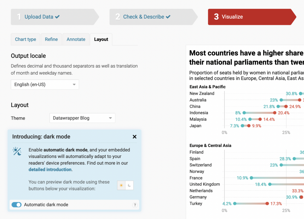
You can find the setting “automatic dark mode” in the Layout tab of step 3: Visualize. If you already support dark mode on your site, then all you have to do to ensure your Datawrapper embeds adapt is to turn on this setting for each visualization in the app. If not, don’t worry — your embeds won’t switch to dark mode unless you choose to activate the option.
When “automatic dark mode” is turned on, your embedded visualizations will appear in dark mode for readers who have chosen to view your website that way.
This might be something they enabled in the settings of their operating system (on a Mac, that’s in System Preferences > General > Appearance: Dark) or in their browser (in Firefox, there’s a default “Dark” theme readers can enable).
Before turning on automatic dark mode for visualizations, make sure that your whole website offers a dark mode! That’s something you need to design and code on your side. For example, websites like DuckDuckGo and spiegel.de have a dark mode, while sites like Wikipedia or economist.com don’t. We’re using the setting prefer-color-scheme to check whether your readers prefer dark mode or not — verify that your website respects this setting before turning on Datawrapper’s automatic dark mode.
If your website is not designed for dark mode, just don’t enable the automatic dark mode in the Layout tab, and everything will stay as you’re used to.
You can always check your colors in the dark mode preview below each Datawrapper visualization:
You will find that all the elements on your charts, maps, and tables remain readable in dark mode. To ensure that, we wrote an algorithm that is based on color contrast. It automatically finds suitable colors for your chart elements, gridlines, title, description, source, byline, color key, highlight ranges, table text, table heatmaps, annotations, etc.
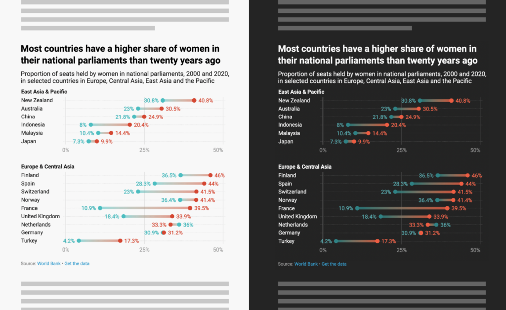
Here are two embedded charts as an example:
As you can see, the color contrast of each element against the background is always the same. The black text on the white background has the same contrast as the white text on the black background; the light blue “high trust” bar on the white background has the same contrast as the dark blue “high trust” bar on the black background. Colors that are very dark on the white background will be very bright on the black background, and vice versa.
If your organization uses a custom theme, you can decide on a few things.
Please reach out to our support team if you want to:
Just get in touch with us at support@datawrapper.de. Elana, Aya, Eddie, and Margaux are looking forward to hearing from you.
If you always want to show your visualizations on a dark background, no matter your readers’ preferences (e.g., because your website always uses a black background), simply pass a ?dark=true parameter to the visualization URL in the embed code. For example, the visualization datawrapper.dwcdn.net/GMW3g/3/?dark=true will always show up with a black background.
To learn more about this feature, visit our Academy article on the topic. We know many of you have been eagerly awaiting this feature — and as always, we’re looking forward to your feedback. Write to us at support@datawrapper.de or on Twitter @datawrapper.
Comments