Data Vis Dispatch, February 18: German election polls, corruption, and tariffs
February 18th, 2025
9 min
Datawrapper lets you show your data as beautiful charts, maps or tables with a few clicks. Find out more about all the available visualization types.
Our mission is to help everyone communicate with data - from newsrooms to global enterprises, non-profits or public service.
We want to enable everyone to create beautiful charts, maps, and tables. New to data visualization? Or do you have specific questions about us? You'll find all the answers here.
Data vis best practices, news, and examples
250+ articles that explain how to use Datawrapper
Answers to common questions
An exchange place for Datawrapper visualizations
Attend and watch how to use Datawrapper best
Learn about available positions on our team
Our latest small and big improvements
Build your integration with Datawrapper's API
Get in touch with us – we're happy to help
This article is brought to you by Datawrapper, a data visualization tool for creating charts, maps, and tables. Learn more.
The best of last week’s big and small data visualizations
Welcome back to the second edition of Data Vis Dispatch! Every week, we’ll be publishing a collection of the best small and large data visualizations we find, especially from news organizations — to celebrate data journalism, data visualization, simple charts, elaborate maps, and their creators.
Recurring topics for this week include record-breaking heat waves, regional elections in France, and (what else?) the pandemic.
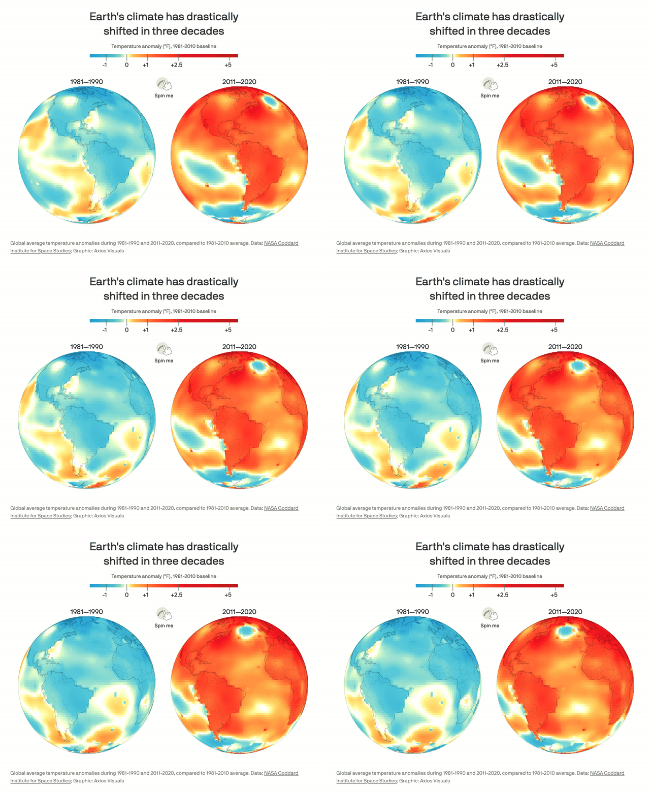
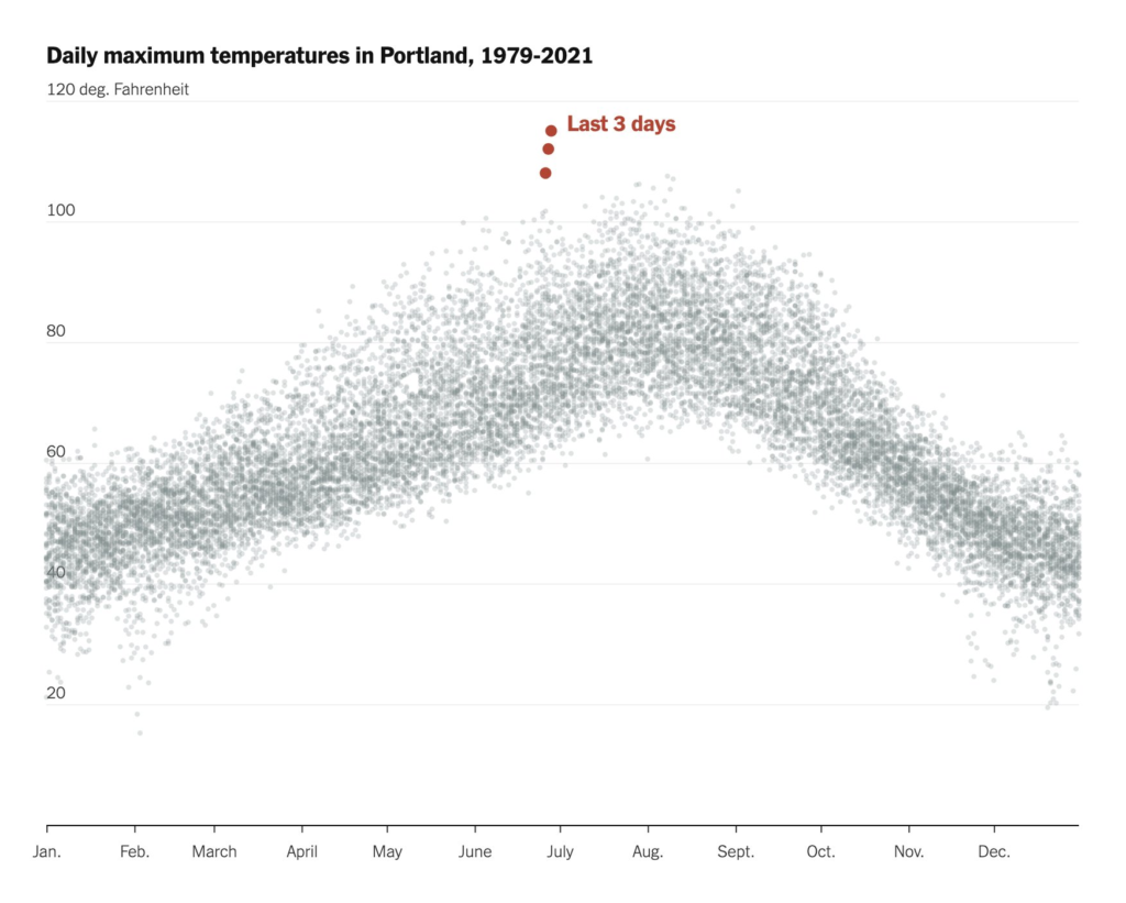
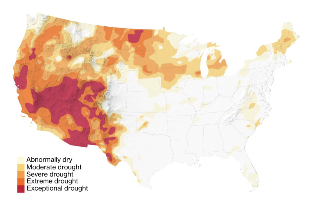
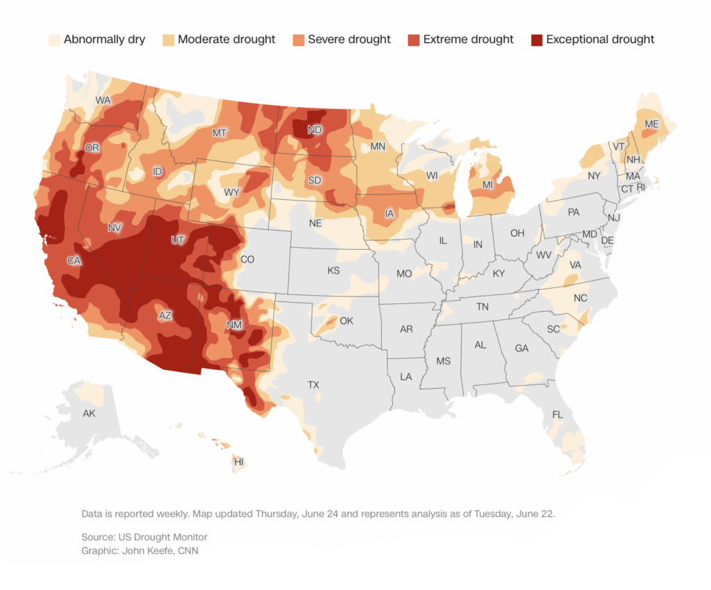
Last week’s heat and drought continued to shatter records around the world. These maps showed not just a few days of extreme weather, but a major climate shift:
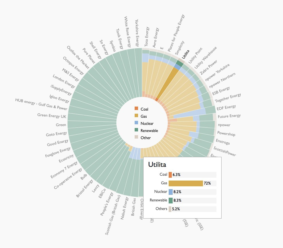
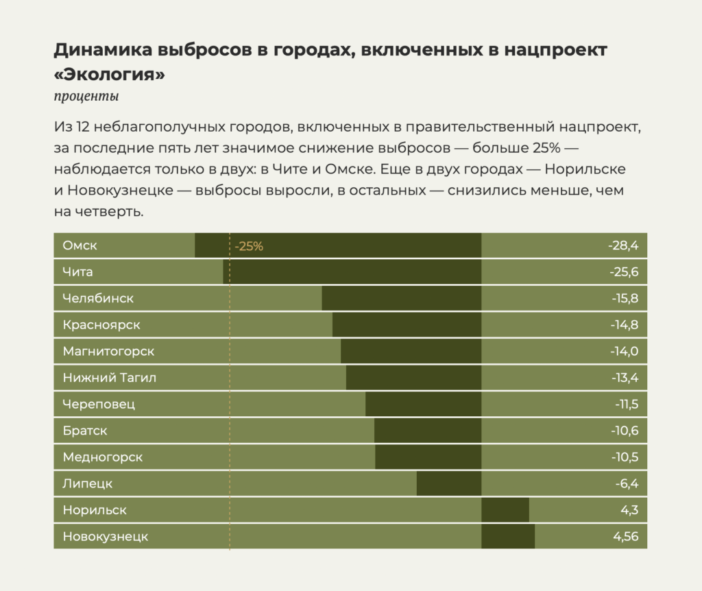
And these charts explored progress on emissions in the UK and Russia:
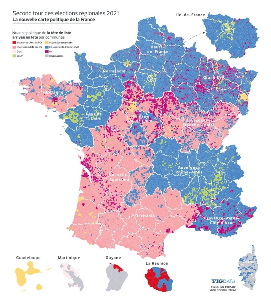
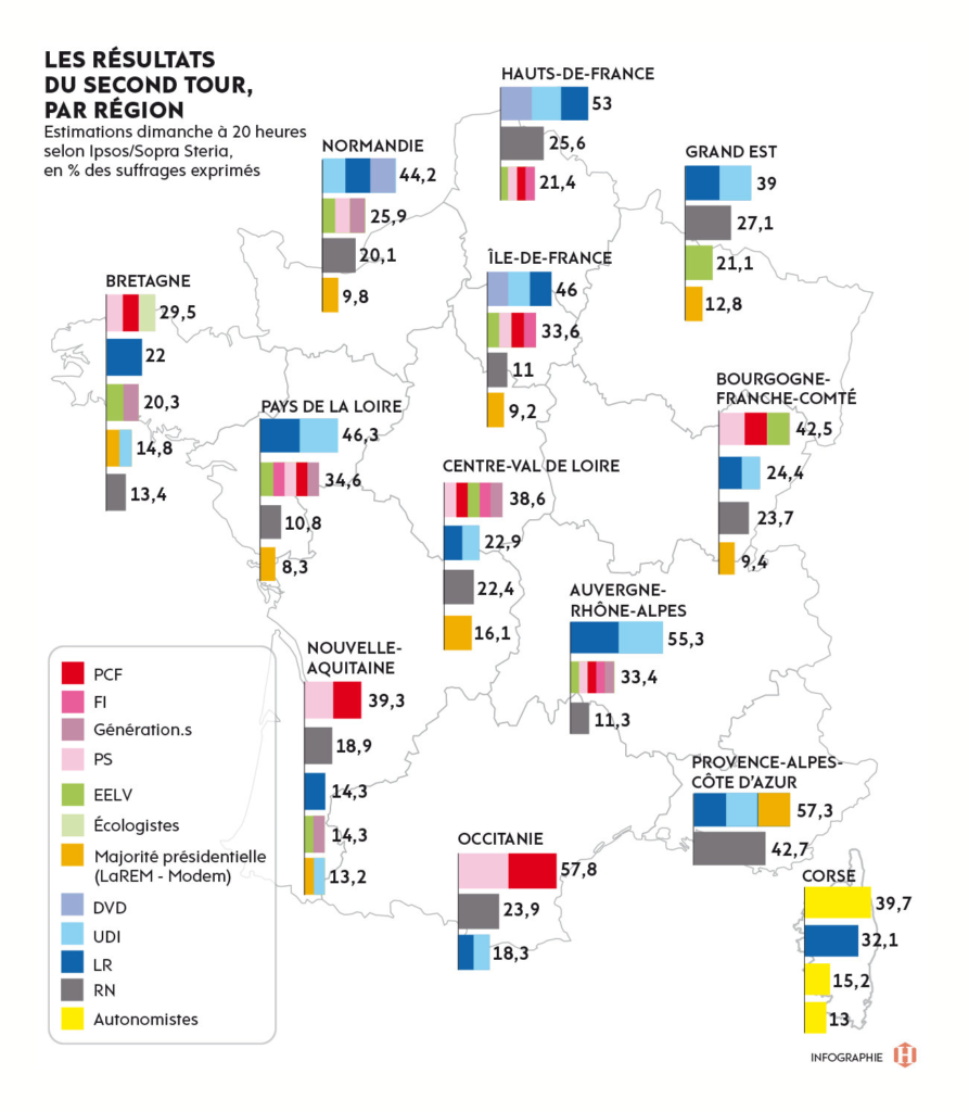
The political theme of this week was France’s regional elections, with low turnout hanging over the results:

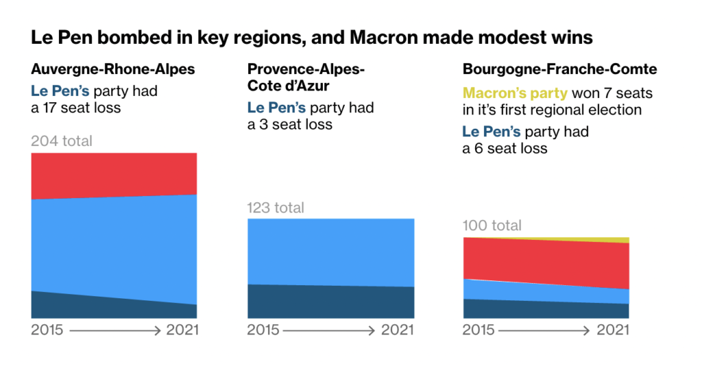
On general topics, this week offered clean, simple charts and maps:
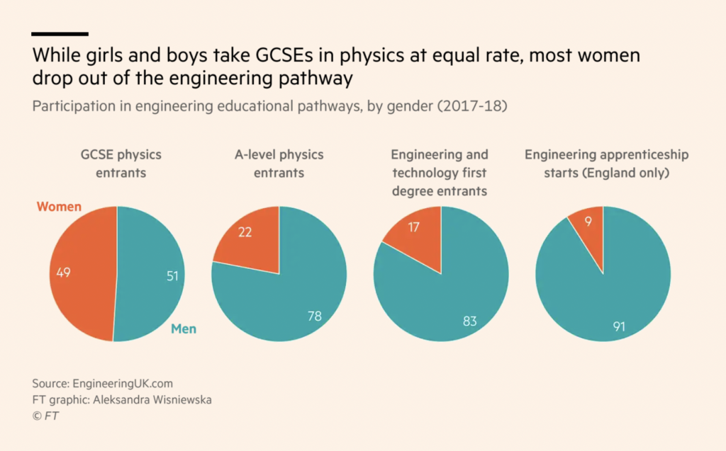
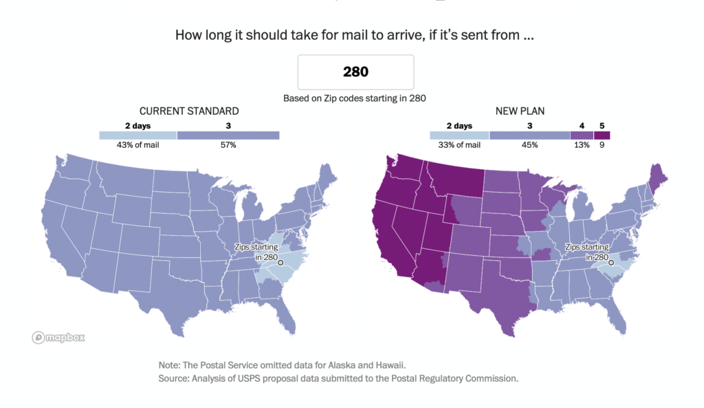
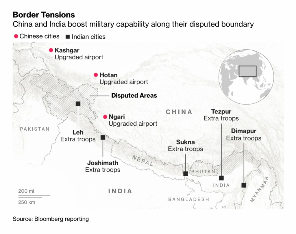
And also some more unusual data visualizations, with a bivariate choropleth map (Adedamola Lapido), a connected, proportional area chart (The Economist), and a data visualization as tall as the entire article (ProPublica):
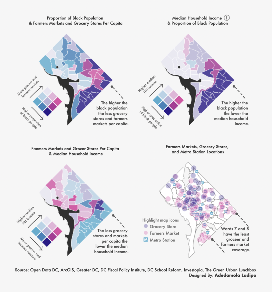
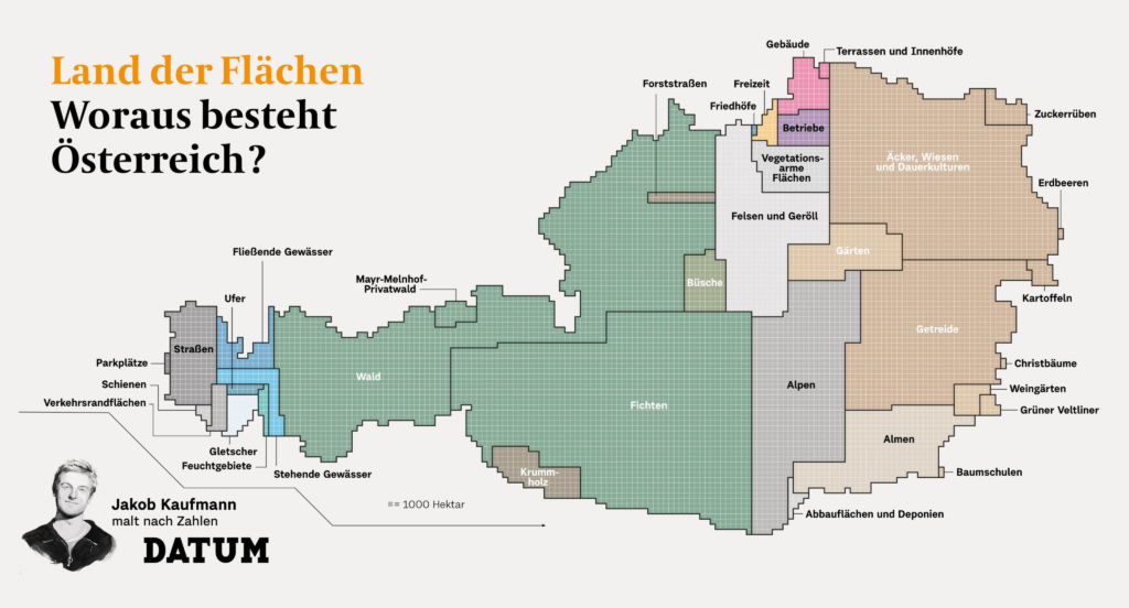
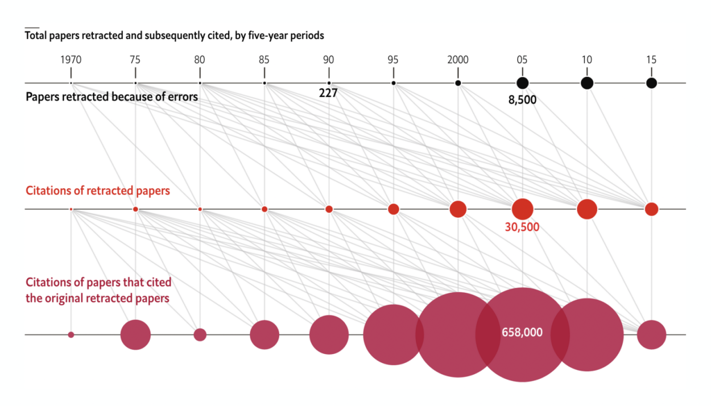
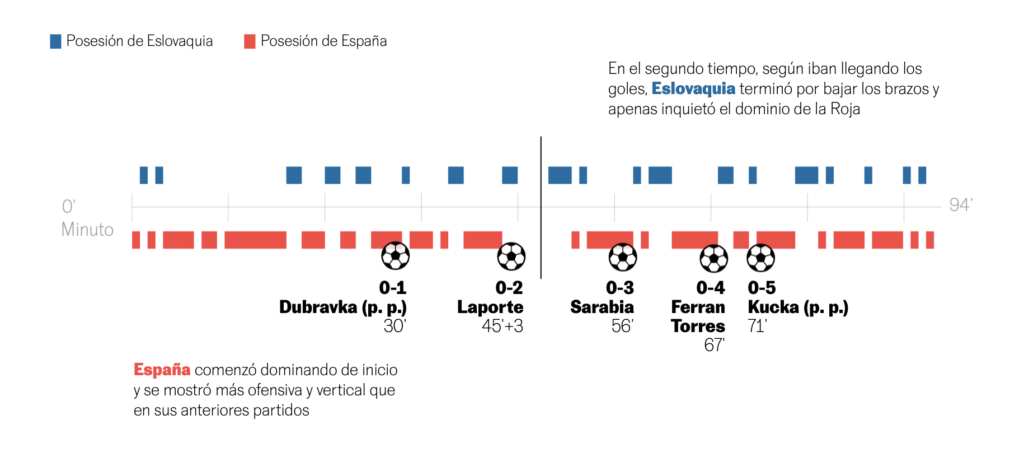

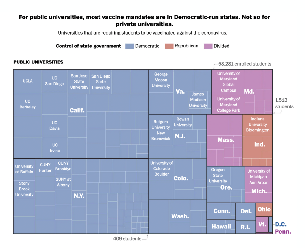
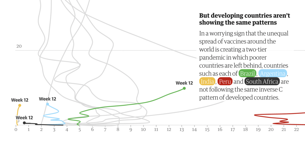
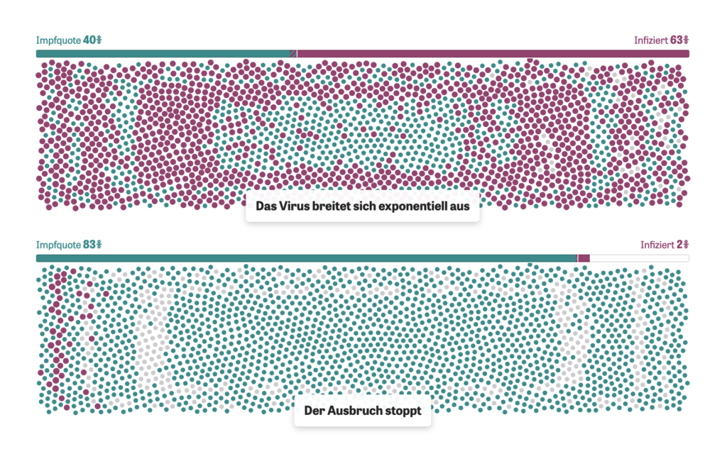
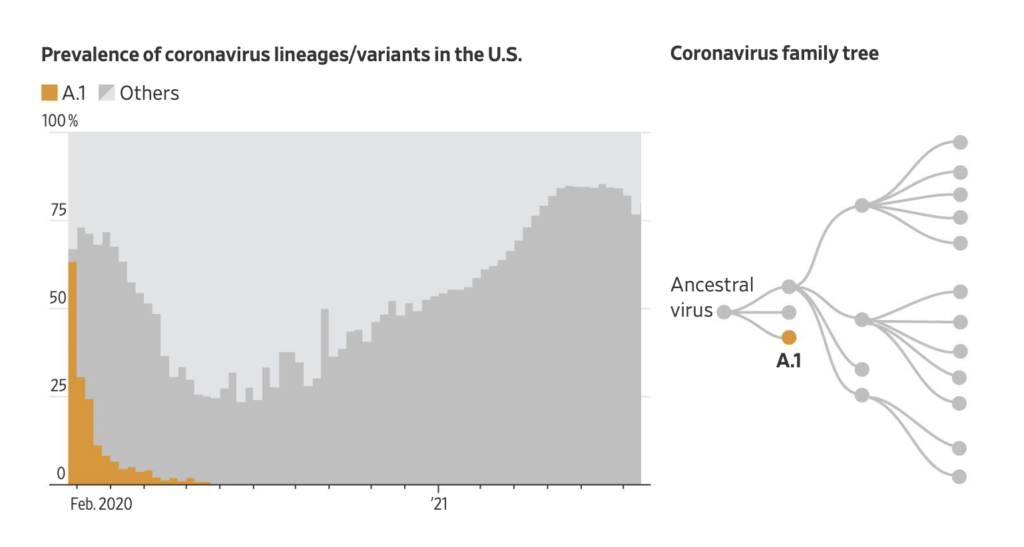
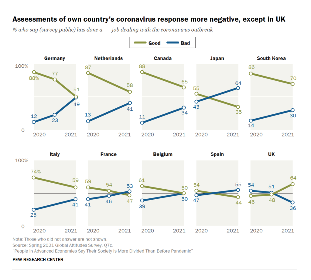
Finally, this week’s COVID charts covered vaccine policy, compared variants, and looked back at changes in public opinion:

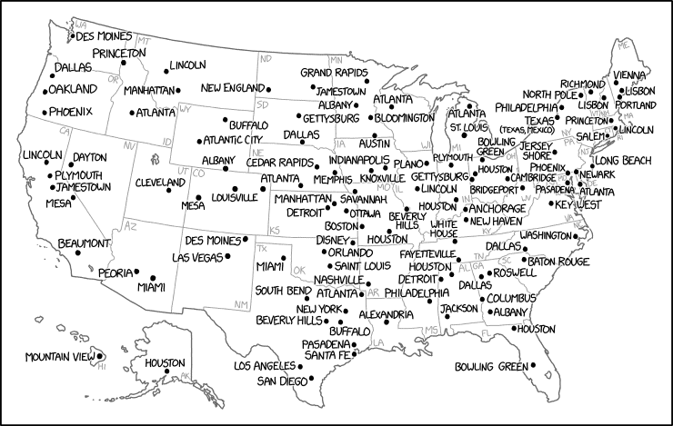

And if you liked last week’s history of the England – Scotland football rivalry, now you can make your own (Tweet).
Help us make this dispatch better! We’d love to hear which newsletters, blogs, or social media accounts we need to follow to learn about interesting projects, especially from less-covered parts of the world (Asia, South America, Africa). Write us at hello@datawrapper.de or leave a comment below.
Comments