Join our webinars: Getting started with Datawrapper, and a Maps Deep Dive
June 20th, 2023
3 min
Datawrapper lets you show your data as beautiful charts, maps or tables with a few clicks. Find out more about all the available visualization types.
Our mission is to help everyone communicate with data - from newsrooms to global enterprises, non-profits or public service.
We want to enable everyone to create beautiful charts, maps, and tables. New to data visualization? Or do you have specific questions about us? You'll find all the answers here.
Data vis best practices, news, and examples
250+ articles that explain how to use Datawrapper
Answers to common questions
An exchange place for Datawrapper visualizations
Attend and watch how to use Datawrapper best
Learn about available positions on our team
Our latest small and big improvements
Build your integration with Datawrapper's API
Get in touch with us – we're happy to help

We’re excited to introduce you all to a new member of the Datawrapper team: Aya Tanikawa, our new support engineer. She’s working five days a week, answering your questions and making sure you get the most out of Datawrapper.
As the coronavirus crisis gave data visualization a new, more important standing within organizations, our support requests multiplied. Luckily, we quickly found Aya, who helped our Head of Customer Success, Elana, as a support intern since April (maybe you already know her because she replied to a question you sent to support@datawrapper.de). Since June, she’s our support engineer, and we’re very happy about that.
Let’s hear from herself:
Yes! Hi, I’m Aya. I’m from Tokyo, Japan, but also grew up in Egypt and England.
Before moving to Berlin in the fall of 2019, I studied Bioscience and helped out in a lab doing research on piezoelectric materials. I went on to do my Master’s in the same lab, but I was interested in everything and took random courses from many different faculties. I almost didn’t know anymore what I majored in. I had always dreamed of being an expert in a scientific field, but soon realized that I was more drawn to science communication, positioned between the experts and the general public.
I decided to take a break from my studies and travel while working odd jobs here and there:
A Datawrapper chart that Aya created for her first Weekly Chart in April
I mainly answer questions from our lovely users, troubleshooting any issues they encounter. I also write Academy articles. I hope to help and guide users to be able to use Datawrapper to create visualizations suited to their needs.
I’d also like to reach out to more Datawrapper users who may be encountering issues, not just the ones who get in touch with us. This could come in the form of creating easily digestible educational content for beginner users. I’d also love to reach people back home in Japan.
I’m also learning a lot! I’m learning and growing with our users.
Because of the people! I had been interested in the world of data visualization for about a year before moving to Berlin. Once here, I went to a datavis meetup organized by Lisa and Jonas where I learned about an open internship position at Datawrapper.
After reading everyone’s profiles and doing some online stalking, I really just wanted to meet the whole team! I was excited to work together with d3.js & datavis experts and developers. And with cartographers!

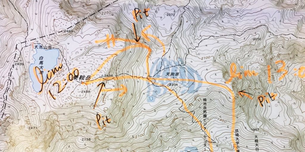
I used to spend weekends and holidays getting lost wandering in the mountains, so staring at topographic maps became a big part of my life. I also love that I get to interact with many journalists.
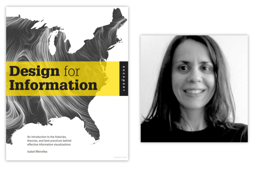
6 years ago, I picked up a book called Design for Information by Isabel Meirelles in my university library. That was my first encounter with information design.

I didn’t even know that data visualization was a thing back then, but I was always drawn to making sense of information and data through visual representation. I also loved the concept of maps, not just geographical, but conceptual too. I like searching for patterns and finding connections.
Last year, I read about the Dear Data project by Giorgia Lupi and Stefanie Posavec, and I really liked the concept of visualizing and seeing patterns in one’s daily life and sharing that with someone. Then I found Data Sketches, a project by Nadieh Bremer and Shirley Wu, which was my first time learning about d3.js. I slowly started reading more about data visualization, following newsletters and communities.
I’d really like to navigate the world of data and communicate it better. I’m learning web development, data analysis and design and I’d love to document the process and share the journeys for other newbies out there.
I get insecure about not having a specific skill or experience to offer, but I believe being a beginner can also be a skill. I can share my journey of going from zero to one.
Welcome, Aya! It’s great to have you here. If you, dear reader, want to learn more about Aya, make sure to follow her on Twitter (@ayatnkw).
Comments