
This article is brought to you by Datawrapper, a data visualization tool for creating charts, maps, and tables. Learn more.
How to use the new Python library “datawrapper” to create 34 charts in a few seconds

Today we’re happy to bring you a guest post by Sergio Sánchez, who’ll tell us how to automate creating charts with a Python library he built.
¡Hola! This is Sergio Sánchez, a research associate at the Public Policy Institute of California. I research higher education and migration policy in California.
I happen to love data visualization because of its capacity to convey complex information quickly and easily which is how I ended up using (and even writing a little about) Datawrapper. A few weeks ago Benedict Witzenberger had a guest blog post here announcing DatawRappr, the R package. That inspired me to write the Python equivalent. So here we are: A Python package for the new Datawrapper API called “datawrapper”.
How to use datawrapper (the Python library)
You need to know a little bit of Python to use this library (and I prefer to work in JupyterLab, so knowing Jupyter is another semi-requirement if you want to follow along my code).
First, we need to install datawrapper. To do so, we run pip install datawrapper or choose another way here.
Now we pass our Datawrapper API key to the Datawrapper instance:
from datawrapper import Datawrapper
dw = Datawrapper(access_token = "1234567890")
(If you have your API key exported as an environmental variable, you can skip this step.)
After that, we can check our account info to make sure it’s working with dw.account_info().
Now we can start creating charts. dw.create_chart() will return a Python dictionary containing the information of our newly created chart. This includes its ID, which we’ll need if we want to edit it later. For this reason, I’d suggest saving it to a variable.
The function create_chart() can take four arguments: title, chart_type, data, and folder_id. The most important one is chart_type. We can choose one of many ways to display our data (e.g. chart_type = 'tables'). All of them can be found in the Datawrapper API docs.
As an example, we can recreate Datawrapper’s API tutorial on how to create a chart but with a twist: We’ll use publicly available data found at IPUMS.org from the US American Community Survey to create a stacked bar chart:
This is the type of data I use day to day in my job as a public policy researcher. My research focuses around two topics, California’s colleges and universities, and immigration. For both topics, I use a lot of census data to look at demographic characteristics of certain geographies or people, i.e. to ask questions like “What is the educational background of those arriving in California in the past 5 years?”, like we are asking in this exercise.
So let’s see how we can create the chart above with the Python library datawrapper. Later, we will build even more charts: Using Python and Pandas, we’ll create one chart for California as a whole and one chart for each of the 34 counties for which the data is available. First, California:
california_chart = dw.create_chart(title = "California's Recently Arrived Immigrants",
chart_type = 'd3-bars-stacked', data = dw_data)
You’ll notice we are passing something called dw_data to data. create_chart() can take a Pandas DataFrame as its data argument and upload it to Datawrapper at the moment of creating a chart. Let’s take a quick detour to learn more about how this data looks:
Preparing the data
After getting the data from IPUMS.org, dropping some columns and aggregating the education variable into only three categories, I get a DataFrame with five columns that looks like this:
| year | perwt | countyfip | edu-three-cat | county |
|---|---|---|---|---|
| 2007 | 92 | 06037 | Advanced degree | Los Angeles |
| 2007 | 182 | 06077 | High school or less | San Joaquin |
| 2007 | 217 | 06065 | Bachelor’s degree | Riverside |
This is weighted data (each row represents more than one person), and it’s not ready to be used in Datawrapper yet. It takes two simple steps with Pandas to change that:
dw_data = data.pivot_table
(columns = 'edu-three-cat', index = 'year',
values = 'perwt', aggfunc='sum')
dw_data = dw_data.apply
(lambda x: x*100 / x.sum(), axis = 1).reset_index()
After this, our dw_data DataFrame looks like this:
| year | Advanced degree | Bachelor’s degree | High school or less |
|---|---|---|---|
| 2007 | 13.490163 | 24.928126 | 61.581711 |
| 2008 | 14.776653 | 25.3320222 | 59.903125 |
| 2009 | 15.518236 | 26.25654 | 58.231110 |
All we did was group our data by year and sum up how many people had an Advanced degree, a Bachelor’s degree, or a “High school or less” education. The second step was to calculate each column’s share of the total for that year. You can see all the code for this in this jupyter notebook on GitHub. Ok, back to the chart!
Editing & publishing the chart
To add a source for the data we can use dw.update_description:
dw.update_description(
 california_chart['id'],
 source_name = 'IPUMS',
 source_url = 'https://ipums.org',
 byline = 'Sergio Sánchez',
)
Because we’ve saved our new charts info to the variable california_chart, we can pass its ID to dw.update_description() like we would access any other key-value pair in Python, california_chart['id'].
In the tutorial, we also update the look of our chart. We’d like the bars to be thick and we want to use specific colors:
properties = {
 'visualize' : {
     'thick': True,
     'custom-colors': {
         'Advanced degree': '#15607a',
         "Bachelor's degree": '#1d81a2',
         'High school or less': '#dadada'
     },
    }
}
dw.update_metadata(california_chart['id'], properties)
After all this, we’ll want to publish our chart:
dw.publish_chart(california_chart['id'])Et voilá! We have published and customized our first datawrapper chart using Python!
Creating 34 Datawrapper charts automatically
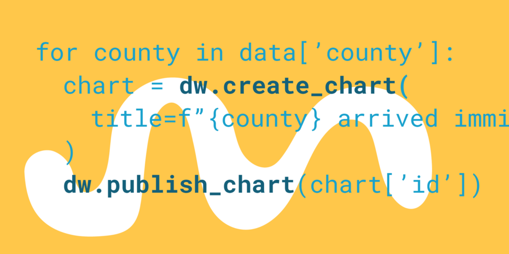
This is a basic workflow, but because it’s automated, we can scale things up. We can wrap this all up in a for-loop and create a chart for every county we have data for in just a couple lines of code! All with a consistent look and feel.
properties = {
    'visualize' : {
        'thick': True,
        'custom-colors': {
            'Advanced degree': '#15607a',
            "Bachelor's degree": '#1d81a2',
            'High school or less': '#dadada'
        },
    }
}
# For each county
for county in data['county'].unique():
    if pd.notna(county):
    # prep data
        mask_county = data['county'] == county
        dw_data = data[mask_county].pivot_table(columns = 'edu-three-cat',
index = 'year', values = 'perwt', aggfunc='sum')
        dw_data = dw_data.apply(lambda x: (x / x.sum()) * 100, axis = 1)
        dw_data.reset_index(inplace = True)
        # publish chart
        county_chart = dw.create_chart(title = f"{county} recently arrived immigrants",
chart_type = "d3-bars-stacked", data = dw_data, folder_id=13942)
        dw.update_description(
            county_chart['id'],
            source_name = 'IPUMS',
            source_url = 'https://ipums.org/',
            byline = 'Sergio Sanchez',
        )
        dw.update_metadata(county_chart['id'], properties)
        dw.publish_chart(county_chart['id'], display = False)
    else:
        print("Skipping! Null value.")
And that’s what we’ll see in our Datawrapper dashboard after running this code:
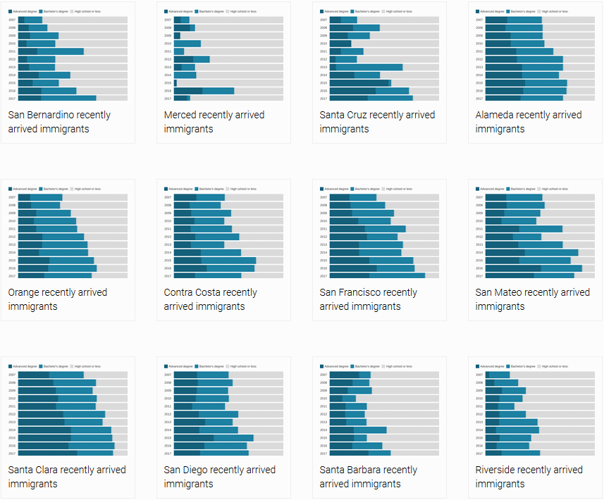
We just generated 34 Datawrapper charts in a few seconds.
But wait, there’s more
There is more we can do with Datawrapper’s API (like exporting charts!). Or we can get a chart’s iframe code to embed it anywhere we like:
dw.get_iframe_code(california_chart['id'])This means we can integrate awesome Datawrapper charts in our Python apps, Django websites, or anywhere we’re using Python.
You can find the documentation of datawrapper (the Python library) at datawrapper.readthedocs.io. Its code is available on GitHub. There’s even been one pull request already! (I’m looking forward to more.)
I hope you liked this tutorial/explanation of datawrapper, the Python package for Datawrapper. If you want to learn more about my work as a policy researcher you can find it here. Other projects are on my personal website soyserg.io or tacosdedatos.com, where I and other data-enthusiasts from Latin America and Spain write about data analysis and visualization in Spanish. Follow me on twitter at @tacosdedatos too!
Sergio is always happy about pull requests, so if you’re using Python (and Datawrapper!), consider helping him to build the best Datawrapper Python library out there (also the only one so far. But also the best!). If you’d like to write a guestpost yourself, get in touch with me (Lisa) at lisa@datawrapper.de. As always, I’m looking forward to hearing from you.
Liked this article? Maybe your friends will too:
NEWSLETTER
Sign up to our newsletters to get notified about everything new on our blog.


Comments