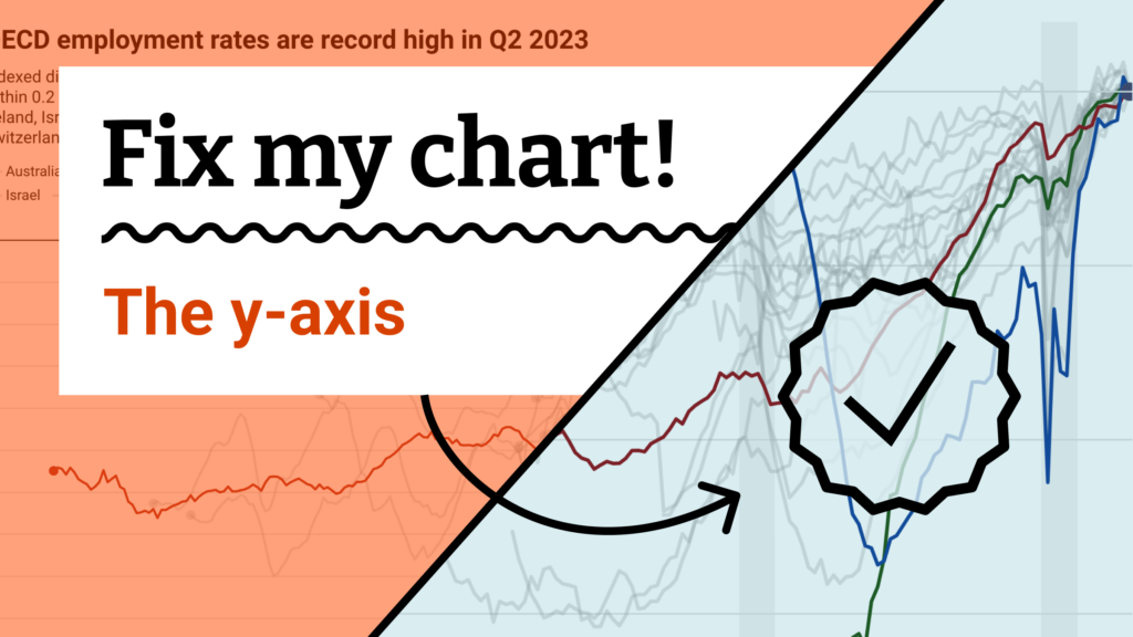
Fix my chart » The y-axis

Hi everyone, Rose here! Today we’re introducing something new on the Datawrapper blog: a data vis advice column.
You might have seen me before writing Weekly Charts (1, 2, 3), or heard me talk about observing the data vis world while writing the Data Vis Dispatch. But behind the scenes, most of my job is being an editor. Through formats like Map Stories or the Weekly Chart I work with my colleagues as they explore different visualization concepts and help them decide how to make their final charts, maps, and tables look as beautiful as possible.
Now I’d love to do the same for your visualizations too. My mailbox is open for your letters with questions, struggles, and every kind of data vis consultation. Use the submission form to write in and check back here for regular replies, including concrete suggestions for each visualization. I’m looking forward to hearing from you!
Dear Rose,
Please fix my chart!
I want to show my mainstream audience that the employment rates of lots of OECD countries have never been higher, but I’m afraid that readers won’t really understand. The official press release has charts as well, but they don’t scream RECORD, they’re just simple bar charts.
When I show the employment rates themselves, I get a huge mess, so I tried to use an index. But I showed it to my coworker and then my mom and they both didn’t really get it. I think they thought that every country has the same employment rate now? (Also, the difference between employment rate and unemployment rate is hard! I made the word “employment” bolder in the description, but not sure that works?) Maybe the not-indexed data is better after all?
Help!
Laura
Dear Laura,
You’re right! The measure you’re visualizing is tricky to understand. Unemployment is a familiar concept — an indexed difference from the current rate of employment just isn’t. But realizing that, and showing the chart to other people who helped you figure out exactly what the tricky parts are, is already a big step in the right direction. And luckily there’s still a lot you can do to help everyone grasp what this chart is saying.
Let’s get to work:

The way I see it, your main concerns about this chart all lead back to its y-axis.
- Can we help readers distinguish between employment and unemployment? Let’s label the zero baseline in words, not just in numbers:
Employment as of Q3 2023. - Will they understand how an index works? Let’s give a verbal explanation of how values relate to that baseline:
-5% from 2023. - Is it clear that employment has never been higher? Let’s keep repeating these concepts in symbolic terms, putting the whole y-axis and every tooltip value in terms of a negative percentage (
-11%instead of just plain11).
Here’s my full suggestion for a spruced-up version. For everyone reading along — click “Edit this chart” in the top right corner to explore a copy in your own Datawrapper account.
Til next time,
Rose
Does your chart need a tune-up? Write in here or fill out the form below!

Comments