This article is brought to you by Datawrapper, a data visualization tool for creating charts, maps, and tables. Learn more.
A real heatmap

Hi, this is Hendrik, backend developer and system administrator at Datawrapper. Lately, I’ve noticed some impressive Datawrapper tables for which our users used the fairly new heatmap feature. I somehow got stuck at the term heatmap – and decided to take a heatmap of myself.
Before we dive into the topic, I’d like to answer a few questions that might arise while looking at the chart:
- Yes, this is a real thermal image. A good hint for that is my (outstanding) nose being colder and thus darker than the rest of my face and my fingertips are colder than the palm of my hand.
- No, I’m not wearing sunglasses. These are my normal glasses I use for reading. While they are transparent to high wavelength visible light, they are blocking low wavelength heat radiation. This is how a greenhouse (and sadly global warming) works. Without glasses, I would look rather weird because my eyes have the same temperature all over and would be hardly visible.
- Yes, I’m wearing a hat indoors. This is because my hair seems to be bad in isolating my head, and I didn’t want to appear like a bald head man wearing sunglasses.
Speaking of isolating fur, here’s a thermal picture of my cat:

Now that the confusing thoughts created by the chart have been cleared up and we are done with the cat content, we can finally get on topic.
Why are they called heatmaps?
A heatmap in data vis terms doesn’t show faces or cats – but it also uses darker or brighter colors to make one dimensional (as in one value per field) data points visible in a regular grid (tables in Datawrapper).
The grid cells are then colored based on the cell’s value. Thermal image creators often use a coloring scheme that somehow resembles fire, or at least makes us think of cold and hot areas.
So while I believe thermal imaging is a bit older than heatmap style visualizations, the methods and the use case are very similar. Thermal imaging is basically a special case of heatmap visualization. (Interesting clusters of data are also often referenced as hot spots in visualization.)
I wanted to point out this similarity by creating a Datawrapper table based on thermal image data, so that the resulting table still looks like a thermal image (you can even hover over the fields to see the data).
The use of false colors
You might ask why it’s a common practice to use a color ramp (e.g., a gradient from bright yellow via red to dark purple) instead of just mapping the values to greyscale brightness (white via grey to black).
The answer to that question lies in the way our eyes work and how screens present information to our eyes.
While our eyes enable us to see from a range beginning in pale moonlight up to bright sunlight, we can not see intensities in that full range all at once. We get blinded by bright light.
Our screens are only good for a fraction of that range – and that range is typically split into 8-bit steps. That makes 256 possible intensity values with a single step (e.g. from 127 to 128) very hard to distinguish. Screens that can display more than 8-bit intensities are specially designed to make distinguishing steps in smooth ramps even harder.
This is exactly what we do not want for visualization!
We want to have a dynamic range that is by far higher than 8-bit while maintaining the ability to identify patterns of only subtle changes. Common HDR techniques taken from imaging do not help here because they work by exaggerating local contrast. They flatten out global changes in illumination and focus on local details.
This is where the different hues come in for visualization! We can use the hues to enhance the range of data our eyes can distinguish.
Here is an example of how using different hues helps us preserve the global distribution of values (not using HDR filters) by not only changing the brightness of the colors, but their hue too.
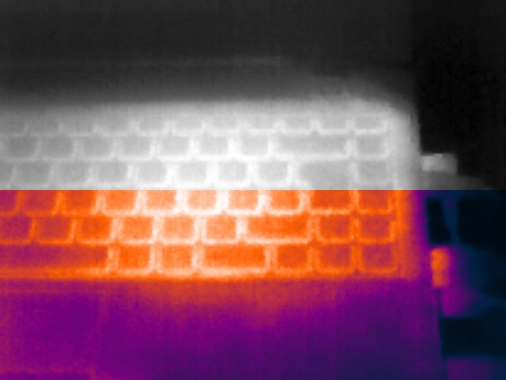
Both parts of the show my CPU glowing with heat through the keyboard of my laptop. The upper part uses plain intensity mapping; the lower part uses a color ramp like Datawrapper heatmaps provide. Now imagine looking at this image in bright sunlight, or at an old screen with bad contrast. The keyboard keys will be clearly better distinguishable in the colored parts.
I’ll leave you with another example of how color ramps help to improve perception. This is a so-called depth-image – not a thermal one this time – of a miniature model of the medieval city of Magdeburg (here’s a video of that model). The rainbow colors encode the distance to the camera. I took the image from a very flat angle, so the distance grows the higher you get to the image’s top.
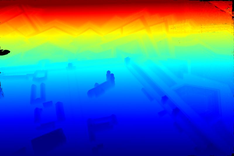
Without these rainbow colors, the buildings would be tough to recognize. Their variance in depth is very small compared to the global increasing distance.
I hope I was able to raise your interest in adding some heat(maps) to your tables. If you have any questions, leave them in the comments. We’ll see you next week!


Comments