

New: Automatically label data points in line charts
September 18th, 2024
3 min
This article is brought to you by Datawrapper, a data visualization tool for creating charts, maps, and tables. Learn more.

Last week we launched spike maps; now, we’re happy to introduce heatmaps to you. “More maps?” you ask? Well, yes – but only in the broadest sense. Our heatmaps don’t show data on a spatial map. Instead, they will help your readers to see patterns in your tables.
Let’s take the following table as an example. It’s merely a big table of numbers – until you turn it into a heatmap. Only then do some values jump out visually. The heatmap enables your readers to quickly skim the table for outliers and patterns in the data:
You can turn on the new heatmap option for only a few or all number columns in your table. Select the column(s) you want to see turned in a heatmap, and choose Show as heatmap.
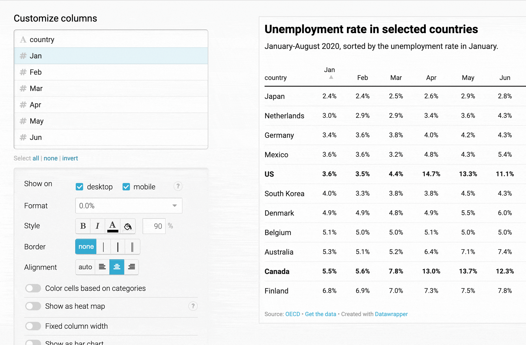
Note how the gradient automatically adjusts itself to the minimum and maximum number in the selected columns.
When you turn on heatmapping for your columns, you can still use all our other great table options. You can sort heatmapped columns, format them, change their column width, add a border – even add bar charts on top of the heatmap coloring!
And you’ll find more options for the heatmap itself at the bottom of the Refine tab:
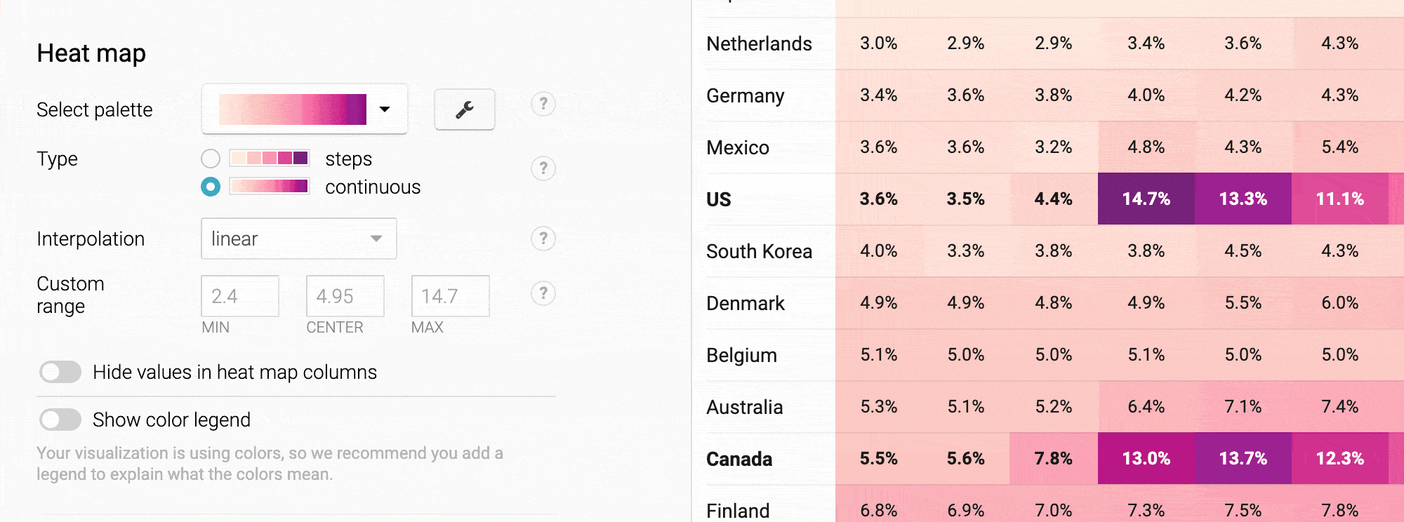
You can change the color gradient, switch to a stepped scale, define a custom range for your colors, turn on tooltips – or add a color legend. If you’ve used our symbol or choropleth maps since we updated them a few weeks ago, this color palette tool will look familiar.
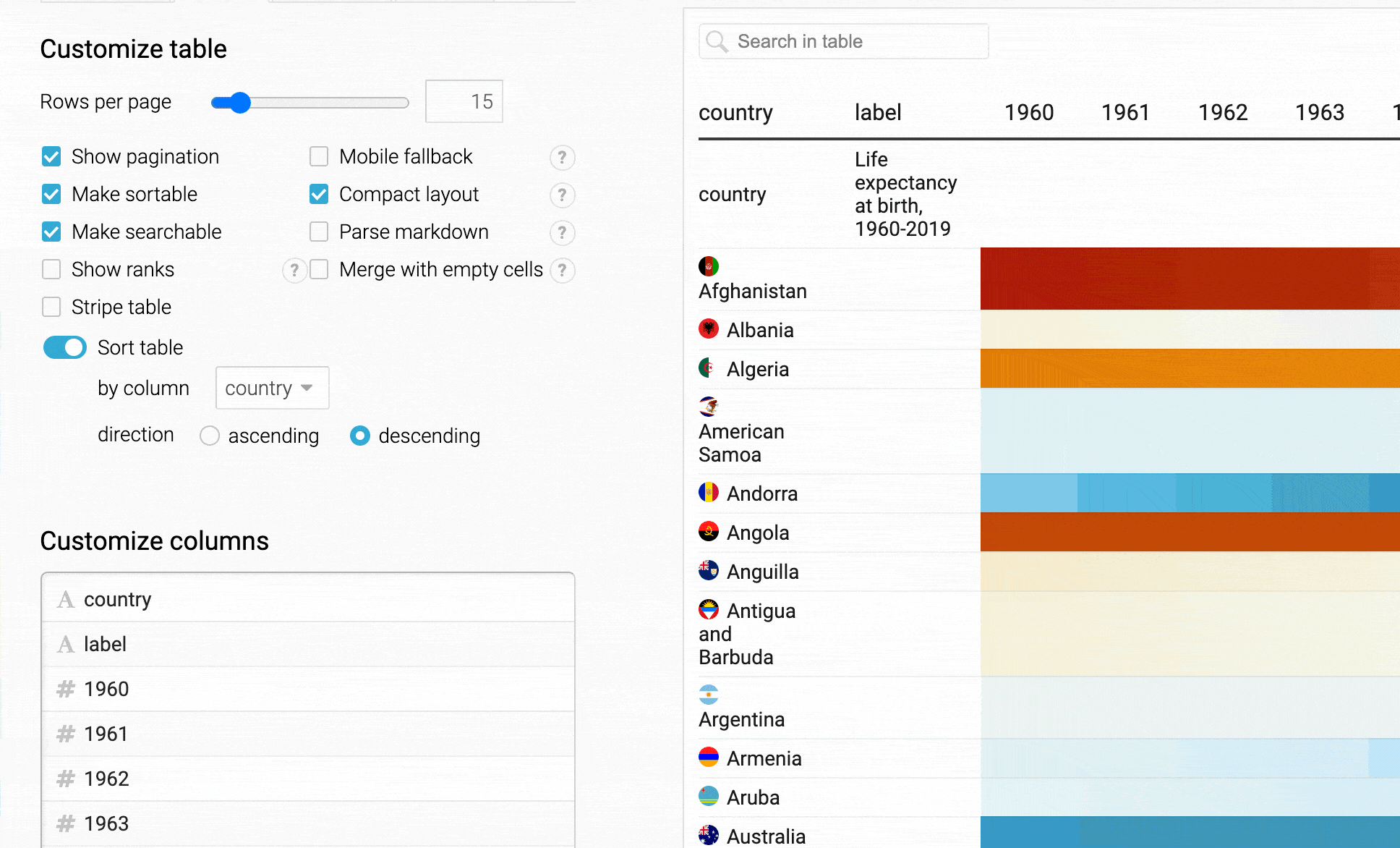
And here’s a pro tip: When uploading lots of columns, you can also hide the values in your heatmap and hide the header to create very narrow heatmapped columns:
If you want narrow columns, you need to hide the header. But you might still want to tell your readers what the data is about. To hide the header but still have this “extra header” that you can see above (“country”, “Life expectancy at birth, 1960-2019”), do the following:
When preparing the data, place the label you want to see above the heatmap in a second, otherwise empty row. Our “country” column header goes in the first column – above all the country names – and the “Life expectancy” column header goes in a second, otherwise empty column.
When customizing your table in the Refine tab, select Merge with empty cells at the top, then Hide header.
Then select your second row under Customize rows. In our case, it’s the “country” row. Now select both Move row to top of page (of it isn’t already there), and – if you have multiple pages – Show row on every page.
Here’s the whole process as a GIF:
And yes, our heatmaps come with tooltips for such cases. Try them out in the table above.
You could also upload empty column headers to arrive at the same narrow columns. The tooltips will automatically adjust and only show the cell value.
We hope you like this new feature for our tables and can’t wait to see what you’ll build with it. And as always, we love to hear from you. If you have questions, feedback, or hints, get in touch with us at support@datawrapper.de.


Comments