The world could be your oyster, but it depends on your passport
October 10th, 2024
4 min
Datawrapper lets you show your data as beautiful charts, maps or tables with a few clicks. Find out more about all the available visualization types.
Our mission is to help everyone communicate with data - from newsrooms to global enterprises, non-profits or public service.
We want to enable everyone to create beautiful charts, maps, and tables. New to data visualization? Or do you have specific questions about us? You'll find all the answers here.
Data vis best practices, news, and examples
250+ articles that explain how to use Datawrapper
Answers to common questions
An exchange place for Datawrapper visualizations
Attend and watch how to use Datawrapper best
Learn about available positions on our team
Our latest small and big improvements
Build your integration with Datawrapper's API
Get in touch with us – we're happy to help
This article is brought to you by Datawrapper, a data visualization tool for creating charts, maps, and tables. Learn more.

Hi, this is David. I’m working at Datawrapper since May on the design and user experience. It was a weird time to start a new job: Because of our working-from-home-during-the-coronavirus-crisis-policy, I started working remotely and haven’t met most of my colleagues in person yet. But I’m happy to have the possibility to work from home, especially in times like these. And I was wondering: Who else gets the chance?
I found the answer in a survey about the employment situation in Germany during the pandemic by the University of Mannheim[1]. They started the “Mannheimer Corona Study” on the 20th of March. Since then, they ask about 3.600 Germans weekly about how their life changed due to the coronavirus crisis – and among others, how their employment situation changed.
The following charts show how the participants replied in the week between the 3rd and the 10th of April:
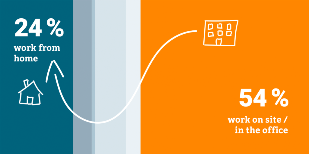
The coronavirus led to more people working from home. In 2019, 5,2% of surveyed German said they “usually” work from home while 7,4% did so “sometimes” (Eurostat 2019). When the University Mannheim asked their participants in March/April this year, 24% of them replied they work from home, completely or partially.
In May, the survey started to differentiate between “working completely from home” and “working partially from home”. Last week, 4-7 % participants said they’re still working completely from home, and 18-23 % worked partially from home. So while the number of people who work completely from home is about the same as in 2019, the number of people who work at least partially from home seems to be much higher.
But there are huge differences regarding economic sectors. Employees in the information and communication, energy supply or education sector were able to work from home far more than employees in accommodation and food service, water supply and waste management or human health and social work.
These differences also become apparent when taking a look at the employment situation by educational level:
The higher the level of education, the more likely the option to work from home.
The same seems to be the case for income: A greater share of high-income employees worked from home. And we can see that people who earned 1000 Euro or less per month and people with a low level of education reported leave, short-time work, and unemployment far more often.
The study and these charts show that the risks of the crisis are divided unequally and seem to amplify social injustice.
The University of Mannheim made the data for these charts available as PDF. The Datawrapper Academy article on How to extract data out of a PDF was helpful to figure out how to get it out of there – I ended up using Tabula to extract the data.
I then used the same chart type (stacked bar charts) and the same colors in all three charts to make it easier to quickly understand them. I also decided to show paid leave, unpaid leave, unemployment, and short-time work as individual categories instead of summarising them to “others”, as the report does in its charts. To still place the focus on work from home and on site/office, I put these two categories at the opposing ends of the bars.
I also used color to underline the difference. When choosing them, I got inspired by the articles about colorblindness that my colleague Lisa recently published on this blog (Part 1, Part 2, Part 3). I decided to play it safe and went with blue (okay, its a bit greenish) and orange – they’re easy to distinguish by colorblind readers.
That’s it for this week! This post was produced with a lot of help from Lisa, thank you. Let me know if you have any feedback or questions in the comments below. We’ll see you next week.
The data used here comes from the Schwerpunktbericht zur Erwerbstätigkeit in
Deutschland and Täglicher Bericht, which are both part of the Mannheimer Corona Studie (Blom et al. 2019) from the University of Mannheim and are licensed as CC BY 4.0.
Comments