
Remind readers of the colors in your data visualization
October 11th, 2023
12 min
This article is brought to you by Datawrapper, a data visualization tool for creating charts, maps, and tables. Learn more.
Part 1 of a three-part series on colorblindness
When visualizing data, you always use colors. And we at Datawrapper have written about color a lot. But if you don’t know any colorblind people, it’s easy to forget that your charts have readers who can’t tell colors apart as well as you do. Should you worry about them?
That’s not an easy question. How many of your readers are colorblind differs between regions, ages, sexes, and the kind of deficiency. For example, we know that red-/green deficiencies are far more common in men than women and that they’re more common for people with European descent than for Asians[1]. 8% of European men and 0.5% of European women seem to have some kind of red-/green colorweakness or colorblindness.
So if you have a designer blog or a website that’s just read by women, don’t worry too much. For everyone else, I wrote this three-part series about colorblindness. Here’s what the parts will cover:
That’s the article you’re currently reading! This week, you’ll learn about:
The basics
1. Colorweakness
2. Colorblindness
Color combinations to avoid
1. Red, green and brown
2. Pink, turquoise and grey
3. Purple and blue
The second part explains color combinations that work, colorblind-safe palettes, and other considerations. They all make it more likely that colorblind readers can read your charts – and that readers with normal vision can decipher them faster (win-win!).
In the third article, you’ll hear from then colorblind data visualization enthusiasts themselves, like our Datawrapper CEO David. You’ll learn if/how they perceive their colorblindness as an inconvenience in daily life and when reading (or designing!) charts and maps.
Let’s start with the basics:
The best explanation of why we see colors I found is this fun 5min video by Calder Hansen:
As the video explains, we see color because photoreceptor cells (also called cones) in our eyes react to certain light waves. We have three types of these cells: They’re either especially sensitive to light waves that translate into red-ish, into green-ish, or into blue-ish. If one of these cell types is not working properly, you’re at least a bit colorweak. If it doesn’t work at all, you’re colorblind.
So there are different kinds of colorblindness and three different kinds of colorweakness, one for each kind of cone type.
(There is also Achromatopsia, which is colorblindness in its literal sense: You can’t see any colors at all. None of your cones still work, just your sense for lightness remains. It’s extremely rare, so I won’t mention it in this article.)
Let’s see what the world looks like for your colorweak readers. Keep in mind that the lines are blurred between normal vision and a color vision deficiency. Your colorweak readers might see these colors better or worse:
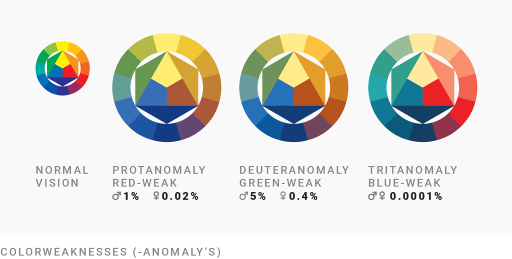
The colors look like there’s a retro Instagram filter put on top of them – but it’s still possible to distinguish between them. Red and green, blue, and yellow look different from each other. Colorweakness is far more common than colorblindness; around 6-7% of males[2] have some kind of colorweakness.
The names of these types of colorweakness sound complicated, but they’re simply the Greek words for first, second and third and the word for anomaly. So Protanomaly means “first anomaly”, Deuteranomaly means “second anomaly” and Tritanomaly “third anomaly”. The order of colors is the same as in RGB: red, green, blue. So the first anomaly, Protanomaly, is a red-weakness.
Let’s move on to colorblindness. Colorblind people have one defect cone type: They’re either red-blind, green-blind, or blue-blind. People with good vision see 10 million colors. Colorblind people see less.
Colorblindnesses are named like colorweaknesses, except with the ending anopia. a- means “no/not” and -opia means “vision”, so anopia means “no vision”:
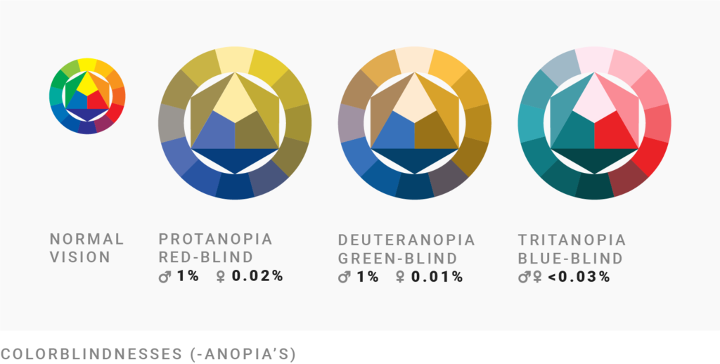
Yes, this is worse. The bad news is that colorblind people can’t distinguish at all between certain colors: Your red-blind and green-blind readers can’t tell red and green apart, or orange and light green. For your blue-blind readers, blue and green looks the same.
The good news is that colorblindness is uncommon; at least less common than colorweakness. Around 2-3% of men are colorblind.
Every 12th men and every 200th woman of Northern European descent has some kind of red/green color deficiency. They’re either colorweak or colorblind. If 500 people see your visualization, 24 of them might have problems to read it because of it. So here’s what to avoid.
(Red-blindness and green-blindness are so similar that I cover them together. I leave out explanations for the very rare blue-blindness.)
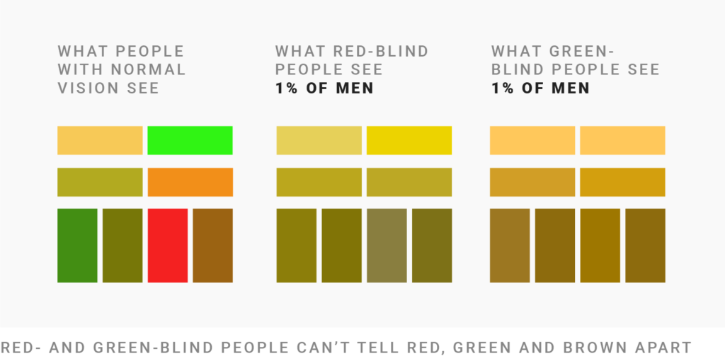
Red- and green-blind person have problems to distinguish between red, green and brown, if their brightness is the same. Note that saturation doesn’t play a role. ⬤ is far more saturated than ⬤, but they both appear as ⬤/⬤ to red- and green-blind people.
Also note that red doesn’t signal “danger, attention!!” for red- and green-blind readers, as it does for readers with normal vision:

Left: What people with normal vision see. Right: What green-blind people see. Photo by Jos van Ouwerkerk, Pexels.
You can see this in the photo above. The red traffic light doesn’t stand out from the green trees in the background.
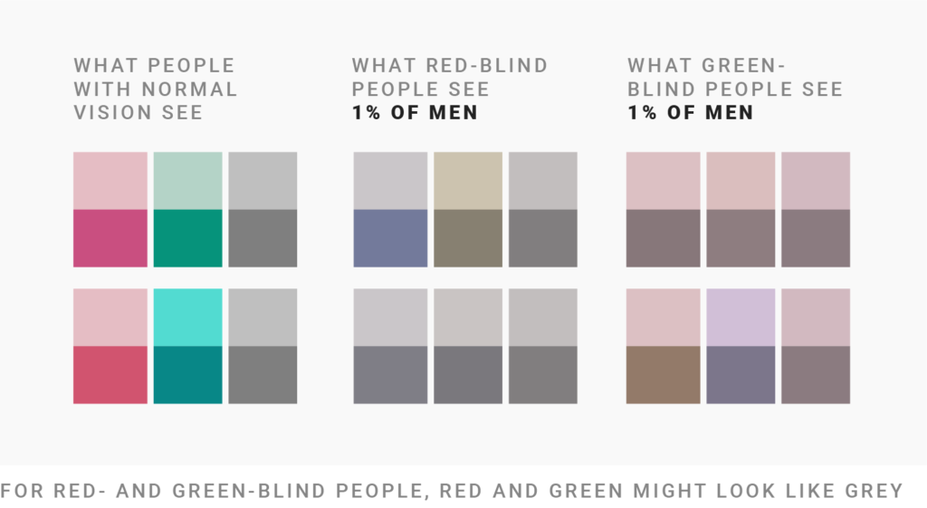
You can also see on the photo above that the light green ⬤ of the traffic light looks like a light pink ⬤. But the grey of green-blind people also has a pink-ish tint to it, so ⬤, ⬤ and ⬤ all look like shades of grey to green-blind people.
The same is true for darker colors: ⬤ and ⬤ become ⬤ for red-blind people. Note that elements with these colors won’t get the attention of colorblind people when they stand in front of grey gridlines.
The “greyness” of colors depends if you’re red-blind or green-blind; so make sure to check for both types of colorblindness.
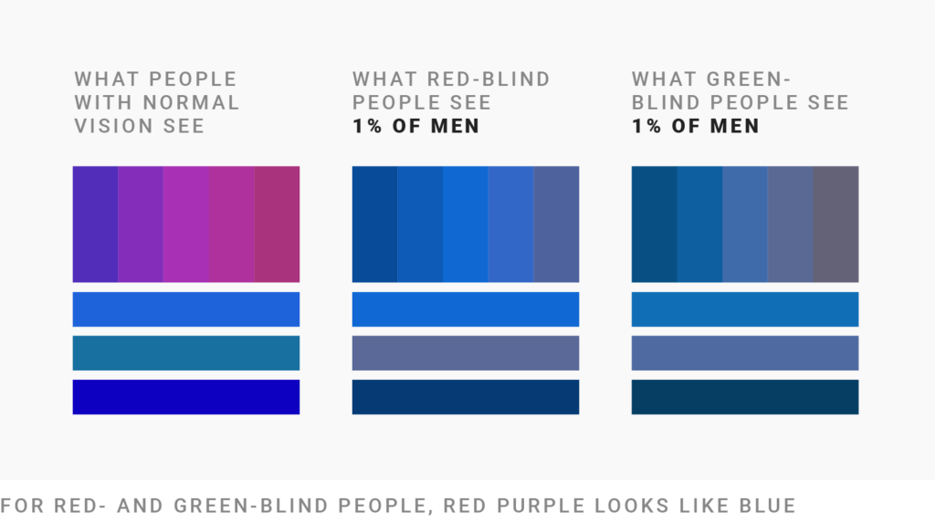
For red- and green-blind people, a red purple looks like blue. For example:
This also applies to lighter or darker purple colors. Your red-blind readers will see a blue, no matter if you present them the color combination ⬤⬤⬤ or ⬤⬤⬤.
That’s it for this week! If there’s something I should mention in this article or something I got wrong, please let me know at lisa@datawrapper.de or in the comments below. Click here to read the next article in the series and to learn which colors work well and which tricks exist to enable colorblind people to read your data visualizations.
The metastudy by Jennifer Birch in 2011, “Worldwide prevalence of red-green color deficiency”, “confirms that the male prevalence of deficiency in European Caucasians is about 8% and that the prevalence in Asian populations is between 4% and 5%.” ↩︎
I couldn’t find consistent numbers for the different kinds of deficiencies (even this Wikipedia chapter contradicts itself), so don’t rely too much on the numbers I state in this article. ↩︎
Comments