
New in symbol and choropleth maps: cropped view and inset maps
April 12th, 2024
3 min
This article is brought to you by Datawrapper, a data visualization tool for creating charts, maps, and tables. Learn more.
Ideas on what and how to report. Plus: live-updating poll tracker.
Graphics reporters and journalists have been busy this year with reporting on the coronavirus pandemic – and now the U.S. elections are around the corner, too. On Tuesday, 3rd of November (and days and weeks before with lots of letters), U.S. citizens will decide on all House seats, 35 Senate seats, and if they want to call the Republican Donald Trump or the Democrat Joe Biden their next president.
It’s an important election. We expect you might want to cover at least the Presidential part of it – and that’s what we’ll focus on in this blog post –, even if you’re not from the U.S., and even if you don’t have the team or the capacity to create a big election dashboard.
Here are some ideas on which data to cover and how to do so.
A word ahead: We won’t offer any live-updating charts on election night. However, the friendly people from FiveThirtyEight put their election forecasts on Github. We used them in some of the following charts, maps, and tables. They will update once a day. Feel free to re-use all of the following visualizations, no matter if they come with live-updating FiveThirtyEight data or test data: Hover over the visualization of your choice, click on “Edit this chart”, change the data if necessary, and then publish & embed it.
While most people in many states have been voting either Democrat or Republican for years – and polls show that they plan to do the same this year –, “swing” or “battleground” states will decide the election. Most newsrooms focus on them and how little we know (so far) about who will win in these states. To do the same, you can show a map like the following:
When creating the symbol map above, the challenge is to place symbols in the middle of each state. To do so, you’ll need the longitudes and latitudes of these center points. You can get them from this Google Sheet we prepared for you.
If you hover over the map, you’ll see bar charts in the tooltips. To create them, you’ll need to style many divs: Each bar section is a div with a width that’s decided by data columns. You can learn the basics in this Academy article. To copy and paste the HTML code for the tooltip, click on “Edit this chart” and get it in the “Customize tooltip” section in the Annotate tab. Tip: Edit the tooltip in an HTML editor like Atom or Sublime before pasting it back into Datawrapper.
Here we decided to use a symbol map instead of a choropleth map. After all, electoral votes will decide the election, not land area. When mapping election polls or results on a state level, consider using symbols on top of the state’s boundaries as we did. The symbol sizes represent the number of electors for this state.
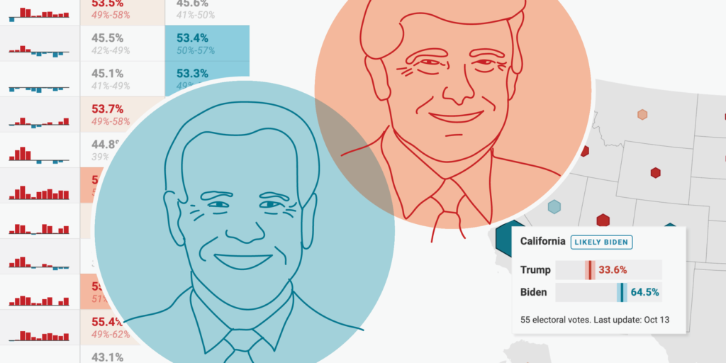
In addition to a map, consider showing a table with detailed information. A table has the advantage to be sortable. Here we sorted it by the difference in the estimated votes for Trump and Biden, to show the swing states first:
To create the "last eleven elections" column, use our "Show selected columns as tiny charts" feature.
Markdown comes in handy to make the forecasted vote share bigger than the margin of error below. Your data needs to be in a format like 52.7% ^49%-57%^ for that.
And you can use the "Color cells based on categories" option to color the votes columns by a hidden column that categorizes the winning chances.
The last column is then a simple bar chart that you can create with a click on the "Show as bar chart" button.
The U.S. Presidential election will be decided with electoral votes. So many newsrooms show a version of the following line chart:
To create the confidence intervals in Datawrapper line charts, use our "Fill area between lines" option. Then set the line width of the upper and lower range to zero.
To make the names of Trump and Biden bold, write HTML tags in the column headers, like so: ... for <b>Trump</b>.
You can give your readers a concise idea of how many electoral votes (are estimated to) go to which candidate with a stacked bar chart. You will find it in many election dashboards at the very top:
In the chart above, we highlighted the 270 votes a candidate must reach to win the election with first turning on grid lines and then setting a custom axis tick at 270.
But there's another way. Here's the same chart, but it highlights the 270 votes even more:
To add the line and the "270 votes are needed to win the election", you'll need to write and style both in the Notes text field, like so:
<b style="text-align:center; display:block; font-style:normal; margin-left:-1%; margin-top:-50px; font-size:15px;">⎹<br>⎹<br>270 votes are needed<br>to win the election</b><br><br>Electoral votes as forecasted by FiveThirtyEight. Darker colors mean more likely votes. Grey votes are from uncertain states. 270 electoral votes are needed to win the election. The line is a Unicode character ⎹ that you can move over the bars with margin-top:-50px. Set the text below the line and then place both in the middle of the chart with text-align:center.
You can also split up the bars to show a plainer comparison that also works well for small screens:
To color all five parts of these stacked bars differently, put your data in five columns: safe for Biden, lean Biden, safe for Trump, lean Trump, uncertain. Only fill the cells that apply, e.g., "safe for Biden" and "lean Biden" in the Biden row.
Because of the coronavirus pandemic, lots of voters vote by mail. It will take days (maybe weeks?) for all the votes to be counted so that the election coverage will drag on. Consider letting your readers know when they can expect results and which states have already called a winner.
For this table, add empty rows before each timestamp to give them a bit more room to breathe. Then style the time stamp rows and the first row individually with the "Customize rows" option. Consider hiding the actual header row – it's not needed here.
To color the called states, add a hidden "called" column and use this one to "Color cells based on categories."
You can do the same in map tooltips:
To create a tilemap like this one in Datawrapper, choose "Choropleth map" in the map menu, search for "tile" and then choose the "USA » States: electoral college (hexagons)" map.
After the election comes the time where everyone analyzes what just happened. Consider the following chart types to do so:
Here's part of what the stacked bar chart showing voter demographics could look like:
To group your stacked bar chart (or arrow chart, range plots, dot plots, etc.) in Datawrapper, create an additional text column with the category name. Then "Group bars by column" in the Visualize step.
Maps are essential for election coverage. If you're a U.S. organization, your readers will want to know the results from their home county. That's why Datawrapper lets you create county maps for each U.S. state:
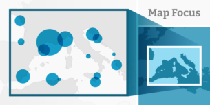
There are also lots of U.S. maps to choose from in Datawrapper. You've already met two in this article: the U.S. tilemap sized by electoral votes and the U.S. state map. Here are a few more:
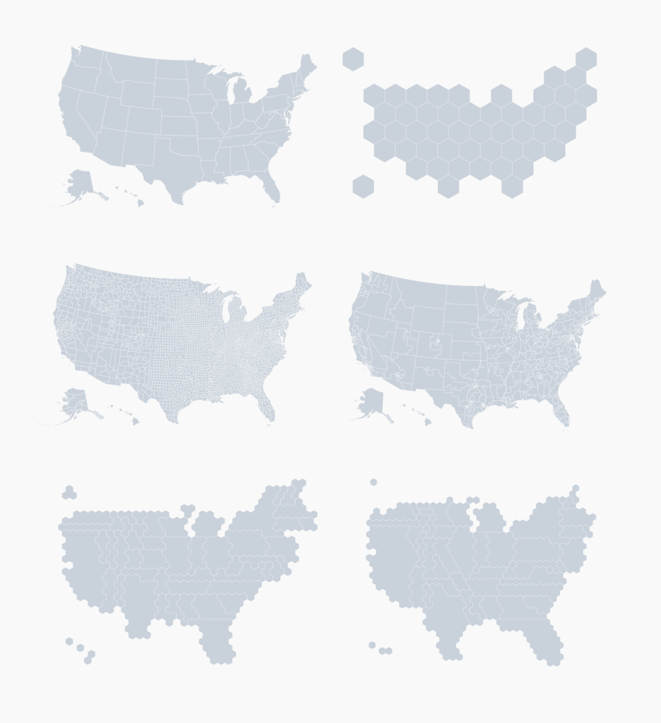
In total, you'll find more than 2000 maps in Datawrapper. You can see the whole collection in our map selector (no need to sign up). If you don't find what you're looking for, get in touch with us at support@datawrapper.de or upload your own GeoJSON.
To get more inspiration for how you could visualize election data, visit the dashboards that newsrooms created for the 2016 and 2018 elections: Guardian, BBC, Washington Post, Financial Times, Bloomberg, Politico, New York Times 2016, New York Times 2018.
You can also have a look at the poll trackers that some newsrooms have created for the 2020 election: the Economist, New York Times, Financial Times, BBC, Guardian, Washington Post, FiveThirtyEight.
We hope that these visualizations provide a good starting point for your election visualizations. To use any of the ones above, hover over them and click on "Edit this chart". This will lead you right to step 3: Visualize. From there, you can either change the data (source) and the title, labels, colors, etc. – or you can directly publish your visualization to get the embed code. Any questions? Let us know at support@datawrapper.de.


Comments