

New: Automatically label data points in line charts
September 18th, 2024
3 min
This article is brought to you by Datawrapper, a data visualization tool for creating charts, maps, and tables. Learn more.
Since our big dark mode announcement at the end of January, we’ve made a lot of smaller improvements and updates to the Datawrapper app and to specific chart types. Here’s what’s new in Datawrapper from the past few months.
Accessibility is important to us — and to your readers. We improved several accessibility features in our tables, including:
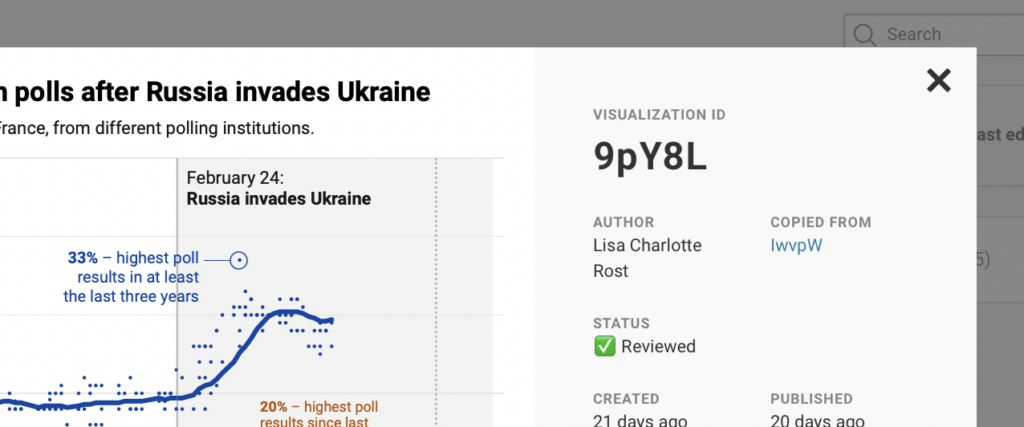
In the first few days of Russia’s invasion of Ukraine, many of you asked us to add new, war-related icons to our locator maps. So we did. We hope the eleven new icons for things like tanks, battleships, and radiation won’t stay in the news for long.
Bars in bar charts can now be colored by a date column. We also fixed a bug that prevented coloring bars by auto-generated labels.

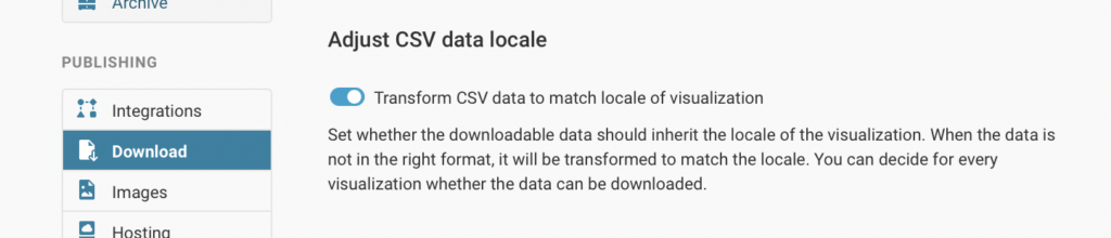
You can now define an output locale for data downloads, so that their number formatting will match your visualization’s. If you’re a team admin, you’ll find this option in team settings under Download. If you choose to leave it turned off, the Get the data links in footers will generate a CSV file with U.S. number and separator formats (en-US: 1000.99), just like they did before.
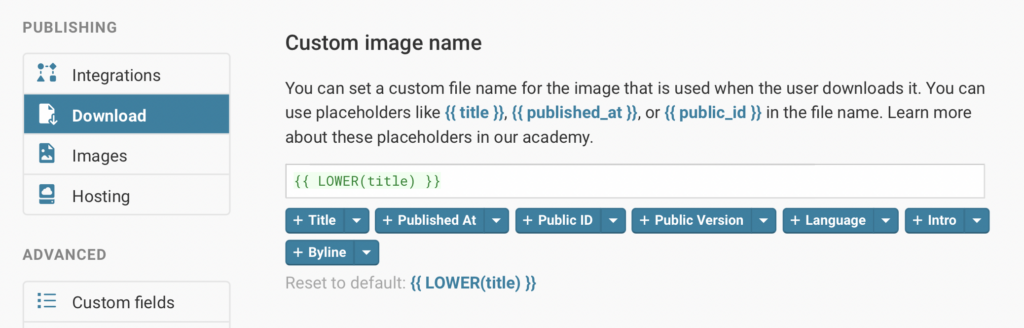
If your team is on a Custom or Enterprise plan, you can also define a file name to be used when readers download an image of your visualizations.
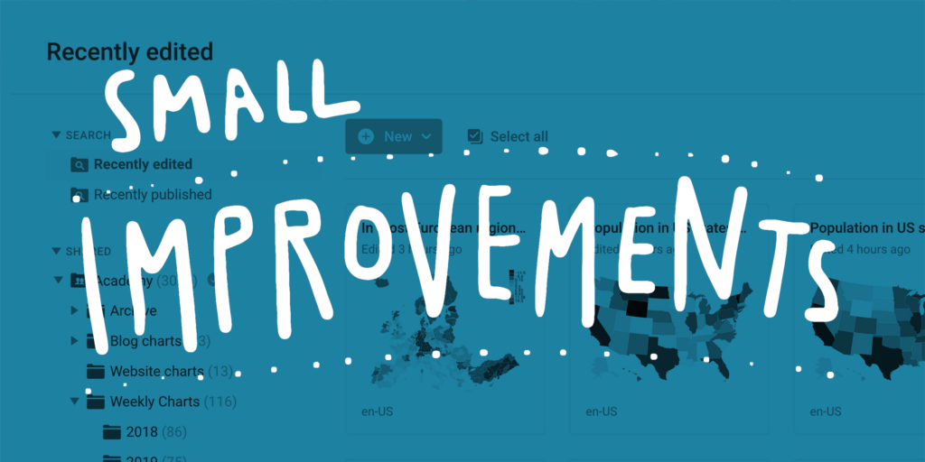
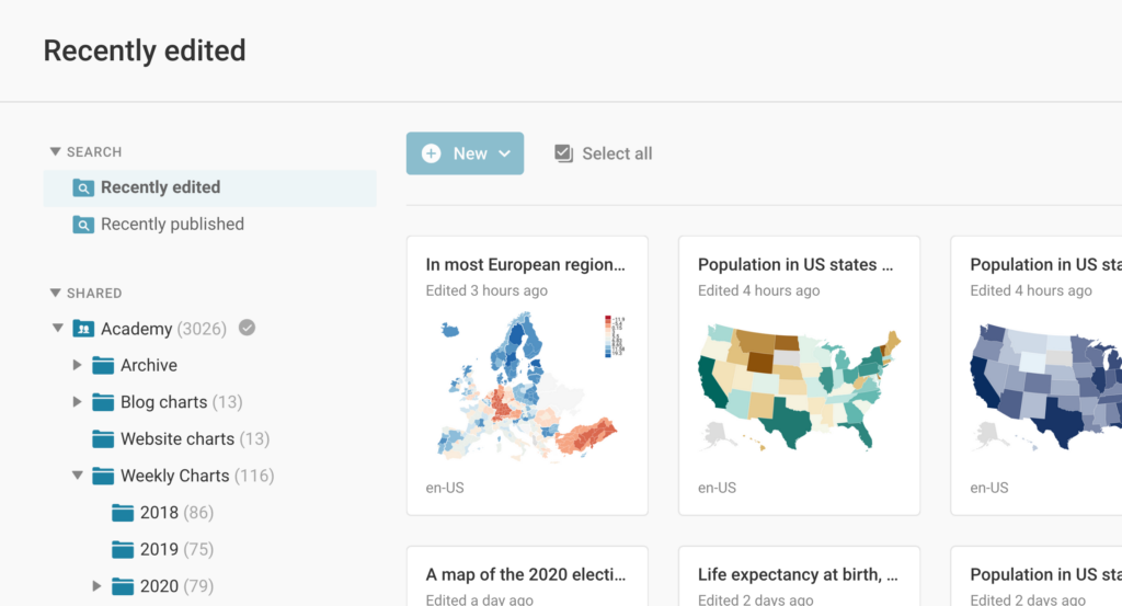
You can now view all recently edited or recently published visualizations in your archive on the top left. Charts will appear there no matter what team or folder they were created in, including your private folders.
If your team is on a Custom or Enterprise plan, you’ve already been able to create a custom field to display in your archive. Now, those fields will also appear when you view the details of a visualization.
You can now add a border to your PDF exports, so they’ll look beautiful anywhere. PDF exports are now also supporting OpenType font features like tabular numbers.
If your external data file doesn’t use Unicode, Datawrapper will now detect and convert its character encoding.
Finally, we added support for the Macedonian, Tajik, and Turkmen languages in all visualizations. You’ll now be able to create charts, maps, and tables that use those languages in numbers, dates, and footer text. We also improved our support for Arabic script in chart descriptions and axis labels.
Last but not least, every month brings new basemaps to use as the foundation for your choropleth and symbol maps. In the past two months we’ve added:
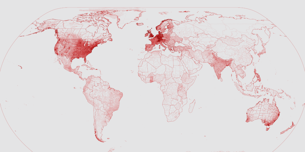
By now, we offer more than 2875 maps that you can use to plot your data on. Are you missing one? Our map expert Anna will happily add it for you. Get in touch with us at support@datawrapper.de.
These were just some of the recent improvements we’ve made to Datawrapper. You can find all the latest news and stay updated by visiting our changelog. Have a question, feedback, or feature request? Get in touch in the comments, on Twitter (@Datawrapper), or at support@datawrapper.de. We’re looking forward to hearing from you.


Comments