
This article is brought to you by Datawrapper, a data visualization tool for creating charts, maps, and tables. Learn more.
KFF: “We are all-in on Datawrapper”
How Datawrapper went from one person’s discovery to an organization’s tool of choice

It’s often one person’s initiative that brings Datawrapper to their company. At KFF, a nonprofit research center for healthcare policy in the U.S., that person was Rabah Kamal. As a policy analyst on the Peterson-KFF Health System Tracker, Rabah got her whole department using Datawrapper back in 2017 — and when we first interviewed her about that transition two years later, it already sounded like a story with a happy ending.
But KFF is a big organization, and the Health System Tracker is just one part of it. So when we heard this spring that Rabah had moved on to a new job, we were curious — in the end, was Datawrapper just a pet project or had it grown deeper roots across KFF? What we found is the story of how Datawrapper goes from being one person’s discovery to a whole organization’s tool of choice.
Part I: Discovering Datawrapper
The story begins in 2017, with a major website redesign at the Peterson-KFF Health System Tracker. “The Health System Tracker is a nonprofit, nonpartisan source for information on U.S. health care costs, accessibility, and quality,” Rabah explained to us. “We work closely with journalists and policymakers to help them quickly understand a lot of complex information. And visualizing data is a huge part of that.”
“The website had grown a lot from its early days,” she continued, and their old workflow — building PowerPoint charts and exporting them as PNGs — just wasn’t adequate. “We really wanted to figure out the data vis aspect of the website; we wanted to make it more engaging. And ultimately, I landed on Datawrapper.”
Datawrapper versus in-house tool
“We don’t need to reinvent the wheel”
There was another option on the table. “At the time, our developers were actually working to create a customized D3-based chart generator,” Rabah told us. But the project was dragging on: “It was a huge commitment to design a tool with different chart types that could adapt to different data. The process felt endless.” The tool was a time sink, and colleagues from outside the development team struggled to use it in its half-finished state. “Everyone has an interest in policy at KFF,” Rabah explained. “But not everyone comes in with experience working with data or presenting it. Making charts needs to be intuitive, something that people can jump into with just a little orientation. And with all the workarounds that we had come up with to build our own chart tool, I was basically the only person who could use it. That’s not efficient!
“I said to myself, ‘This is not sustainable. And we don’t need to reinvent the wheel.’ I tried a lot of existing tools, and in the end, Datawrapper was the one that met our visual and workflow needs. And so when we launched the redesign of our site in 2017, we worked with our developers to build Datawrapper chart embedding right into our site’s back end.”
Rabah’s team sees results
“Sparking curiosity”
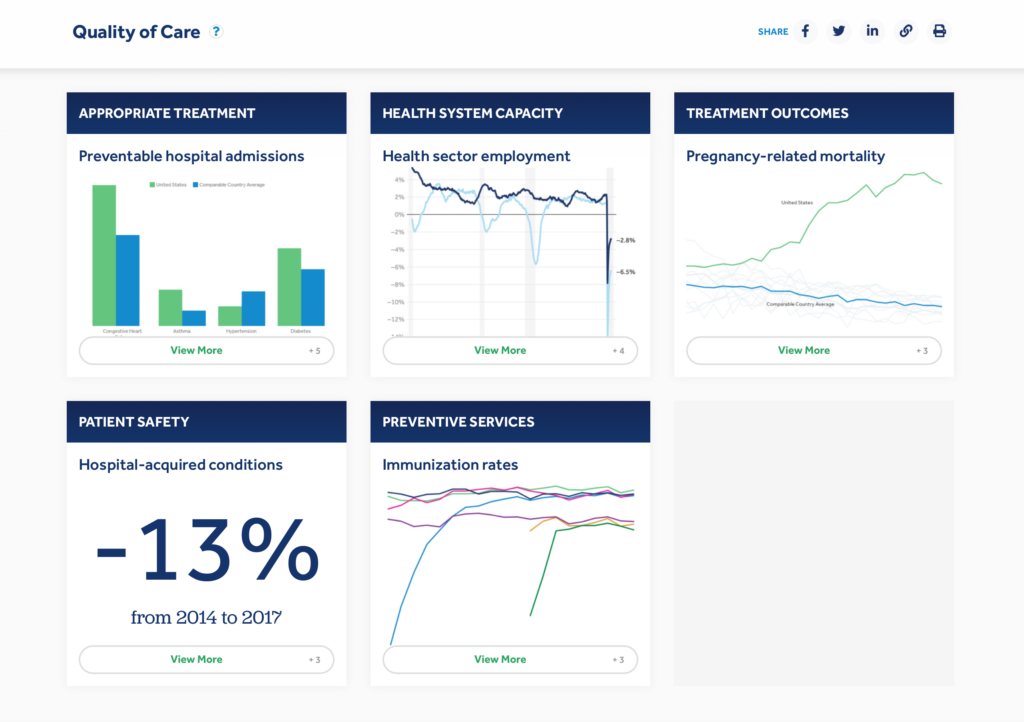
The core of the new website was a data dashboard about the U.S. healthcare system. “That's been a cool place to have Datawrapper charts,” Rabah noted, “because it would be easy for the dashboard to look too complicated, given the complexity of this information. What I like about Datawrapper is that it pushes us to show only what we need to show. Having that clean look, with the visuals as standardized as possible, was really important.”
Most importantly, the new tool was one that everyone could use. “Datawrapper has always been pretty intuitive for people — they can play around, make some practice charts, and easily catch up on what Datawrapper is capable of. It's comforting to know that we can easily bring new people in.” That didn’t just lighten Rabah’s workload; it improved the quality of her team’s data visualization. As she explained, “It’s been cool to see on my team how new people working with Datawrapper will come up with something really creative. There's enough flexibility that you don't have to stick with the way you've always done things.”
Part II: Spreading the word
“Rabah brought all of KFF on board with Datawrapper,” says Nisha Kurani. “Which is fantastic.”
It’s now 2021, and the past two years have been busy ones for data vis at KFF. Datawrapper has become the tool of choice across all program areas — so today we're sitting down not only with Nisha, a policy analyst working on the Health System Tracker in a similar role to Rabah’s, but also with Ashley Kirzinger, an associate director on the Public Opinion and Survey Research team, and Lydia Zuraw, a web producer for KFF’s media arm, Kaiser Health News. Together, they filled us in on their departments’ data vis needs and how they’ve met them with Datawrapper.

KFF embraces Datawrapper
“Sophisticated and simple”
Although they work on different project areas, all three women face the challenge of communicating complex topics to a very broad readership. “The audiences are policymakers, journalists, interest groups, and the public,” Ashley explains. “So the data vis has to be sophisticated enough that it looks credible to senior-ranking government officials, but simple enough that a general audience can understand it.”
To get the message out, it’s important that charts be easily sharable. “A big part of our news distribution model is sharing content with partner organizations,” says Lydia. “Our stories are on cnn.com, NBC News, The Washington Post, all kinds of places. Datawrapper is an industry standard for data vis in journalism, and that’s made sharing really easy. It's easy in technical terms to share the embed codes, but also the fact that so many other newsrooms are using Datawrapper means that our partners are already familiar with the tool. For example, recently time.com wanted to run this graphic that we made, but make it match their site’s style. I was able to connect with them through Datawrapper and send them a copy of the chart, which they then transformed into their theme. The collaborative elements are so much easier to deal with with Datawrapper than with other tools.”
Datawrapper support
“Always a good experience”
Everyone agrees that Datawrapper’s support team was a major help in making the switch. “We’ve always had a really good experience with Datawrapper responding to feedback and requests,” Lydia says.
"A big focus of the Public Opinion and Survey Research team since late 2020 has been our COVID-19 vaccine monitor,” Ashley tells us. “That’s our ongoing tracking of Americans' attitudes towards the vaccine and vaccination rates. In November, our CEO said that he wanted all of that data on a separate site, visually different from the KFF site, and that we needed to get it up and running by January. Datawrapper and Tableau were the main options we considered, and we built mocks for both. It was the responsiveness from Datawrapper support that made us think ‘Oh, we could actually pull this off.’ Designing a template for the vaccine monitor charts, and getting the new colors and branding — with Datawrapper, we’d get a response in hours, and with Tableau it would take much longer and was a bit more finicky. We only had two months to create this website, so it was a very quick turnaround, and it wouldn’t have been possible had we not had that kind of responsiveness from Datawrapper.”
In this respect, nothing has changed since Rabah’s day. As she put it in 2019: “Datawrapper as a team is clearly invested in the art of visualization. It was never just, 'Here is a product you can purchase.’ Everyone on the support team has been very responsive about changes and customization, and everyone was very patient with those tweaks to get the theme just right. I really appreciate it, because creating a brand that's recognizable does come down to those little details. It’s been nice not just to have the design customization, but to work with people who are thinking about what the implications of it are, what the utility of it is."
Two years after we first spoke with Rabah, the future of Datawrapper at KFF is looking bright. “The simplicity of Datawrapper, along with its extensive functionality, makes for really effective communication,” says Nisha.
“I love the functionality,” Ashley agrees. “And the charts just look appealing. Yeah, we are all-in on Datawrapper.”
Thanks so much to Rabah, Nisha, Ashley, and Lydia for taking the time to speak with us! To see more KFF charts, you can also follow along on Twitter @KFF.
Liked this article? Maybe your friends will too:
NEWSLETTER
Sign up to our newsletters to get notified about everything new on our blog.


Comments