
This article is brought to you by Datawrapper, a data visualization tool for creating charts, maps, and tables. Learn more.
London City Hall: “Datawrapper has sparked a change”

When Mike Brondbjerg joined London’s City Intelligence Unit back in 2018, he knew he was taking on a challenge. Overnight, Mike went from working for himself at a boutique design agency — “more art, less chart,” as he describes it now — to overseeing data visualization in an office of dozens of researchers for the Greater London Authority.

“The Greater London Authority was set up to do more strategic thinking around London,” Mike explains, “and the City Intelligence Unit produces analysis and reporting for other teams and for the public. When that analysis work is published, we’d like to make both the data and the publication as engaging, open, discoverable, and reusable as possible. Datawrapper helps with that.”
In the past three years, the unit has put out a steady stream of reports, dashboards, and infographics for readers in government, business, and the public — no small feat with a data design staff of one. Mike sat down to tell us how Datawrapper enables his work translating the team’s specialist expertise for a broader audience.
The City Intelligence Unit is full of experts — a “50-strong team of economists, demographers, analysts, data scientists, and GIS people” — and crunching numbers has always been its mission. But Mike found that these “masters of Excel and R” were often lost when it came to visualizing their results, particularly if charts needed any kind of interactivity[1]. “People were creating data visualizations all the time, but it would be at the end of their process,” he recalls. “And they were overwhelmed. Anyone can look at the charts that Excel spits out and go, ‘I know it’s not right.’ But they didn’t know how to fix it. And it’s difficult when all you’ve got is Excel!”
Mike needed a tool the staff could work with to create charts their readers would understand. “You might be an economist, but you’re not a developer; you might be an analyst but you’re not a graphics person. I was trying to find a solution that everyone could use.” That solution was Datawrapper. “For user interface and design thinking, Datawrapper stands out. The clarity and readability is great.”
Mike’s reason for choosing Datawrapper is simple: “It’s just really easy. It’s really easy to use.” In his words, “Getting colleagues on board with Datawrapper is painless thanks to its simple and consistent approach to importing, visualizing, and refining the charts.”
Extra hands are particularly welcome for keeping online dashboards and other routine charts updated. “A number of colleagues, not technical staff, are using Datawrapper to maintain our economic fairness pages,” Mike reports. “That has lots and lots of little charts, but Datawrapper lets us create them to a higher standard with less effort.”
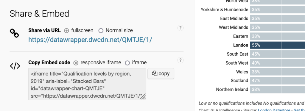
It's not only making the charts that's easier with Datawrapper, but publishing them too. "Sometimes you're limited by the platform itself," Mike notes. "London Datastores is where we keep all our data but also where we talk to the world — and the publishing platform is basically a WordPress site. Datawrapper makes it easy to get interactive charts online when our content management system (CMS) has limited ability to publish code. The ease of embedding is key."
All in all, Datawrapper's ease of use doesn't just benefit others — it's changed Mike's own workflow. Now that each chart doesn't eat up days of his time, visualization isn't an afterthought but a part of the analytical process. "You don't want to spend weeks building an elaborate D3 solution and then go, 'Oh the data isn't quite what we thought.' You want to be quick, have a back-and-forth: 'Give me the same data, but for this borough or this demography.' That's where I head straight for Datawrapper."
Luckily, quick work doesn't have to mean rough results. "With Datawrapper, the default is great, whereas often with programming libraries you've got to do a lot of work to make them look good," Mike says. "And a lot of the work we do is fairly routine and doesn't need huge amounts of customization. Illustrator is good to a point, but Datawrapper can make all these decisions and lay things out nicely for you. Even before making any changes to the layout, the default design decisions take you 90% of the way there. The charts blend in nicely, too — I like that they don't shout, 'I'm a Datawrapper chart!'"
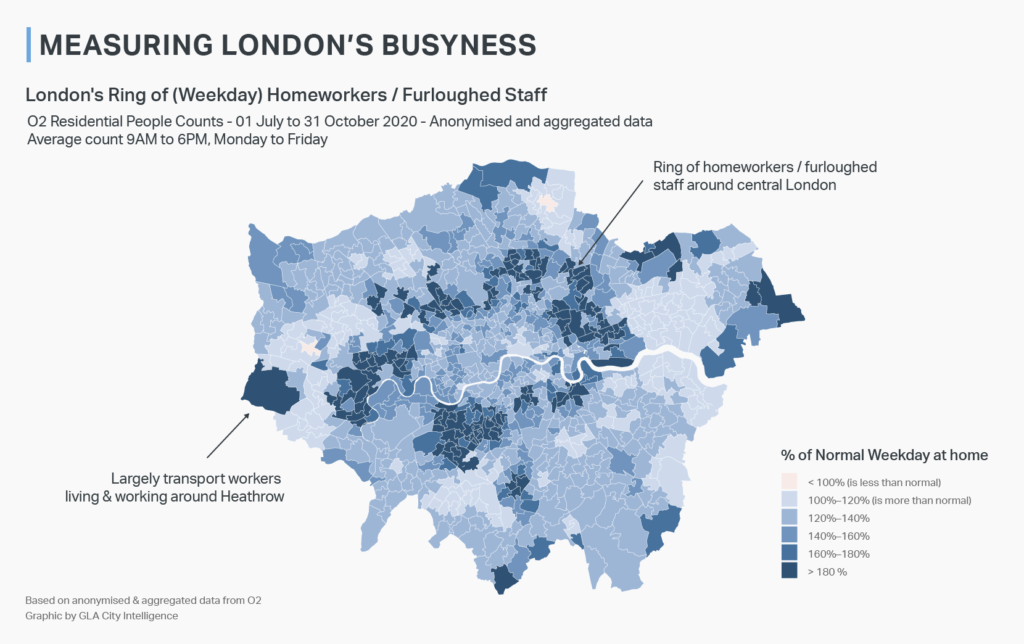
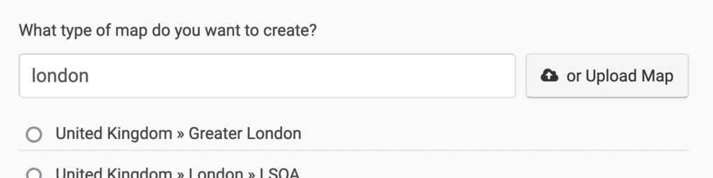
When more customization is needed, Datawrapper is flexible enough to handle that as well. "The ability to upload your own basemaps is really good," Mike reports. "When we want to upload a new map, some very obscure combination of London boroughs, Datawrapper is great. I'm quite impressed with that."
Meanwhile, features within Datawrapper are inspiring the unit to get even more ambitious with their charts. "The awareness of interactivity has grown," Mike reports. "Being able to interrogate and interact with the data — we didn't have the tools to do that before. Datawrapper has sparked that change."
Sometimes the discoveries take them by surprise. "There are moments of delight. Take the table tool, for example: when you first announced it, I thought, 'Okay, it's a table.' Doesn't sound particularly exciting, does it? But it's brilliant! Being able to combine columns and create sparklines and bars — suddenly it's like, 'Wow. I didn't know I needed this solution, but it really works for us.'"
Thanks to Mike for taking the time to speak with us! To see more of the City Intelligence Unit's work, go to data.london.gov.uk or follow Mike on Twitter @mikebrondbjerg.
- Mike: "Where interactivity isn’t required, the team are also increasingly using R, and packages like ggplot2 help a lot in improving their visual output. In fact, they’ve created a branch of ggplot2 called gglaplot that defaults to our house style." ↩︎
Liked this article? Maybe your friends will too:
NEWSLETTER
Sign up to our newsletters to get notified about everything new on our blog.


Comments