

We’re hiring a UI / UX designer with experience in data visualization
June 28th, 2024
6 min
This article is brought to you by Datawrapper, a data visualization tool for creating charts, maps, and tables. Learn more.

After meeting Jack and Antonio in June, it’s time to introduce you to the third new face of the summer: Luc Guillemot! The newest full-time member of Datawrapper’s visualization team, Luc is joining us right here at the office in Berlin.
We got to know Luc better with a few questions:
Hi! I will work on everything related to visualizations: making sure the charts are built correctly, that labels are in the right place, and adding new features as well!
Before Datawrapper, I worked in various environments: in academia, doing social sciences; in a design studio, doing interaction development; in a newsroom, doing data journalism. The only constant was making data visualizations and learning the programming languages I needed to create them.
I’ve already been living here in Berlin for the past two years with my husband. We’ve also lived in Rennes, Lausanne, San Francisco, and Zürich!
I have a vivid memory of a map-reading class in school, where my teacher could decipher the characteristics and history of a place only based on the features of a topographic map: the shape of buildings, size of parcels, type of vegetation, etc. I realized how powerful representing things on a flat surface could be.
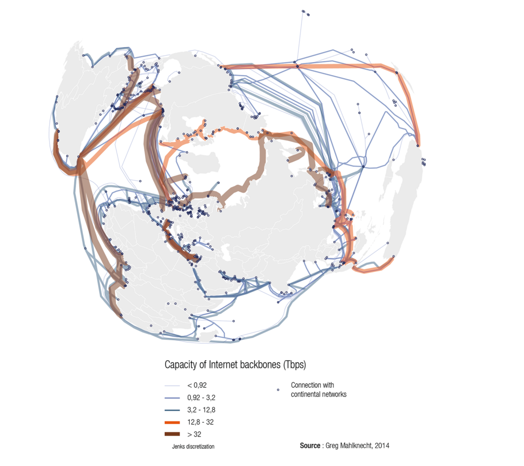
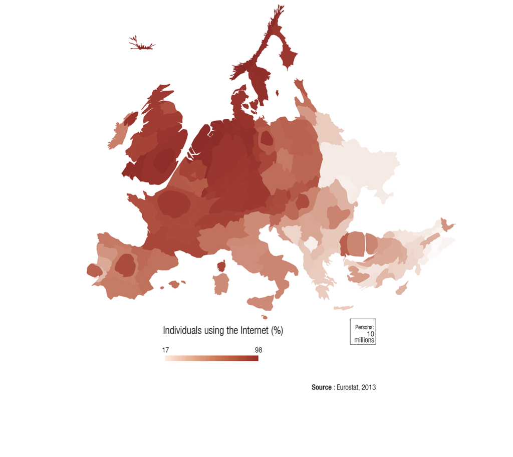
I decided to study maps further, starting with a master’s in GIS where I also picked up computer science and visualization in general. I created a lot of maps in my dissertation — I was really into cartograms at that time. And I never stopped!
One of my cartography professors mentioned the book “Semiology of Graphics” by Jacques Bertin. I read every single line! I love how Bertin describes data visualization as a formal system, where properties of a data set can be matched to a set of visual parameters. I then learned about the practical implementation of similar systems, like Leland Wilkinson’s “Grammar of Graphics,” ggplot, D3, or Vega. I talked about such systems in the data visualization meetup I used to organize in Zürich.
Out of academia, I had a very scientific approach to data visualization, thinking more about the system — and being quick to judge if it was “correct” or not — and less about its readers or users. Something I learned later, while working with designers at the studio Interactive Things, is that the system itself is only the starting point. You need to design the full user experience to actually create a story and convey information with data.
I love that data visualization is at the intersection of so many disciplines: graphic design, journalism, computer science, art, social sciences… It’s the perfect proxy to learn about almost anything.
I have read and learned from this blog for years! I also participated in some book clubs organized by Datawrapper and always had the impression that it was a great team. I’ve used Datawrapper myself when working as a data journalist at Funke Interaktiv, and I was very curious to travel to the other side and work under the hood.
Welcome, Luc! It’s great to have you with us. You can follow Luc at vis.social/@Luc, or visit lucguillemot.com.


Comments