

New: Stay organized with a more powerful, faster visualization archive
June 25th, 2024
3 min
This article is brought to you by Datawrapper, a data visualization tool for creating charts, maps, and tables. Learn more.
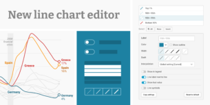
Today we are adding a new visualization type, which we expect to become quite popular: The area chart.
If you want to try the new area chart for yourself, hover over the example chart below and click on “Edit this chart” in the top-right corner to open Datawrapper and this chart in a new browser tab. You need to be on your computer for this. The button won’t appear on your smartphone or tablet.
This new addition is a close relative of the line chart. If used well, the added color helps to create visually attractive data representations. Experts in data visualization will have a hard look at our version. Is Datawrapper now adding just any chart or are we keeping our course to provide high-quality charts? Our answer: Area charts are by far not as problematic as pie charts, but there are issues.
The biggest issue is avoidable: Not sorting the values in a logical way, e.g., from largest to smallest. This often results in making it hard for users to identify specific values in the chart for good comparison. Our version comes with features to avoid this problem and lets you use multiple ways to sort, depending on the specific data.
There’s another reason we’ve added this chart type. We recently found really well-applied use cases for area charts: The Pudding, which has impressive stories and custom charts, for example. In another iteration, German publication Zeit Online recently used well-crafted custom area charts to talk about changing sentiment. It took work to come up with a good version in Datawrapper. With today’s addition, you have a new option to tell a story through data. Use it well.
Comments