This article is brought to you by Datawrapper, a data visualization tool for creating charts, maps, and tables. Learn more.
Remaking a 200-year-old chart

Hi, this is Ivan — I am a visualization developer here at Datawrapper. For this edition of Weekly Chart let’s travel a couple of centuries into the past.
We recently launched our brand new small multiple line charts. Having contributed a lot of time and effort towards developing the feature, I was excited to take it for a test drive in my Weekly Chart!
My initial idea was to find a very early small multiple chart from a data visualization pioneer and recreate it in Datawrapper. While I failed to find something adequate — let me know if you know what the first ever small multiple chart was! — I did encounter this line chart (you can also see it in this post below) by William Playfair and decided to remake it as small multiples in Datawrapper.
Why I remade the chart as small multiples
The original chart contains multiple time series that are fighting for attention within the single plot. Plotting each line in a separate panel gives each time series more space and makes it easier to see the impact of different events (in this case, wars) on the development of each measure.
Obtaining data
Obtaining the data was tricky. After some searching I could not locate data sources used in the original (where’s the CSV, Mr. Playfair? 😂). While it would probably be possible to obtain some of the original data by looking through historical sources, I decided to use a different approach.
I came across an amazing tool called WebPlotDigitizer which allowed me to throw in the chart image and extract data directly from it. After marking axis values directly on the graphic as an initial step, I manually marked yearly values for each time series. WebPlotDigitizer saved my marked data points and then I simply exported the data.
There is even an algorithm for automatically extracting all data but I did not manage to get it to work (perhaps it would work better on an image of digital origin). Nevertheless I’m definitely keeping this tool in my data visualization arsenal for the future!
Making the chart
Once I had the data, making the chart was straightforward. I applied line colors from the original chart, edited panel titles to explain each measurement and used repeated range highlights and text annotations to depict events.
Of course my remake lacks the charm of the original but I hope it’s a worthy alternative that showcases a different approach to visualizing the same dataset.
Observations on the original chart
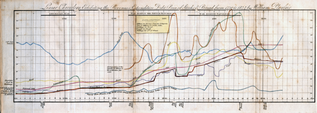
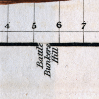
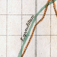
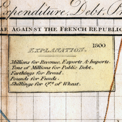
I really enjoyed exploring the little details of William Playfair’s original chart while remaking it. The rotated annotations, the curved line labels, and the “Explanation” legend are all fascinating from my perspective of someone who works on a digital charting tool, as these features don’t necessarily follow the data visualization “best practices” of today.
At the same time so many basic charting choices are completely in line with a good modern line chart:
- Distinguishing between time series with different colors.
- Clearly labeled years.
- Use of grid lines.
- And many more!
All this long before the existence of “best practices.” What an achievement for a chart made 200 years ago!
I hope you enjoyed this dive into the past as much as I did. Please let me know if you have any comments below or at ivan@datawrapper.de. We’ll see you next week!


Comments