


New: Stay organized with a more powerful, faster visualization archive
June 25th, 2024
3 min
This article is brought to you by Datawrapper, a data visualization tool for creating charts, maps, and tables. Learn more.
We at Datawrapper want to make it as easy as possible for our users to first visualize and then embed all the data they have — be it with one of our 19 chart types, three map types, or as a table. Today we’re adding a new way to visualize your data: small multiple line charts.
Line charts are often the best choice to show how a trend has developed over time. Datawrapper’s new small multiple line charts — or “Multiple lines,” as you’ll see them labeled in our app — do the same, but with each line in its own separate panel. That means every line is distinct and readable, and you can have a clear view of all the trends at once.
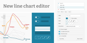
Jump directly in the chart editing process (no need to sign up!) by clicking on “Edit this chart” in the top right of any of the charts in this article:
Because each line gets its own space, small multiples make it easy to compare trends (”How much and how quickly do the lines go up and down?”), as opposed to just comparing individual data points (”Was category A or B higher on this date?”).
And there’s no need for a color legend in multiple lines — each panel has a title of its own. All the lines can be in the same color, giving your chart a clean, professional look.
You’ll find small multiple line charts (or, as they’re sometimes called, trellis plot, facets, grid charts, or panel charts) to be a great option for many of your data sets. Datawrapper users agreed and made it the most requested chart type when we surveyed them.
As you’re used to from us, we put a lot of consideration into our newest chart type. We tried to make Datawrapper small multiple line charts versatile while still enabling data visualization best practices. Here’s what you’ll find in the options of the multiple lines chart type:
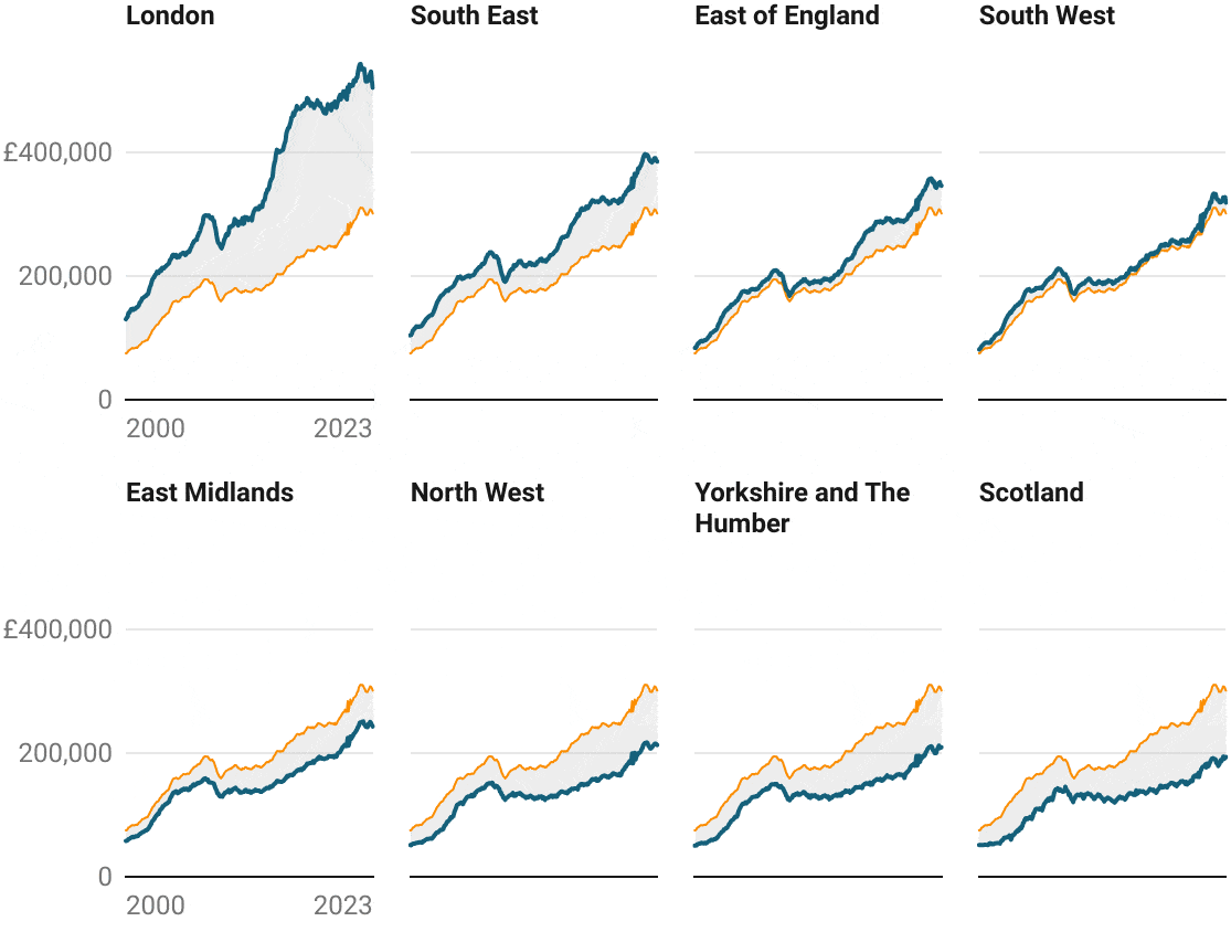
Any line can be shown as a repeated line in the background of every panel. Use it to let readers compare all the categories to each other — or to a certain baseline, such as a national average.
It's possible to include a baseline only as a repeated line, like the United Kingdom average in the chart below. In this case, you can label the repeated line in a color key:
If you’ve used Datawrapper before, you know our powerful annotations — and you’ll find them in small multiple line charts too. They’re great for highlighting specific data points or adding context and explanations.
You can place annotations wherever you need them, change their font size and colors, add pointer lines, and even drag them easily to another panel:
If you’re creating a multiple line chart and find yourself wanting to highlight points or ranges on either the vertical or horizontal axis, you’re in luck: Our new chart type has this option built in too. Use it to point out date ranges (and then annotate them!), or to show the difference between minimum and maximum points, like here:
Sometimes it can be helpful to include a highlight range (or even an annotation) in all panels of your multiple line chart, so that your readers can better orient themselves. To save you some work, we make this possible with one click:
If you’ve got lots of lines in lots of panels, it can be tedious to change their appearance individually. In our multiple lines, you can adjust the color, width, and dash of each line separately — or of several lines at once.
By default, hovering over one line shows the value for that date in every panel. This way, readers can better compare the values of different lines on the same date. Try it out here:
If your chart has many small panels and the tooltips become overwhelming, just turn off “Sync tooltips in all panels.”
Small multiples compress a lot of data into a tight space and have a tendency to look busy — especially if the axis labels are repeated in every single panel. That’s why, by default, our small multiple line charts show the horizontal grid labels — usually the date — only in panels of the first column:
The same is true for the vertical grid labels, as long as all panels use the same scale. Your chart works better with grid labels everywhere? Just turn on “Display grid labels in all panels.”
When you create a new small multiple line chart, all your panels will share the same vertical axis scale. But if your lines have very different data ranges, some lines may look so compressed that it’s difficult to see the trend over time. That’s why you can opt to use an independent scale for each panel. If you do so, each line will take up the maximum available vertical space. Grid labels will always be displayed in this mode, to avoid misleading comparisons.
You want to show three tall panels next to each other? Two panels vertically stacked? Lots of tiny ones in a grid? In our small multiples, you can set the number of columns both for desktop and mobile. You’ll also get fine control over the panel height and width. Decide, for example, that your panels should always be square (”100% based on width”), no matter how big they become. Or make sure that each panel always has the same height, no matter how narrow or wide they end up.
Here’s what else you can adjust in small multiple line charts:
Datawrapper isn’t just about the visualization types; it’s also the suite of features that our users have come to appreciate. We made sure that all these will work for small multiple line charts too: automatic descriptions for screenreaders; multilingual support, including right-to-left languages; dark mode; PNG, SVG, and PDF export; responsive mobile support; and custom chart themes.
Click here to create a new chart in Datawrapper, including the new small multiple line charts. You'll find them in the chart type selector in step 3 and can create them on any plan, even if you’re not signed in to a Datawrapper account.
To learn more about the do's and don'ts of using small multiple line charts, visit our article What to consider when creating small multiple line charts.
To get a step-by-step guide and an explanation of all available settings, head over to our Academy:
To see them in action and learn what's possible, attend our webinar about small multiple line charts in Datawrapper this Wednesday or again in two weeks.
We look forward to seeing what you create with small multiple lines! As always, let us know if you have any feedback or suggestions on how we can improve. You can reach us at support@datawrapper.de.
Comments