This article is brought to you by Datawrapper, a data visualization tool for creating charts, maps, and tables. Learn more.
Recreating a chart from history: a beginner’s look in the data vis world

Hi, this is Livnah, the office manager at Datawrapper. This week I’m bringing you my first Weekly Chart and second visualization from the Datawrapper tool.
I have been working at Datawrapper for the past six months now. Although I was familiar and confident with all the office tasks from my previous job experience, I was completely new to the data vis world when I started here last July. I had no experience beyond the normal bar chart or pie chart that you learn about in school. While I have to say the education about charts in my school was fairly good in terms of pointing out the statistics behind it, or how to judge charts based on the possible bias of the source, it was never part of the curriculum to build charts yourself.
I have done one simple pie chart with the Datawrapper tool so far. In this case a very simple pie chart was sufficient because the point I wanted to bring across was very simple 🙂 (Hire me: yes and yes.)
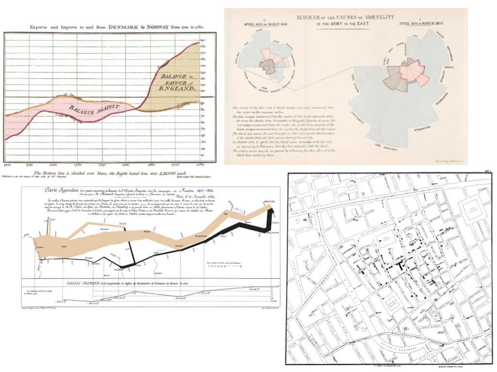
So for this week, I decided to prepare for my first Weekly Chart duty by reading some classic books about the history and the beginnings of data visualization — Edward Tufte’s “The Visual Display of Quantitative Information” and Darrel Huff’s “How to Lie with Statistics.” Through all the history that I looked at, these four historical charts got mentioned the most: William Playfair’s import/export graph in the field of state finance, Charles Minard’s “March to Russia” military map, John Snow’s cholera map, and Florence Nightingale’s “rose” charts in the field of science and healthcare.
I remembered learning about Florence Nightingale years ago at the museum about her life in London. She is well known to most people as a nurse and healthcare practitioner, the “lady with the lamp.” As a 25-year-old in 1854, she traveled with 37 other volunteer nurses from London to Scutari (today’s Istanbul), where wounded soldiers were sent back from the Crimean War for treatment. What I completely missed, or just didn’t remember, were her contributions in statistics and changing the sanitary conditions in hospitals all over Britain and consequently the world. So I decided to do some more research on her and take her famous roses as a model for this week’s Weekly Chart.

During her work she meticulously kept track of everything — nutrition, arriving shipments, causes of death, and especially her suspicions about the relationship of unsanitary conditions to the high rate of deaths among soldiers. Note that “germ theory,” which is absolutely plausible for everyone today, would not be proven for decades after that time. She wrote a whole report to send to Queen Victoria of England to convince her of the importance of sanitation and the need for supplies like clean bandages and alcohol, and to discourage practices like sending medical officers to fight at the front instead of keeping them to practice medicine in the hospitals.
She later collected all her reports from the Crimean War in the book “Notes on matters affecting the health, efficiency, and hospital administration of the British Army,” which is still available to read online. It includes many tables of data and some visualizations to make her findings and numbers more understandable and appealing.
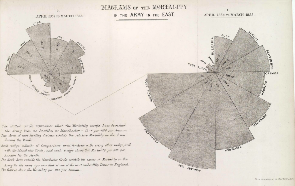
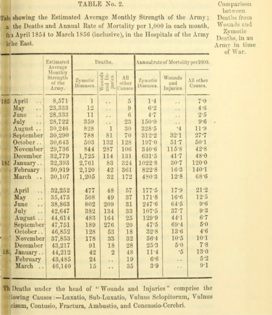
Probably the most famous are her “rose” diagrams. This gray one shows the mortality rates (per year, out of 1000) among soldiers compared with the mortality rate of normal people in Manchester, which Nightingale describes as one of the unhealthiest cities in Britain during that time. At first I couldn’t see the source of the numbers she used in this chart, but when I copied her tables into Datawrapper and added a summary column, it became clear to me that she used this visualization as an extension of her tables, showing total deaths from all causes together.
The next one is probably her most famous chart: a blue, black and red rose. At first, the explanation of the data seemed simple — the war is progressing and more soldiers are being killed, then the war is coming to an end so fewer soldiers are dying. But take a closer look the composition of different causes of death!
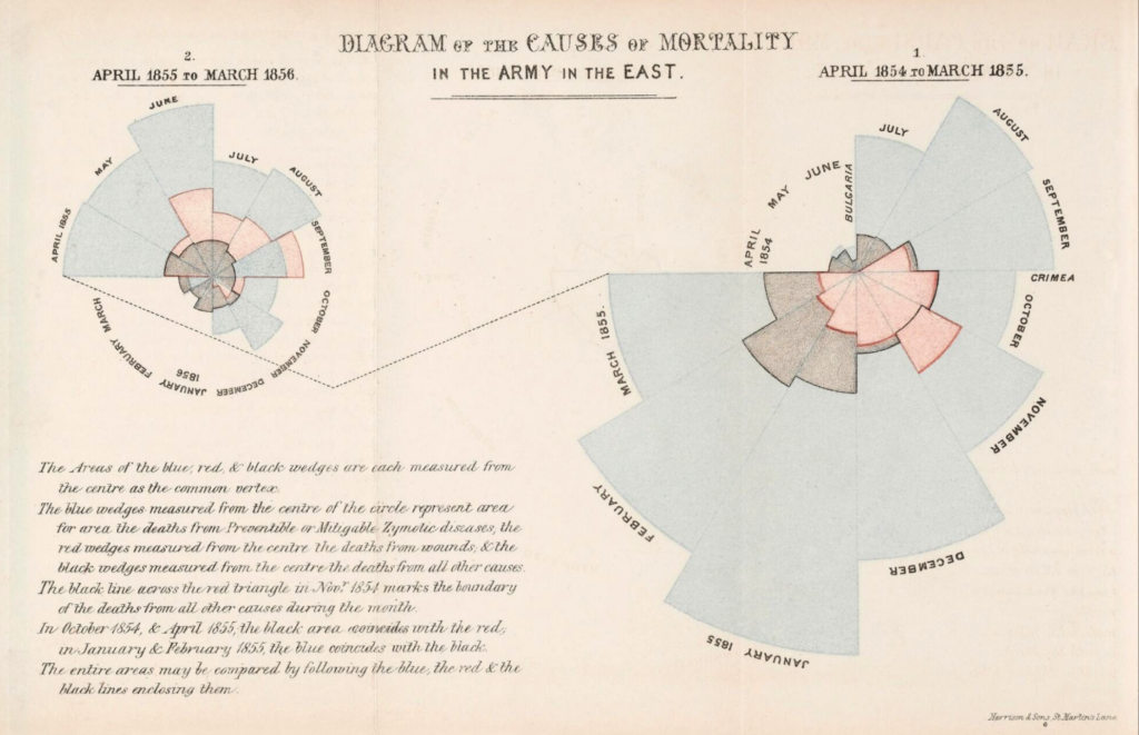
You can see that a majority of deaths are actually from “Zymotic disease,” in blue. (Zymotic is an old medical term from the 19th century meaning infectious diseases like typhus, typhoid fever, smallpox, etc.) A lot more soldiers were dying due to infection than due to actual wounds from battle. February and March of 1855 is when Florence Nightingale finally managed to implement better standards of sanitation after being hindered by the standing policies of what nurses were and weren't allowed to do. Right away, deaths from disease started to go down again as you can see in her chart.
An absolutely great and beautiful visualization by Florence Nightingale. Now here is my visualization of the same data:
I tried a little different approach with a linear timeline and grouping the numbers instead of overlapping them. In the rose chart, all the pieces start from the vertex in the middle, so in some months it is hard to distinguish the different colored areas (for example in December ‘54, when the black area is slightly bigger than the red). I also added the baseline of a military hospital in London, which Nightingale also mentions in her book, for better comparison than the Manchester hospitals where the broad average population was treated (including infants and senior citizens), and I marked the change to Nightingale’s improvements in February/March of 1855.
I was eager to learn more about Florence Nightingale’s impact on the health care system and the overall history of data visualization. It was a good challenge to learn more about the Datawrapper tool and it makes me wonder how hard it must have been for Florence Nightingale to make visualizations just with pen, paper, and math skills.
That’s it from me. I’ll be back in a few months when it’s my turn for the Weekly Chart again. Hope to learn lots more about data vis in the meantime. If you have suggestions or good beginners’ resources, reach out on Twitter @_livnah


Comments