

Radish to romanesco: A year in vegetables
February 20th, 2025
4 min
This article is brought to you by Datawrapper, a data visualization tool for creating charts, maps, and tables. Learn more.
Hello! I’m Jack, a developer on the app team. Datawrapper offers lots of great mapmaking options — but this week I want to try making maps using our line charts, something they definitely weren’t intended for.
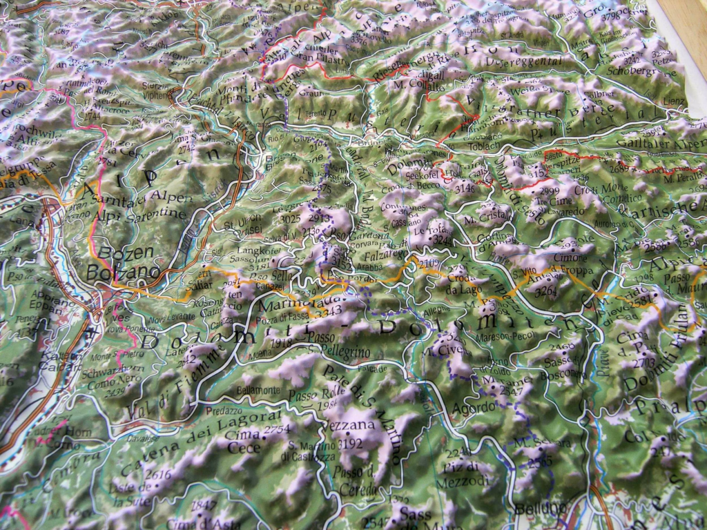
The inspiration for this Weekly Chart came from looking at some raised relief maps. I’ve always loved how this type of map gives you an intuitive feeling for the shape of the land, and also just looks good when framed and hung up on a wall.
I wanted to see if I could use Datawrapper to replicate this intuitive representation of elevation, hopefully with results that also look good enough to be used as decoration.
The obvious limitation was that my plot would need to be displayed on a screen, without that handy third dimension. However, we can simulate depth using perspective:
(Be warned: Depending on the device you’re reading this on, the large number of lines in these maps may slow down your browser considerably. This isn’t what our line charts were built for!)
I’m very satisfied by how three-dimensional these maps look, especially when changing the height of the plot, which makes it look like the you’re changing the angle at which you’re viewing the scene. Try it yourself by clicking "Edit this chart" in the top right of one of my maps, then dragging the bottom of the plot up and down in the "Visualize" step.
I created these maps using Open Elevation’s self-hosted API:
The main issue with this approach was that the landmasses were very hard to make out from the sea surrounding them (since the Open Elevation API also returns 0 elevation for coordinates that are in the ocean).
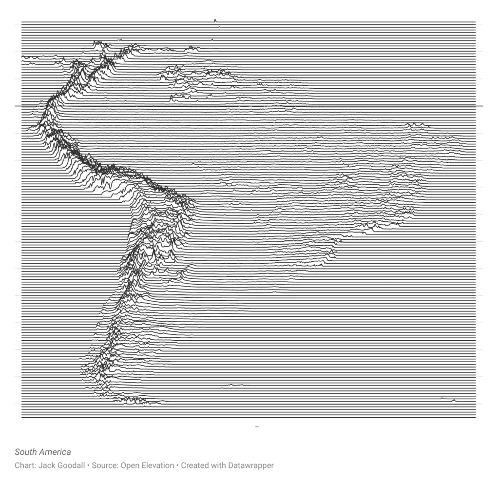
To address this issue I split each line of latitude into two, with one line representing the sea and the other the land. This allowed me to color and style them differently in Datawrapper to make the landmasses stand out.
This method still isn’t 100% accurate, since any point with an elevation of 0m is treated as sea, which isn't necessarily true. Ideally we would use the true coastlines of the landmasses to determine whether a point is land or sea.
For even cooler maps, we could include bathymetric data of ocean depths to visualize the sea floor as well. I’ll leave that as an exercise to the reader, or maybe a future Weekly Chart!
While creating these maps I was reminded of the album art for Joy Division’s Unknown Pleasures, which our visualization developer Ivan has recreated in a previous Weekly Chart — it’s definitely worth a read if you enjoyed this article. Check in next week for a new Weekly Chart from our writer Rose.


Comments