This article is brought to you by Datawrapper, a data visualization tool for creating charts, maps, and tables. Learn more.
A post-punk chart
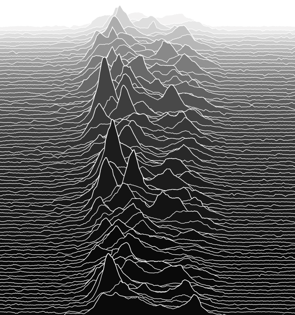
Recreating the album cover of Unknown Pleasures by Joy Division.

Hey, this is Ivan – developer here at Datawrapper. In this edition of the weekly chart I used Datawrapper to recreate a music album cover.
There is a bit of a tradition of publishing “arty” weekly charts on this blog[1]. Inspired by my colleagues, I decided to join the ranks of our in-house artists with my own humble entry. Here is a recreation of the album cover of Unknown Pleasures by Joy Division:
Unknown Pleasures is a debut album by an English post-punk band Joy Division and features a graphic illustration as an album cover without any mention of the band or album name (see a decently sized image of the album cover here).
It was designed by Peter Saville and is based on an image of radio waves from pulsar CP 1919 (a pulsar is a “rotating neutron star”). Each line shows a burst of electromagnetic radiation emitted by the pulsar. The image was originally created by radio astronomer Harold Craft[2].
I love the way this illustration looks and sometimes find myself just staring at it for a while. I think it’s so captivating because it looks like a mountain range: the high peaks obscure lower areas behind them and each successive line seemingly retreats into the distance.
It is essentially a small multiple line (or area) chart with individual elements close together and partially overlapping each other.
This chart type gained popularity in the data visualization community in 2017 and was at first known as a “Joyplot”, but was later renamed to “Ridgeline plot”. There is even an R package for creating ridgeline plots.
Creating the chart
Getting the raw data was easy as it is available online.
Ridgeline plot is a somewhat niche visualization type and Datawrapper does not support it out of the box. That’s why before I could create the chart I wrangled the data into the required form. Here are the major steps involved:
- Resort data rows from bottom to top. The original dataset has a row order for plotting lines from top to bottom, whereas I needed to construct the chart from bottom to top.
- Include a vertical gap between each line to move each subsequent line above the previous one. Increasing the vertical gap makes peaks lower and vice versa.
- This is a crucial step: go through each line, keep track of current maximum value on the horizontal axis and use this value in case a current line’s value is lower. This creates the “overlapping” effect that gives the chart its characteristic appearance.
- Finally, transpose data to bring it into the correct format for Datawrapper line and area charts. This can also be done in Datawrapper after you’ve uploaded the data.
I ended up writing my own node.js script for steps 2 and 3.
I chose an area chart type to create the chart, although it’s also possible to use a line chart and define fill areas between individual lines to create the color background.
With regards to the settings used, I turned off the “Stack areas” option and also turned off all labels and ticks (something that you shouldn’t do in a “normal” chart!) to give it the minimal look of the original artwork.
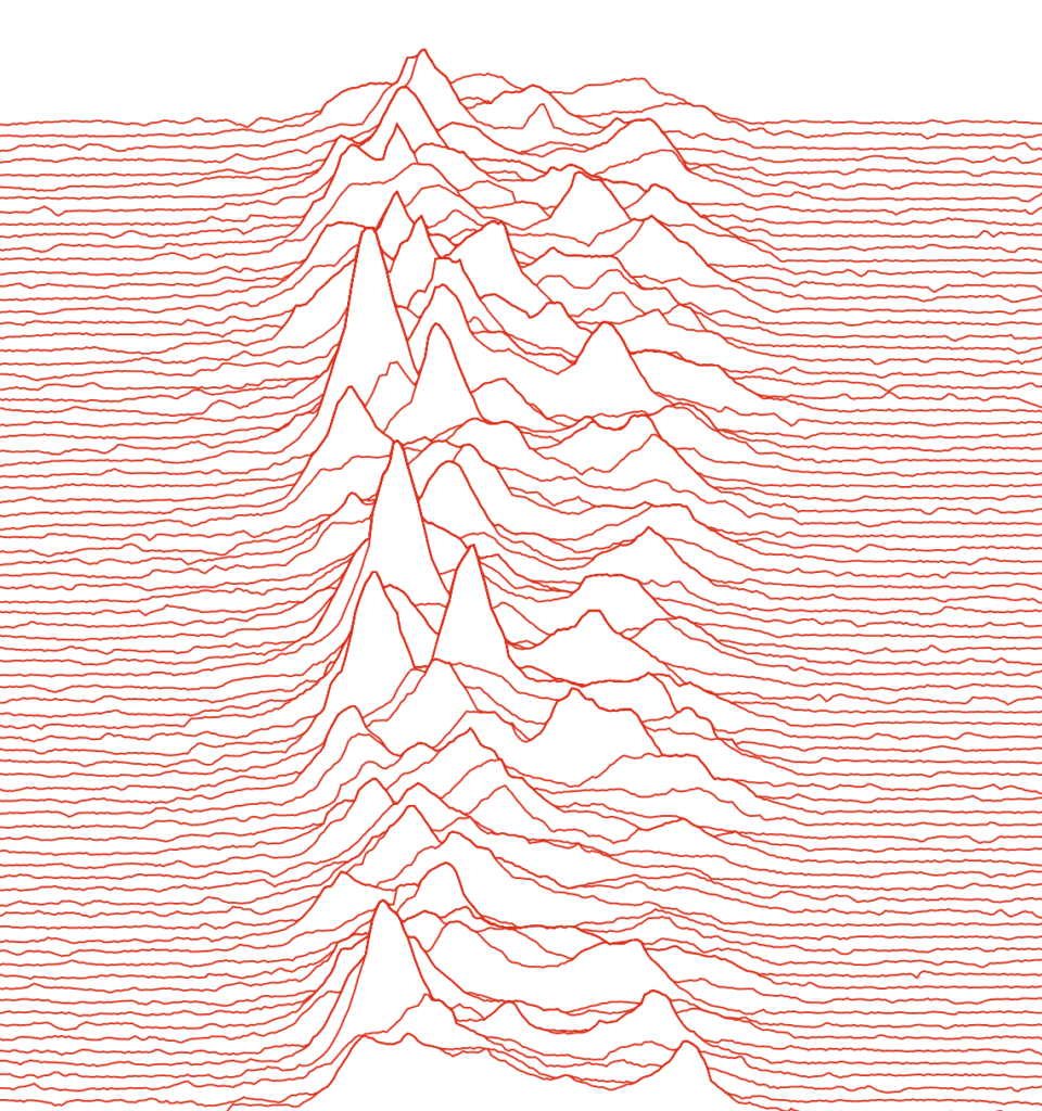
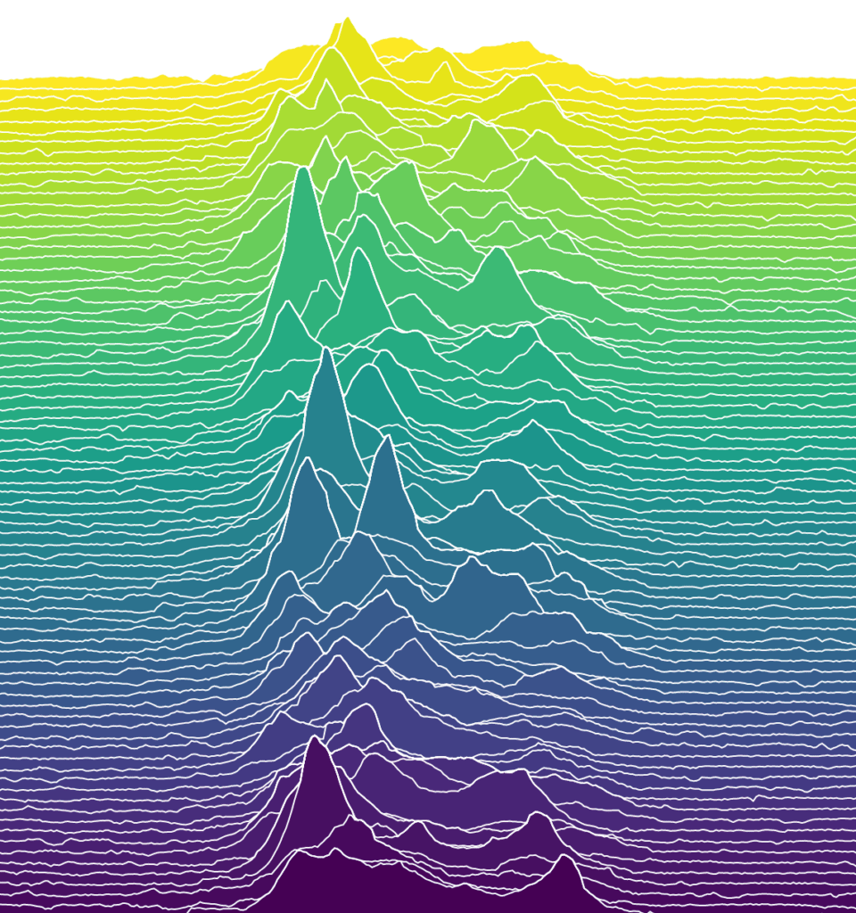
The great thing about Datawrapper: once you’ve wrangled the data into a desired form and created your chart, it’s very simple to experiment with settings to produce captivating and delightful variations! Here are a couple that I came up with:
It’s a very cool and somewhat famous album cover; if you haven’t heard the music on the album you should check it out. It’s gloomy rock and is fantastic (in my opinion) 🙂 Let me know if you can think of any other album covers that can be made as a chart! You can reach me at ivan@datawrapper.de or on Twitter. We’ll see you next week!
Check out these amazing entries by my colleagues Elana, Fabian and Lisa.
A detailed story behind the image can be found here.


Comments