Paula Guisado & Jaime Gutiérrez, DatosRTVE, will speak about a dataviz workflow for breaking news

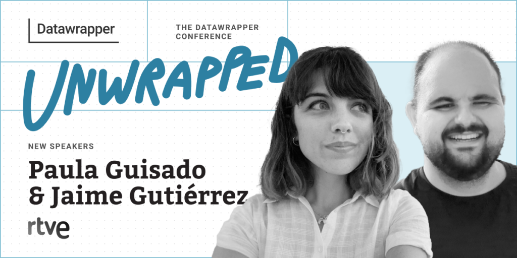
We’re excited to announce that Paula Guisado and Jaime Gutiérrez from DatosRTVE will speak at our Unwrapped conference about “Here’s your graphic: how DatosRTVE created a systematic dataviz workflow for the breaking news team.”
Paula is the head of DatosRTVE, the data journalism unit at the Spanish public broadcaster. Since arriving at RTVE, after several years working as a data and investigative journalist, she has focused on strengthening the team, creating internal and external dynamics for the data and visualization tasks and sustaining their individual and common growth. Paula will give the talk together with colleague and data journalist Jaime Gutiérrez, who played a big role in setting up the workflow DatosRTVE now has in motion.
Time to ask Paula and Jaime some questions:
Paula, Jaime, what will you talk about?
Paula: A newsroom is, by definition, a place of uncertainty. But breaking news aside, there are many periodic, repetitive information updates that a newsroom awaits, from employment statistics to meteorological warnings. By using R Studio, the DatawRappr package, an organized folder system, and ad hoc templates in Datawrapper, we at the data journalism team at RTVE have developed a workflow for those recurrent graphics, which allows the breaking news team to get graphics for their news pieces quickly – saving time and offering the user more complete information right away.
How has it been integrating Datawrapper into your organization's workflow?
Jaime: Integrating Datawrapper into our organization's workflow has been nothing short of a game-changer! Since we hopped on the Datawrapper train four years ago, not only has the overall quality of our team's work skyrocketed, but it's had a ripple effect, elevating the standard of journalistic excellence across the entire organization.
Datawrapper isn't just a tool; it's the secret sauce in our recipe for success. It's become the linchpin of our digital breaking news, in-depth stories, and TV productions. The ease with which we can create compelling television infographics is nothing short of remarkable. Imagine being able to effortlessly showcase exactly what you envision, and then seamlessly translate that vision onto the screen with just a few clicks. It's like having a magic wand for visual storytelling!
Our workflow has become more efficient, more visually stunning, and, dare I say, more fun since we embraced Datawrapper. It's not just a tool; it's a catalyst for unleashing the full creative potential of our team.
What advice would you give to other Datawrapper users (or data visualizers in general)?
Paula: To scratch the surface. Datawrapper makes it so easy to come up with a pretty good result that it might be tempting to just go with the first visualization attempt: Why look further when it works? But Datawrapper has so many options for customization and allows for so many levels of complexity that there is always room for improvement.
By that, I don’t mean that you need to make graphics more complicated than they need to be. Less is often more, and keeping things straightforward is the way to go. But giving visualizations extra thought and taking advantage of such a powerful tool can be the difference between an okay graphic and a superb graphic.
How do you use Datawrapper in your team?
Paula: Regarding the account organization, every once in a while, the DatosRTVE team has an organization check for our general workflow and, of course, for Datawrapper. What do we do with this new topic? Do we still keep this other topic in a separated folder? Should we reconsider the way we use dates? It takes us some time to decide the best way to go – it’s usually a matter of days, actually –, but when there is a decision, we commit to it (until further notice). We now have thousands of graphics in our account. And I take pride in saying we can find almost each one of them.
Besides that, we try to keep our data visualization capacities growing by studying other professionals’ work, reading about the topic, and learning both new tools and tricks for the tools we already use. There are always more advanced users who keep pushing the limits and finding new and innovative paths. So we try to endure regular knowledge transmission among the team members to make sure our base level keeps rising.
What aspect of data visualizations would you like to explore more, and why?
Jaime: Diving into data visualization, one aspect that's been keeping me on my toes is climate change. It's not just about data; it's about conveying the urgency and impact of one of the most pressing issues of our time. Last year, I delved into the intricacies of climate and weather forecast predictions – not aiming for meteorologist status, but striving to better comprehend this transcendent phenomenon. The potential for groundbreaking visualizations in this space is vast, and there's a plethora of untapped creative opportunities waiting to be explored.
On a slightly different wavelength, I've found myself drawn to the world of color in chart design. It's not just about aesthetics; colour carries meaning, influences perception, and even addresses visual impairments. Colour isn't just about pretty charts; it's about creating a visual language that resonates with our audience. Navigating the maze of colour choices can be challenging, and while the Datawrapper Academy has been an invaluable resource for clearing doubts, I'm on a mission to discover a unique and recognizable colour scheme for DatosRTVE.
What's your favorite Datawrapper feature?
Paula: The constant improvement of the tool. It’s great to see how Datawrapper listens to their users, tries to build a community around it and keeps upgrading an already outstanding product.
We're looking forward to Paula and Jaime's talk at Unwrapped! Until then, you can find more about Paula on X and LinkedIn, and more about Jaime on LinkedIn. To sign up for Unwrapped and hear Paula, Jaime, and other great speakers, visit our conference website.
Liked this article? Maybe your friends will too:
NEWSLETTER
Sign up to our newsletters to get notified about everything new on our blog.

Comments