We’re hiring a Werkstudent*in Social Media & Communications
October 15th, 2024
4 min
Datawrapper lets you show your data as beautiful charts, maps or tables with a few clicks. Find out more about all the available visualization types.
Our mission is to help everyone communicate with data - from newsrooms to global enterprises, non-profits or public service.
We want to enable everyone to create beautiful charts, maps, and tables. New to data visualization? Or do you have specific questions about us? You'll find all the answers here.
Data vis best practices, news, and examples
250+ articles that explain how to use Datawrapper
Answers to common questions
An exchange place for Datawrapper visualizations
Attend and watch how to use Datawrapper best
Learn about available positions on our team
Our latest small and big improvements
Build your integration with Datawrapper's API
Get in touch with us – we're happy to help
This article is brought to you by Datawrapper, a data visualization tool for creating charts, maps, and tables. Learn more.

Hi! I’m Lisa.
Ok, that’s a bit weird: I’m writing my own “We’re happy to announce that Lisa is a new member of the Datawrapper team”-post. But that was the whole idea of hiring me: that someone writes these blog posts. You will hear a lot from me in the form of articles, tweets, newsletters and how-to’s, so I’ll tell you a bit about myself.
I’m a designer, living in Berlin, and I fancy data visualization quite a lot. It’s beautiful, it deals with numbers and tables, it gives us an overview and we learn stuff: a great combination of things I care about. Writing about data vis turned out to be an excellent way to learn more about it, so I wrote about data vis tools, elections graphics, my Google Search history, colors in data vis, latitudes, curiosity and many more topics. In 2016, I was an** OpenNews Fellow on the NPR Visuals team and spoke at tons of conferences. Before and after that, I’ve visualized data for publications like SPIEGEL and Tagesspiegel, taught data visualization at universities and organized the Data Vis Meetup Berlin.

You can find a longer post on that on my personal blog. The tl;dr: I believe that it should be easier for journalists to create charts for their articles. The public will benefit from more context, and the Data Vis experts in their newsroom will have time to focus on bigger projects. Datawrapper is my best bet on a data vis tool for journalists.
Also, Gregor convinced me.
Expect me to write tons of blog posts. You’ll see at least one post each week in the form of the Chart of the Week, a format we’re starting soon. But we’ll also have lots of blog-worthy new features coming up at Datawrapper in the next few months, and I’ll be the person putting this news into words. I wrote one last week already about our chart folders.
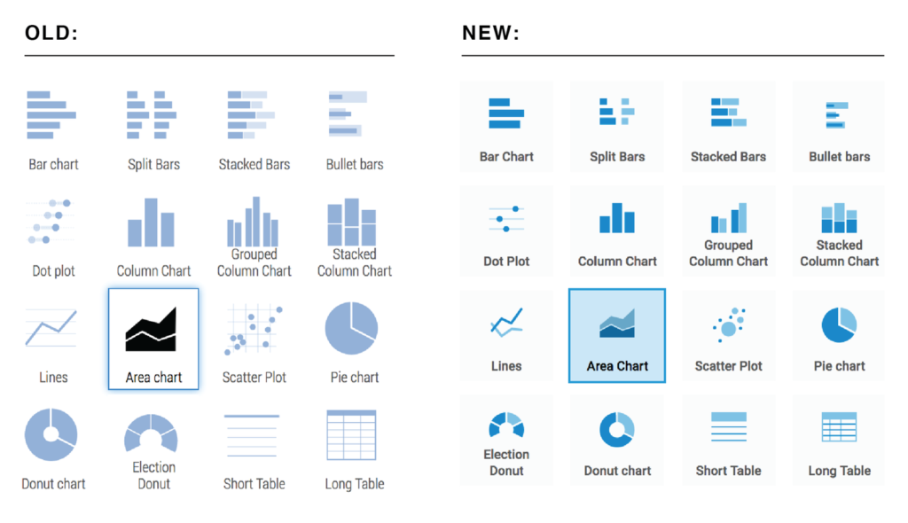
Besides that, I’m a designer, so I do a bit of design work here and there. Noticed the change of the icon design? That was me:

I’m excited to start in this small company (we’re only six people, including me and our two new hires, Ivan and Gregor) and I’m looking forward to spend lots of time thinking and writing about charts!
If you have any questions about anything, please get in touch with me via email (lisa@datawrapper.de) or on Twitter (@lisacrost). I like emails. And tweets.Datawrapper Newsletter
Comments