


New: Add comparison columns for election reporting and more
February 7th, 2025
3 min
This article is brought to you by Datawrapper, a data visualization tool for creating charts, maps, and tables. Learn more.
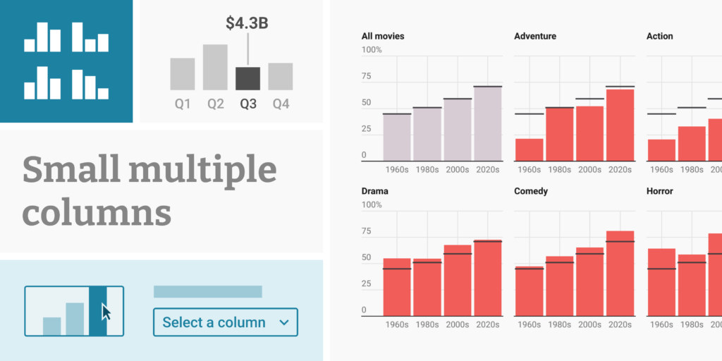
We’re happy to announce the addition of a much-requested feature to Datawrapper: small multiple column charts. Since introducing small multiple line charts last year, we have received a lot of great feedback and seen some incredible usage. Today, we’re adding another versatile visualization type to Datawrapper’s small multiple options.
Column charts are one of the easiest-to-read chart type out there. Small multiple column charts build on their strengths and give you a powerful new visualization option: especially useful when you have many categories of values, multiple columns give each category enough space in its own panel – whether you have two or twenty categories. This makes it easy for your readers to compare the numbers within a category, instead of the total.
Let’s take a look at what makes Datawrapper’s small multiple column charts special:
In small multiple charts, it’s especially important to draw your readers’ eyes to the most important insights. Our small multiple columns give you several tools to do this.
You can color columns either by date/category or all columns in individual panels:
If you have long column labels, you can choose not to display them and instead use colors and a color key to help readers make sense of your columns:
Small multiples compress a lot of data into a tight space and can quickly look busy — especially if the axis labels are repeated in every single panel. That’s why, by default, our small multiple column charts show grid labels only in panels of the first column when you upload a time series.

If your chart has only a few columns per panel, consider turning on value labels for each column. You won't have to worry about a label mess: As you've come to expect from us, we use a smart algorithm to prevent overlapping.
Sometimes it's helpful to repeat values across panels, for example, to allow readers to compare values to an overall average. You can achieve this by adding overlay markers, as in regular column charts, either as notches or as ranges between two values.
And by default, hovering over a column by default triggers a tooltip in all panels at once, making it easy for readers to make quick comparisons:
If you want to draw the attention to individual data points, you can highlight columns by directly clicking on them. Either highlight them in just a panel or two, or all panels at once. You can also choose to display the column values.
If you’re creating a multiple columns chart and want to highlight points or ranges on either the vertical or horizontal axis, you’re in luck: Our new chart type has this option built-in. Use it to draw attention to date ranges, averages, or context data.
If you’ve used Datawrapper before, you know our powerful annotations — and you’ll find them in small multiple column charts too. They’re great for highlighting specific data points or adding context and explanations.
You can place annotations wherever you need them, change their font size and color, add pointer lines, and even drag them to another panel:
You want to show three tall panels next to each other? Two panels vertically stacked? Lots of tiny ones in a grid? In our small multiples, you can set the number of columns both for desktop and mobile.
You’ll also get fine control over the panel height and width. Decide, for example, that your panels should always be square (”100% based on width”), no matter how big they become. Or make sure that each panel always has the same height, no matter how narrow or wide they end up.
Here’s what else you can customize in small multiple column charts:
All other Datawrapper features you’re used to will work with small multiple column charts as well: dark mode; PNG, SVG, and PDF export; responsive mobile support; automatic descriptions for screenreaders; multilingual support including right-to-left languages; and custom themes.
Thanks to everyone who worked on this feature besides Elliot Bentley and Erle Monfils: Gustav Neustadt, Elana Levin Schtulberg, Ivan Lokhov, and David Wendler.
To use small multiple column charts, click here to create a new chart in Datawrapper, and select Multiple Columns in the chart type selector in the Visualize step – or learn more in our Academy. Small multiple column charts are available starting today, for Datawrapper users on all plans.
We look forward to seeing what you create with it! As always, let us know if you have any feedback or suggestions via support@datawrapper.de.


Comments