
This article is brought to you by Datawrapper, a data visualization tool for creating charts, maps, and tables. Learn more.
Statistics Flanders: “We want to reach everyone.”
How Statistics Flanders in Belgium makes statistics a public good with Datawrapper

This is the second part of a series about how organizations use Datawrapper. Learn how the US think tank New America decided for Datawrapper after building a charting tool themselves first in the first part.
We are always excited to hear how Datawrapper customers from different fields use our tool and what we can learn from them. That’s why we called Jo Noppe, whose team at Statistics Flanders (Statistiek Vlaanderen) has created 2000 Datawrapper charts and maps on more than 300 webpages; 100 of which are available in English. Jo told us about their six criteria a charting tool had to meet, their heavy use of templates and duplicating charts, and their aim to publish data that is accessible for everyone.

Flanders is the northern of Belgium’s three regions. It’s stats division Statistics Flanders is a network of more than 60 Flemish government agencies that develop and produce official statistics. The network’s goal is to bring “information about Flanders in front of as many people as possible to make them more informed citizens”, as Jo tells us. On statisticsflanders.be, a 40-people-strong team publishes data supplied by the network about the economy, environment, population, living conditions, and the government – with a strong mission.
Statistics Flanders’ mission
“High quality, but accessible for many people”
Some stats organisations focus mostly on providing complex datasets to experts, but not Statistics Flanders. “Since we started in 2017, we see statistics as a public good. They’re important for everyone and we want to reach everyone,” Jo says. With this goal in mind, the team simplified the website, wrote accessible texts and redesigned the articles. “All of them have the same simple structure now: There’s a text block of three, four small paragraphs and simple charts and maps below. We always start by showing how the data has evolved over the years. Then we present a map with local data, if available, and compare the situation in Flanders with the situation in EU countries.”
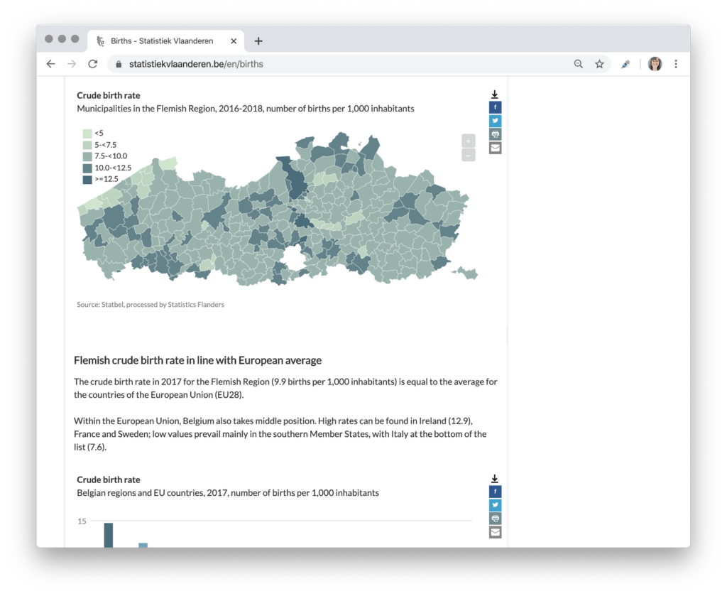
A typical article on statistiekvlaanderen.be with Datawrapper charts & maps.
The simplicity of the charts and maps is intentional. While some institutions try to make charts as elaborate as possible, Jo and his team put lots of thought into achieving the opposite. No chart or map should put potential readers off with their complexity. “Our charts and maps need to be of high quality, but also be accessible for many people. They need to look simple, yet attractive and professional.” Statistics Flanders chose Datawrapper to get there: “Datawrapper makes this possible, and we’re very happy with the result.”
How Jo & his team decided for Datawrapper
“They are all experts in numbers but not experts in designing or coding”
But the simple, professional design wasn’t the only criterion when the team chose a charting tool in 2018. “We had six selection criteria and compared five or six charting tools that are similar to Datawrapper,” Jo explains. “It was the only tool of all of them that scored positive on all the criteria.”
The team’s desired charting tool had to be compatible with the technical side of the website, be dynamic to let readers discover the underlying data, enable multiple people to work on their charts at the same time, make it possible to work with templates (more about that later) and create charts that readers could print, access the raw data as well as share on Twitter or Facebook.
Chart in an article about population size and growth.
“But the most important criterion was the fact that it had to be a user-friendly web tool for everyone on the team. They are all experts in numbers but not experts in designing or coding,” Jo tells us. “We tested the free version of Datawrapper with some colleagues, and they all thought it was very simple to use. Entering the data to create charts in Datawrapper is straightforward, even for non-website-experts.”
“So all we wanted was possible with Datawrapper,” Jo sums up. “It was an easy choice.”
Bringing the whole team to work with Datawrapper
“They don’t have to wait for other people anymore to make nice graphs.”
Once the decision was made, Datawrapper had to be introduced to the whole team. But change can be scary, especially for a government organization. So we were especially curious to hear from Jo how the transition to Datawrapper went.
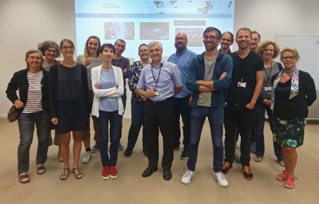
Part of the team at Statistics Flanders.
“If you try to do new stuff, there is always some resistance,” Jo tells us. “So we made a short handbook to explain to our colleagues the new workflow in Datawrapper. I think they used it once or twice. Then they put it aside and could start working with the tool themselves.”
“We also offered a training where we presented the handbook and explained to everyone how to make charts. It was nice! We showed the advantages of Datawrapper and could wipe out the fears of some colleagues during this training,” Jo remembers. “We had a surprisingly nice time switching from the old way of working to the new one.”
Chart in an article about carbon footprint.
One big factor to make the switch so positive was the new independence in the production process for the team: Before 2018, the team prepared the numbers and then gave them to a designer who made them look professional. “Now our data experts can visualize data themselves,” Jo tells us. “They don’t have to wait for other people anymore to make nice graphs. For my colleagues, that’s a positive change.” These days, everyone at Statistics Flanders who writes articles also uses Datawrapper to support their texts with visualizations.
How Statistiek Vlaanderen uses Datawrapper
“Nobody in our team makes charts from scratch”
The most important step Jo explained to his colleagues in the handbook and training was duplicating templates. “It’s very easy in Datawrapper to make duplicates of charts.” Jo explains how they used this to their advantage: “Nobody in our team makes charts from scratch. We prepared ten or so templates for everyone to use and if somebody wants to create a chart, they duplicate one of these templates.”
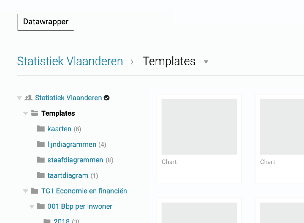
How Jo’s colleagues see the internal Datawrapper folder structure. On the top are the templates that the team duplicates to create new charts.
(The charts and titles are hidden in this screenshot.)
In the duplicated templates, Jo’s colleagues replace the data, title, source, and description. The colors, spacing, and everything else stays consistent. Jo points out that this saves supervising effort for the chart experts and reassures the rest of the team. “When using templates, my colleagues know that they create charts that are up to standard. They know they’re doing well.”
It also saves a lot of time. “Duplicating templates is the quickest way for us to do data visualizations,” he explains, adding that this is key to his job. “When we get data from other data producers, we sometimes only have two or three days to make the charts, write the articles, and publish it all. It’s important that we can deliver very fast. Datawrapper is one of the reasons this is possible.”
The result and outlook
“Now our users can find things easily”
The team at Statistics Flanders started with the principle “Statistics are a public good”. Their website brought them closer to the goal of making official statistics accessible to everyone. “We had very positive reactions about our website,” Jo explains. “Our audiences like the simple structure of our articles. Before, they had to search in complex reports what they wanted. Now they can find things easily.”
“Of course we’re still trying to do better and better. We’re planning to design and fill a new, even better website later this year,” Jo tells us. “Will we use Datawrapper charts on the new website, too? That still needs to be decided. But I’m very happy with our current charts. I see no reason for change.”
A big thanks to Jo for taking the time to talk with us. If you want to find out more about Statistiek Vlaanderen, visit their English translation of their website at statistiekvlaanderen.be, or find them on Facebook or Twitter.
Liked this article? Maybe your friends will too:
NEWSLETTER
Sign up to our newsletters to get notified about everything new on our blog.


Comments