From news media to Datawrapper: Six things I’ve learned in my first year
November 8th, 2023
5 min
This article is brought to you by Datawrapper, a data visualization tool for creating charts, maps, and tables. Learn more.

Hi, I’m Toni, a developer at Datawrapper, and today I’ll be showing you that you don’t have to be a web accessibility expert to make your SvelteKit app more inclusive!
Web accessibility is all about building web applications that everyone can use — no matter what disabilities they might have (visual, auditory, cognitive, etc.), and no matter whether that disability is permanent (like blindness), temporary (like bad vision after an eye surgery), or situational (like bright sunlight glaring on their screen).
Of course we want the visualizations created with Datawrapper to be accessible for as many people as possible, which is why our chart editor offers features like a colorblind check and alt-text field, and why we follow best practices like semantic HTML and supporting keyboard navigation in the final visualizations.
But we also take steps to reduce barriers for users of the Datawrapper app — allowing more people to create visualizations for the web.
Web accessibility can seem daunting, but it’s not rocket science! With a bit of awareness, plus some testing and a dash of research, you can dramatically improve the accessibility and general user experience of your site. Since our app is built with Svelte + SvelteKit, here are seven practical tips to improve your SvelteKit app’s accessibility.
1 Show hidden elements on focus
2 Only add tabindex when elements are actually interactive
3 Provide unique HTML titles for unique pages
4 Use keepFocus, when appropriate
5 Use the correct lang attribute value
6 Add a “skip to content” link
7 Be mindful when following Svelte’s accessibility warnings
This first one isn’t specific to Svelte or SvelteKit, but it’s an issue that often comes up when keyboard navigation isn’t accounted for: elements that only appear when hovering with a mouse.
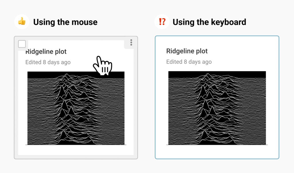
For example, our users’ Archive is filled with preview cards of their visualizations that show a selection checkbox and dropdown menu when hovered over with a mouse. Displaying these options only on hover cleans up the look of the interface and makes it easier to scan for a particular visualization.
But when someone was trying to navigate around the archive with a keyboard, the checkbox and dropdown menu would stay hidden even on the chart in focus.

Thankfully, the fix here is pretty trivial. Add :focus-within or :focus pseudo-classes whenever you use the :hover pseudo-class selector:
.visualization-box {
	.checkbox-container {
	  opacity: 0;
	}

  &:hover,
  &:focus-within {
	  /* 👆 added :focus-within selector */
    .checkbox-container {
      opacity: 1;
    }
  }
}
Now the checkbox and dropdown menu will also appear when the visualization is focused with the keyboard — or when any children are focused, like the selection checkbox itself.
tabindex when elements are actually interactiveAll interactive elements should ideally be focusable via keyboard, so that people who can’t use the mouse aren’t locked out of the interaction. Consider this ContentEditable component which allows inline editing of labels:
<!-- snippet of $lib/ContentEditable.svelte -->
<span
   role="textbox"
   tabindex="0"
   contenteditable={editable ? 'true' : false}
   on:click={onClick}
   on:keydown={onKeyDown}
>
   {value}
</span>
When the label should be editable, we set the contenteditable attribute to true, turning it into an editable textbox.
Since we want the textbox to be focusable via keyboard, we set the tabindex to 0.
💡 What is the tabindex attribute?tabindex is an HTML attribute that controls which elements are focusable and in what order they appear when using the tab key to cycle between elements. With a value of 0, the element is focusable and will appear in the order defined by its place in the document. A value of -1 makes the element unreachable via tabbing, while still allowing JavaScript to focus it programatically. Learn more on MDN.
However, this creates a problem: The element is now focusable even when it isn’t editable, just displaying text. The page now requires lots of extra tabbing to get through, making navigation a chore and confusing users with focusable but non-interactive elements.
In the case of the ContentEditable component, we want to set tabindex to 0 only when the label is intended to be editable:
<!-- $lib/ContentEditable.svelte -->
<span
   role="textbox"
   tabindex={editable ? 0 : undefined}
   contenteditable={editable ? 'true' : false}
   on:click={onClick}
   on:keydown={onKeyDown}
>
   {value}
</span>
Now the element will only be available to focus when it is actually interactive, which makes navigating through the folders in the archive much more efficient.
You don’t need to be an accessibility guru to make simple and sensible decisions like these. A minor tweak can go a long way towards making your component more accessible!
In traditional server-rendered applications, every navigation will cause a full page reload, which makes screen readers announce the page title. Since SvelteKit uses client-side routing to avoid reloading the entire page, it emulates this behavior using an ARIA live region.
SvelteKit injects an element with the aria-live attribute, which lets screen readers know to read out the element’s contents when they change. On page navigations, SvelteKit then inserts the current HTML title.
As developers, all we need to do is make sure that unique pages have unique HTML titles, so that page navigations get announced correctly.
For Datawrapper, we use a pattern of returning a title prop from our load functions, and then using the $page store in the root +layout.svelte to set the current page’s title using svelte:head.
// src/routes/+page.server.ts
export const load = () => {
	return {
		title: 'Dashboard',
	}
}
<!-- src/routes/+layout.svelte -->
<svelte:head>
<title>{$page.data.title}</title>
</svelte:head>keepFocus when appropriateBrowsers reset the focus on a full page reload. Similar to the route announcements above, SvelteKit emulates this behavior by focusing the body element on navigations. This works great for most cases, but there might be times when you’d rather keep the focus on the current element.
Another example from Datawrapper’s Archive: We store sort order as query parameter in the URL, which means changing the sort order is considered a navigation for SvelteKit and by default resets the focus.
To change the sort order, you can navigate to the “Sort by” popover and then cycle through the radio options using the keyboard arrows. But since each option change directly triggers the navigation, you would have to navigate back to the “Sort by” popover after each selection. A switch from “Title” to “Last edit date” would take nine renavigations — what a hassle!
Once again, the fix is pretty straightforward. Just add the keepFocus flag inside the goto function call that’s triggered by cycling sort options.
$: if (currentOrderOption.id !== selectedId) {
  currentOrderOption = sortOptions.find((o) => o.id === selectedId);
  goto(selectedOrderOption?.query, {
    replaceState: true,
    noScroll: true,
    keepFocus: true,
  });
}
Now the focus is preserved when cycling through options of the radio group, and switching the sort behavior back from “Last edit date” to “Title” is as simple as pressing the left arrow key nine times. Way better.
The replaceState and noScroll options were already present, so it was clear that this wasn’t a “real” page navigation, but only a change of a query parameter in the current page’s URL. Having these options present is a good hint that you might also want to add the keepFocus flag.
For links, you can add the data-sveltekit-keepfocus attribute to any a tags to make them keep their focus after navigating. But you should only ever use these options when the focused element is also present on the destination page, and not when navigating to an entirely different page.
lang attribute valueAs the SvelteKit docs state, the lang attribute of the top-level HTML element tells screen readers what language to pronounce your website in. If your website is monolingual, you can simply hardcode this value in your app.html. But if you have a multilingual website, you’ll need to set the correct value dynamically. To do this, you can set a placeholder value in your app.html like so:
<!-- app.html -->
<html lang="%lang%">
	...
</html>
Then we can use the handle function inside the hooks.server.ts file to implement a middleware that will adjust this placeholder value to the currently selected language:
// hooks.server.ts
export function handle({ event, resolve }) {
    return resolve(event, {
        transformPageChunk: ({ html }) => {
            return html.replace('%lang%', getUserLanguage(event));
        }
    });
}
The codebase of a multilingual website should already have a utility to determine the current language (in the example above, it’s getUserLanguage(event)). You can use that here to replace the placeholder inside the transformPageChunk callback of the resolve function.
This one is another generally applicable web accessibility technique, not specific to Svelte. Most apps have their main navigation built into the header with a bunch of useful items and links. As discussed in Tip #4, SvelteKit will reset the focus position by default on each page navigation — which leads to keyboard users being stuck navigating through the header again after every page navigation.
A widely accepted best practice is to add a so-called “skip to content” link. Usually hidden, this link is made visible when it is focused as the first element on a page. Interacting with the link will skip down over all the header elements and instantly focus the page’s main content.
To implement a simple skip-to-content link, give your main content a unique id attribute value and then link to it with that id as the fragment, like so:
<a href="#main" class="skip-to-content-link">
  Skip to main content
</a>

<main id="main">
	(main page content)
</main>
To hide the link for non-keyboard users, we can use a bit of CSS and make it only appear when it has focus:
<style>
  .skip-to-content-link {
     position: absolute;
     z-index: 99999;
     padding: 1em;
     left: -90001px;
     opacity: 0;
     margin: 1em;
  }

  .skip-to-content-link:focus {
     left: 0;
     opacity: 1;
  }
</style>
Again, pretty simple, but this dramatically improves the experience for people using keyboards to navigate around your site.
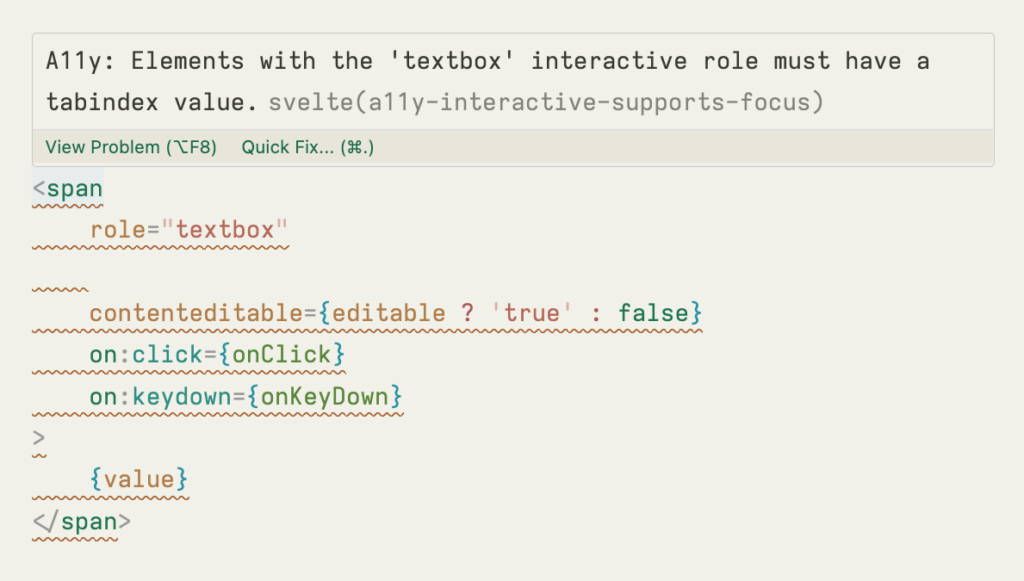
Svelte comes with built-in accessibility warnings that alert developers to potentially problematic markup.

There are many different types of checks, such as the one above about missing attributes, or one for form labels needing to be associated with a form control.
These warnings can help tip you off about potential problems, but they aren’t a silver bullet. The compiler can’t know the intricacies of the interaction you are trying to build.
Just because there’s no warning doesn’t mean your component is accessible. And just because there is a warning doesn’t always mean you have a problem. If you’re unfamiliar with any of the attributes these warnings may suggest, don’t be afraid to look them up on MDN!
As an example, the tabindex attribute was probably added by a well-meaning developer following an accessibility warning from Svelte, but it shouldn’t always be used, as we’ve seen in Tip #2.

When following Svelte accessibility warnings, don’t just aim to make the warning disappear — actually think about the intended behavior and act accordingly.
When you aren’t familiar with a warning, figure out what exactly the accessibility concern is, if it applies in your specific case, and what the expected behavior could be. If a warning really doesn’t apply, you can always suppress it with an HTML comment like this.
<!-- svelte-ignore a11y_distracting_elements -->
<marquee> Never Gonna Give You Up! </marquee>While accessibility is not a one-time task, keep in mind that it isn’t rocket science either. You don’t have to know all the Web Content Accessibility Guidelines by heart to make meaningful improvements.
Tiny tweaks, like the tips above, can already lead to a better experience for people using keyboard navigation and screen readers. Don’t be afraid to research a bit about more obscure HTML attributes, or to get your hands dirty using a screen reader or keyboard to test your applications yourself! It will sharpen your skills and knowledge as a developer and help you create more functional and inclusive web applications.
We hope you find these practical tips useful and can implement them to make your apps more accessible. Please leave a comment if you have any more tips to share!
Comments