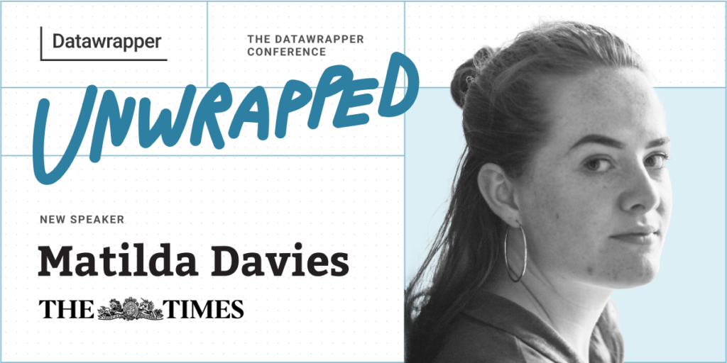
Matilda Davies, The Times, will speak about creating a Datawrapper workflow

We’re excited to announce that Matilda Davies from The Times will speak at our Unwrapped conference about “How to create a Datawrapper workflow that upskills the whole newsroom.”
Matilda is a data journalist at The Times and The Sunday Times. She specializes in creative data visualization and uses a data-led approach to dive into topics from arts and culture to politics and economics. Matilda has used Datawrapper every day for over two years and is always experimenting to find wacky new ways to visualize and help readers understand different topics. She works with a talented team of journalists and developers to create visually engaging stories and support the wider newsroom with data, graphics, and digital storytelling.
Time to ask her some questions:
Matilda, what will you talk about?
In large newsrooms, getting everyone from data novices to Excel experts to use and visualize data can be tricky. But by creating a workflow that allows journalists to use Datawrapper in the most effective way for their skill level, you can upskill colleagues, streamline processes, and demonstrate the power of data throughout the company. I’ll show you how we use Datawrapper and the API alongside other programs to get the best from our journalists.
What's your guiding principle when working on data visualizations?
Invite interactivity, but never require it. Allow readers to delve deeper but make sure they still understand what story the visualization is telling without having to interact.
What advice would you give to other Datawrapper users?
Be creative! Datawrapper offers 20 brilliant chart types, but its functionality can stretch as far as you’re willing to push it.
Anything I haven’t been able to create by fiddling with the data, different chart types, custom lines and HTML/CSS, the Datawrapper team are always on hand to help make it happen.
What's your favorite Datawrapper feature?
Custom lines on a scatter plot. It proves that data visualization is both a science and an art, and opens up the tool to endless creative possibilities – from football pitches to pianos:
We're looking forward to Matilda's talk at Unwrapped! Until then, you can find more about her on X, LinkedIn, and her The Times author page. To sign up for Unwrapped and hear Matilda and other great speakers, visit our conference website.


Comments