Radish to romanesco: A year in vegetables
February 20th, 2025
4 min
Datawrapper lets you show your data as beautiful charts, maps or tables with a few clicks. Find out more about all the available visualization types.
Our mission is to help everyone communicate with data - from newsrooms to global enterprises, non-profits or public service.
We want to enable everyone to create beautiful charts, maps, and tables. New to data visualization? Or do you have specific questions about us? You'll find all the answers here.
Data vis best practices, news, and examples
250+ articles that explain how to use Datawrapper
Answers to common questions
An exchange place for Datawrapper visualizations
Attend and watch how to use Datawrapper best
Learn about available positions on our team
Our latest small and big improvements
Build your integration with Datawrapper's API
Get in touch with us – we're happy to help
This article is brought to you by Datawrapper, a data visualization tool for creating charts, maps, and tables. Learn more.
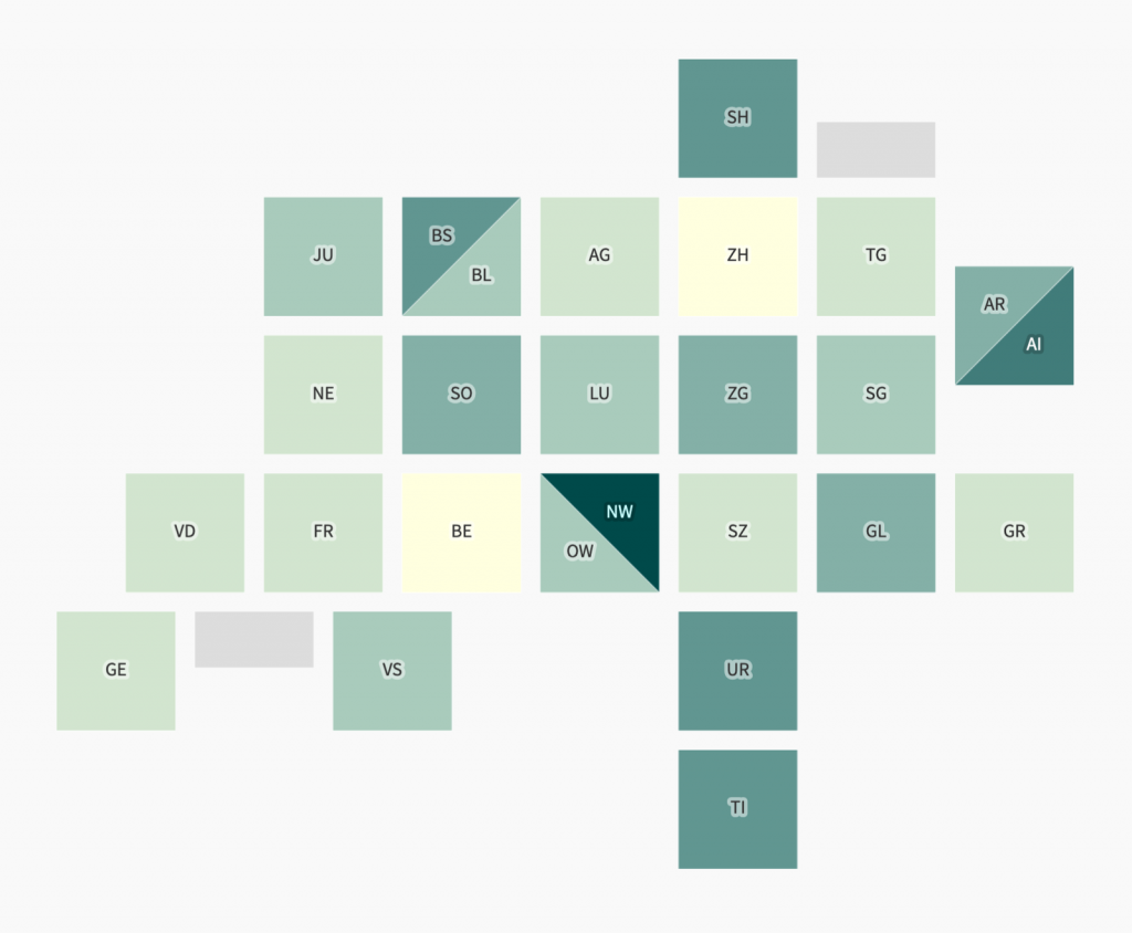
Hey, it’s Lisa again – writer here at Datawrapper. Let’s look at a map today to which the reaction of my coworker Simon Jockers was: “Wow, that’s a pretty tilemap”:
Swiss data scientist Ralph Straumann created this tilemap of Swiss cantons (the Swiss word for “states”) as a side-project in 2016 and published it through his employer EBP, an engineering and consulting company. After he added the Datawrapper-compatible Natural Earth projection to the available projections, data journalist Duc-Quang Nguyen used it for the Covid-19 dashboard of 24 Heures to show the share of people who already got a COVID vaccine in each canton.
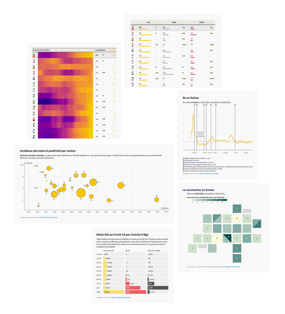
That Covid dashboard is where I found it. Yes, this article is about Ralph’s tilemap, but I simply have to point you to that dashboard. Duc-Quang and his coworkers used all kinds of Datawrapper chart types, tables, and maps to create stunning visualizations. Here’s a selection:

Now back to Ralph’s tilemap.
There are a few interesting things to note about Ralph’s map. He explains:
The tilemap was primarily intended for political visualizations, where the type of canton is often important. The halved squares are Halbkantone or “Kantone mit geteilter Standesstimme”, essentially half-states. They exist for historical reasons and are equal to “normal” cantons except in two regards: Unlike other cantons, they have only one representative (instead of two) in our small chamber of parliament (Ständerat). And their cantonal vote (Standesstimme) only counts half in popular votes (referenda, etc.) that require a majority of cantons/states (Ständemehr).
And what’s with these smaller rectangles in the bottom-left and top-right of the map?
They visualize the Lac Léman and the Bodensee, respectively, Switzerlands largest bodies of water. These rectangles are supposed to help with recognition. This idea was heavily influenced by the London tilemap by agency After The Flood.
When I asked Ralph what he kept in mind when creating that tilemap, he pointed me to an article by the AirBnB data vis engineer Krist Wongsuphasawat. Using six US tilemaps for a case study, Krist defined several quality metrics for tilemaps:
Ralph, too, “tried to preserve relative locations of cantons and make the overall shape of Switzerland recognizable.”


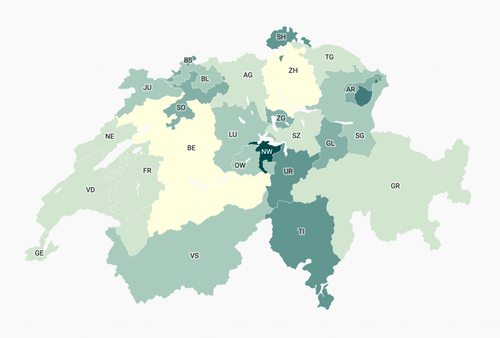
See for yourself how he made that happen – up there are both his tilemap and the same vaccination data in the “normal” map that Datawrapper offers of Switzerland cantons.
When it comes to the actual software used, Ralph explains:
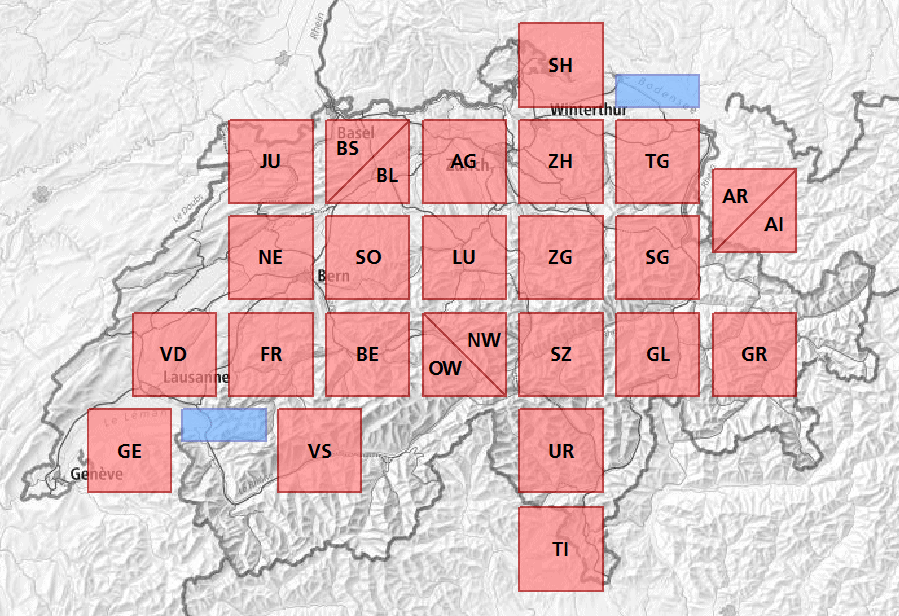
I created the tilemap manually in a GIS (ArcGIS, in my case, but QGIS would also work), using a background map. Pretty much similar to this figure:

I have yet to see an automatic approach for contiguous cartograms that I find convincing.
If you’re thinking about creating tilemaps and you’ve played around with R before, check out the R package called {geofacet}. Ralph has used it for other tilemaps he created: “That package comes with its own browser-based tilemap editor, which is quite helpful for tilemaps with not too many entities.”
To use Ralph’s tilemap in Datawrapper, create a new map and choose “Choropleth Map”, then look for “Switzerland > Cantons (square). To learn more about the tilemap itself, read Ralph’s explanation of this tilemap in German on ebp.ch. He also wrote about other approaches for cartogram creation on his blog. We’ll see you next week!
Comments