Watch the recordings of Unwrapped, our conference

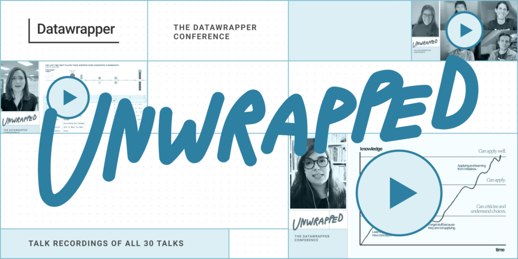
Whether you attended Unwrapped yourself and want to re-watch some of the talks or share them with a friend or colleague: Now you can. Today we uploaded all 30 talks from Unwrapped, the first Datawrapper conference that took place in March this year. You can watch them all on our YouTube channel.
Be sure to check out the full Unwrapped YouTube playlist. There’s a lot to explore, no matter if you’re using (or want to use) Datawrapper…
- in a nonprofit, a data provider, a government organization or a newsroom,
- for polling, census or live data, or
- to create one visualization, dozens, or hundreds.
As a starting point, here are some videos and topics that stood out to me:
The keynote: Amanda Cox, Bloomberg, on making better simple charts
Benefit from Amanda Cox’s experience at The New York Times and Bloomberg and watch her keynote, where she explains why to use verbs in headlines, how to find the balance between too few and too many words on a chart – and why you should eat your cereals:
You can show all the data. The question here is: Do you need to? […] That’s the thing I type most now in my work Slack: […] One good chart is better than seven okay charts.
Amanda Cox
If you find this one interesting, you may also like:
- Muna Alebri, UCL, on right-to-left data visualizations. Muna discusses the challenges of right-to-left data visualizations and what we can do to support them more.
- Ana Bertol, Odd Studio, on helping scientists make their data speak with Datawrapper. Ana talks about her endeavors to teach scientists better data visualizations and what she learned in the process.
- Rose Mintzer-Sweeney, Datawrapper, on three years of trends in news visualizations. Rose shares what she discovered about trends in data visualization while collecting them weekly for our Data Vis Dispatch.
Patrick Stotz, Der Spiegel, on their 7 most satisfying Datawrapper workarounds
Patrick Stotz shows the creative ways in which he and his team approach Datawrapper charts – e.g., by adding the color legend as an image in a chart, faking a chart zoom effect, or stacking visualizations:
And I thought: “How did they do that?” And what they did is, they turned the custom choropleth map into a choropleth map with 3D effect. I think that’s insane. But it worked.
Patrick Stotz
If you find this one interesting, you may also like:
- Julius Tröger, ZEIT Online, on how they ditched D3 and mostly use Datawrapper. Julius shows how he and his team make scrollytelling, switches, and small multiple charts work for all Datawrapper visualizations.
- C.J. Sinner, Star Tribune, on making four unique Datawrapper scatterplots. C.J. explains how she created a timeline, calendar view, beeswarm chart, lollipop chart, and a unit chart with Datawrapper scatterplots.
- Kiko Llaneras, El País, on customizing Datawrapper charts with R. Kiko shows how he builds (small multiple) histograms, column charts with confidence intervals, treemaps, and more in Datawrapper via R.
- Ben Kates, Urban Institute, on creating extended Datawrapper tooltips with Svelte. Ben demos how he created tooltips that (literally!) go beyond Datawrapper visualizations.
- Philipp David Pries, Ippen.Media, on his favorite tricks for Datawrapper locator maps. Philipp shows how to bring 2,000 points into locator maps, create mini charts in them, and more.
Julia Wolfe, Reuters, on bringing Datawrapper into an organization
Julia Wolfe shares tips on bringing Datawrapper into small and big newsrooms – e.g., using a project management system or investing in acolytes. It’s worth a watch even if you’re not working in the news media:
Your graphics team is magic. They have skills that nobody else has: They can code, they can draw, they can map, they can write, they can report, they can do 18 different things. Do not have them spending their time making bar charts.
Julia Wolfe, Reuters
If you find this one interesting, you may also like:
- Matilda Davies, The Times, on a Datawrapper workflow that upskills the whole newsroom. Matilda explains how she got more of her colleagues excited about creating visualizations using a “four levels of knowledge” mental model.
- Victòria Oliveres, elDiario.es, on using Datawrapper in a newsroom. Victòria shares how she and her team streamlined data visualization requests from colleagues to free up time for more of their own projects.
- Philip Holm, Associated Press, on syncing your brand to Datawrapper with custom themes. Phil shows how they created not just one but multiple custom design themes – and why.
Bonus talk: Elana Levin Schtulberg, Datawrapper, on how we decide which features to add
Many Unwrapped speakers shared how they get the most out of Datawrapper. Our co-CEO and head of data visualization Elana shows the other side and explains how we bring the most into Datawrapper (without overwhelming beginners!). If you’ve ever wondered how we prioritize and develop features, this is for you:
This toggle? Maybe it’s exactly what you need in 1 percent of the situations. But in the other 99%, it’s just an extra thing that makes it harder to understand the user interface […] and, in the worst case, opens up a possibility for creating worse charts.
Elana Levin Schtulberg
You can still find the full recordings of all three conference days online (1, 2, 3). We recommend watching the individual talks, though, because they come with improved audio, proper transcriptions (turn on the subtitles or read on in the transcript!), cut-out technical hiccups, and chapters that serve as an overview of what to expect in each video. The Unwrapped playlist on YouTube has all the talks in the same order as the live conference.
If you like a video, give it a thumbs up or leave a comment – the speakers (and we) will appreciate it.
Liked this article? Maybe your friends will too:
NEWSLETTER
Sign up to our newsletters to get notified about everything new on our blog.


Comments