

The world could be your oyster, but it depends on your passport
October 10th, 2024
4 min
This article is brought to you by Datawrapper, a data visualization tool for creating charts, maps, and tables. Learn more.
Marimekko charts, explained
Data about population, urbanism, cities: I can’t get enough of it. Last week we saw that people move away from rural areas into the cities in Europe, and four weeks ago we looked at how fast exactly cities grow around the globe. Today, let’s compare numbers on the national level: How many people in a country live in rural areas? How many people live in cities? And of that share – how many people live in the capital?
Before looking at this chart, we might assume that the bigger a country’s population, the smaller the share that lives in its capital. And indeed: Iceland is a small country, and more than 50% of its citizens live in the capital. And China is huge, and a tiny share of its population live in Bejing. Then again, Argentina’s population is greater than Australia’s, but 35% of Argentinians live in Buenos Aires and almost nobody lives in Canberra.
But unfortunately, that’s something we can’t see in this chart. It shows us the relative numbers, but we have not even the slightest idea about the absolute number of people who live in these countries and cities.
If only there was a chart type that solved this problem. Oh wait, there is! The Marimekko Chart. It’s one of those rare chart types that looks simple & accessible, but contains a lot of information. One can read a lot of different information out of it. Which information? Let’s untangle that with our capital data:
In a Marimekko chart, the height of each bar represents an absolute number – in our case, the population of a country. And since each bar has the same width, the area of each bar represents the full population of a country, too. The area of the “Russia bar” tells us that 143m people live in Russia. The area of the “Argentina bar” is approximately a third the size of the “Russia bar”. So we learn that Russia’s population is three times bigger than Argentina’s one:

That’s where it gets interesting: Since the full area of a bar represents the number of people in a country, a share of the bar will represent the number of people falling into this category. It’s genius! We can look at the chart and learn that in Argentina, a bigger share of people lives in the capital than in Japan. But we can also learn that in absolute numbers, there are more people living in the Japanese capital than in the Argentinian one. (To do so, we compare the size of the red areas of Argentina and Japan with each other.) The Marimekko chart shows us what relative numbers mean for the absolute world. It shows us both.
So Marimekko charts are awesome and we should use them every time we show shares with a stacked bar or column chart? Well, it depends. It’s hard to compare the height of bars with each other (what’s bigger: the population of Russia or Japan?). It’s also hard to compare the size of areas (what’s bigger: the number of people living in Buenos Aires or in Moscow?). So Marimekko charts make sense if the height of the bars should give readers some context, but is not the main story. If we want readers to compare sizes of capitals with each other, the Marimekko chart up there would not be our first choice.
Another deficit: The height of bars can’t be massively different in a Marimekko chart. Here are Iceland and Japan:
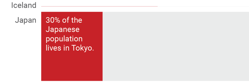
The contrast between the population of these two countries is too high to display Iceland well – our original chart at the top of this article makes that easier. And imagine three tiny countries (followed by far bigger ones): Labelling the small ones would be a pain.
Like every chart type, Marimekko charts have their limits. Which is too bad, because it means I can’t use them all the time. I will see you next week! With another chart type. I promise.


Comments