This article is brought to you by Datawrapper, a data visualization tool for creating charts, maps, and tables. Learn more.
Different units, different patterns
The importance of detail levels, explained

In the last few days, I thought a lot about choropleth maps: these maps where regions are filled with colors that represent a certain value, like unemployment, life expectancy, votes for a certain party. On Tuesday, I published an article explaining what to consider when creating choropleth maps. Today, nothing makes more sense than to create one for this week’s Weekly Chart:
Yes, it’s true: I copied this map. If you’ve read my “What to consider” article, you noticed it right at the bottom of the map, where I give good examples of choropleth maps. The original map is by the super talented peeps at Berliner Morgenpost, a local newspaper here in Berlin, a few kilometers away from the Datawrapper office. They showed the average annual population growth in all European municipalities, which is a crazy high level of detail! Datawrapper doesn’t offer a municipalities map of Europe, so I decided to show the data in the so-called NUTS-3 regions; still a pretty small unit.
Different patterns become visible depending on the unit you choose, and the differences are fascinating. For comparison, here are five maps that show the same data with the same color palette[1] but with a decreasing level of detail. We start with the map by the Berliner Morgenpost; the other four maps I created with Datawrapper:
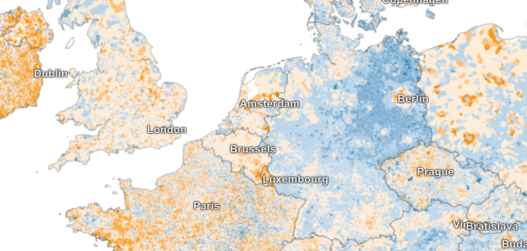
Municipalities: In Germany and Poland, cities are the lone orange wolfs. France and UK seem like a mixed bag.
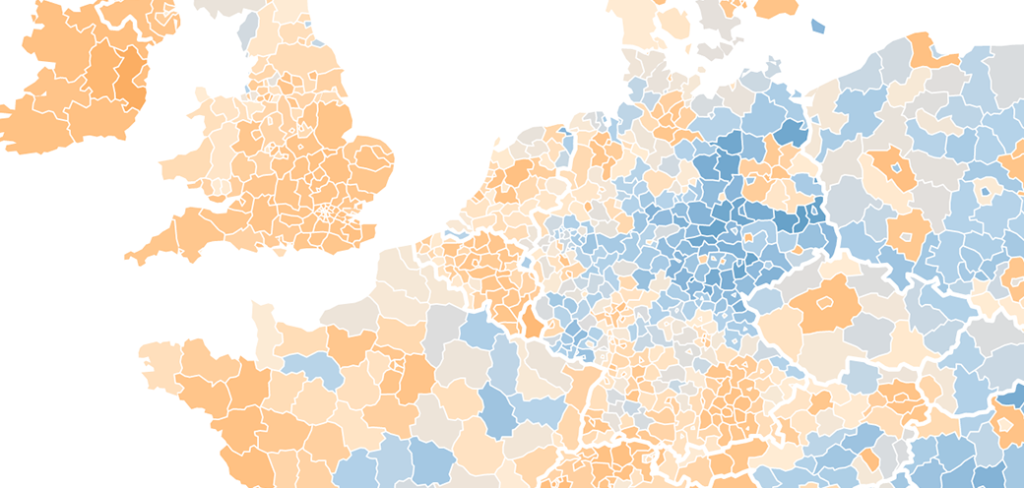
NUTS-3: The Berlin area that grows in population seems far bigger now. In Poland, we can still see metropolitan areas thanks to nicely drawn region borders. France is still a mixed bag, but the UK shows a clear growth now.

NUTS-2: Berlin is a lone wolf again, with an averaged-out state around it. In Poland, the cities disappear and get averaged with bigger regions. France seems to get more and more orange.
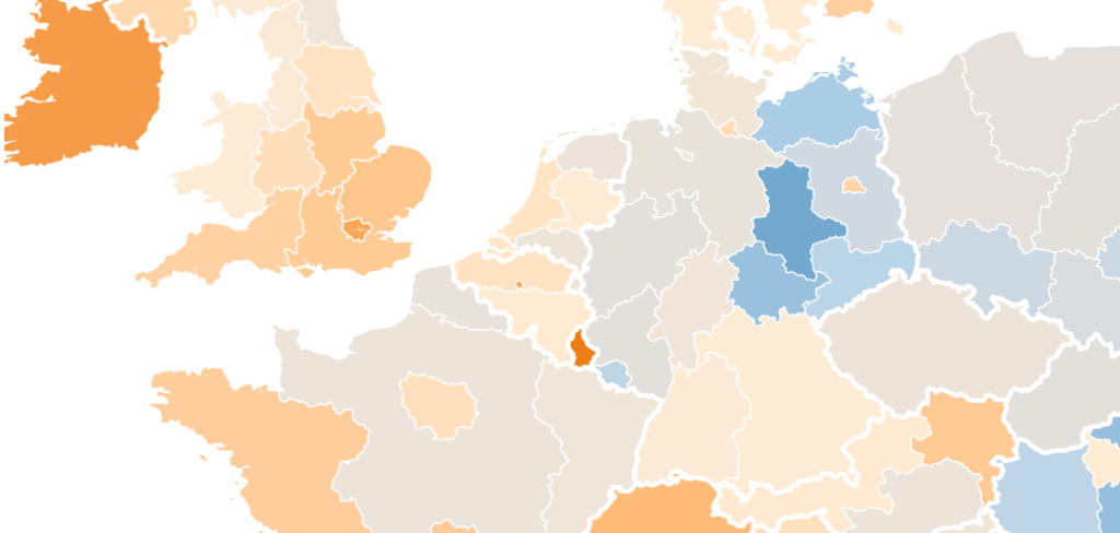
NUTS-1: Almost all regions get more washed out. Only regions in which sub-areas have the same kind of extreme increase or decrease in population stand out, e.g. Ireland, Luxembourg or center Germany.
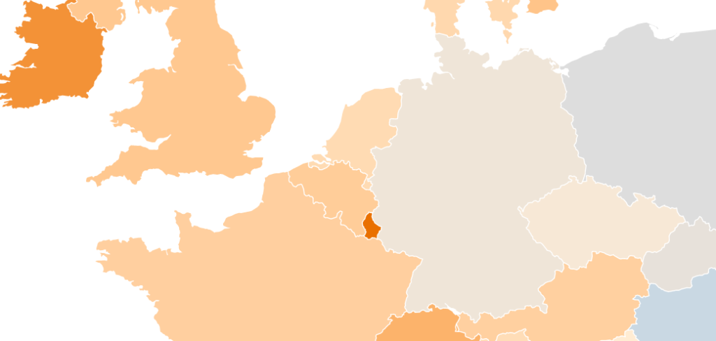
Countries: Aaand all the nuance is gone. Only Ireland and Luxembourg stand out. However, it’s the only map that shows us if a country population has increased or decreased in the last two decades.
Most of the time, we can’t choose: We only get the data in one specific unit. But if we can choose, we should be aware that the level of detail can have a big impact on the statement we want to make. And we should remind ourselves regularly: There’s always more nuance in reality than a map or chart can show us.
If you’re not aware of their work, make sure to check out the Interactive team and their portfolio at the Berliner Morgenpost. I see you again next week!
-
At least the colors are the same. However, the range of values becomes wider the smaller we choose our unit: The country map has a range of a population growth between -13% and +18%. In the interactive map with the NUTS-3 level up there, the range is between -36% and +43%. That means that our darkest color (reserved for our extreme values) will be used in different areas, depending on the unit. It also means that even if we choose “Quartiles” stops for each map, different values and a different number of values will fall in between the stops.↩︎


Comments