Radish to romanesco: A year in vegetables
February 20th, 2025
4 min
Datawrapper lets you show your data as beautiful charts, maps or tables with a few clicks. Find out more about all the available visualization types.
Our mission is to help everyone communicate with data - from newsrooms to global enterprises, non-profits or public service.
We want to enable everyone to create beautiful charts, maps, and tables. New to data visualization? Or do you have specific questions about us? You'll find all the answers here.
Data vis best practices, news, and examples
250+ articles that explain how to use Datawrapper
Answers to common questions
An exchange place for Datawrapper visualizations
Attend and watch how to use Datawrapper best
Learn about available positions on our team
Our latest small and big improvements
Build your integration with Datawrapper's API
Get in touch with us – we're happy to help
This article is brought to you by Datawrapper, a data visualization tool for creating charts, maps, and tables. Learn more.
Hi everyone! 🙋🏻♀️ Elana here. This week Lisa’s off in Mongolia giving a data visualization training, and asked me to stand in for her, so in her honour I’ve prepared something inspired by one of her Datawrapper training wisdoms.
Lisa once mentioned that she often advises her students that “the scatter plot is like the Photoshop of Datawrapper”.
That stuck with me. Because she’s right, it really is such a flexible and powerful chart type that with a little creativity and patience, it’s basically a canvas that you can turn into just about anything.
Readers might recall this crafty range plot that was secretly a scatterplot, this World Cup dotplot, Lisa’s trigonometric art or her recent recreation of the periodic table.
Well, I decided to take this one step further away from dataviz. After all – what is Photoshop if not a way to define the specific position of colored points in two dimensional space? And isn’t that kind of what a scatterplot is too?
How hard would it be to paint a picture using our scatterplots, I wondered to myself.
Well, by digging around in my toolkit not that hard as it turns out. So how did I do this? If you’re interested, read on. If you just want to play with the final result, hover over the chart and click Edit this chart.
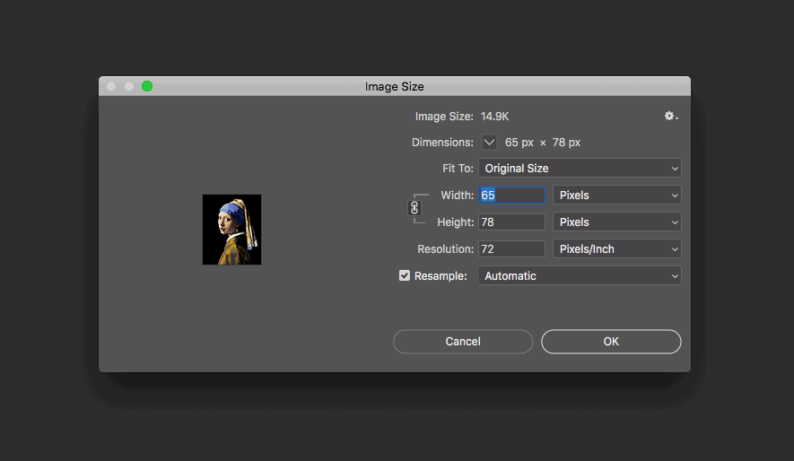
First I had to find an image, then I opened it in Photoshop and reduced the size to 65px x 78px

Then I used Photoshop’s posterize to reduce the number of colors.
I used Processing to write a little script to go through all of the 5078 pixels of the reduced image, extracting the rgb color values and coordinates of each pixel, feeding this data into a csv file.
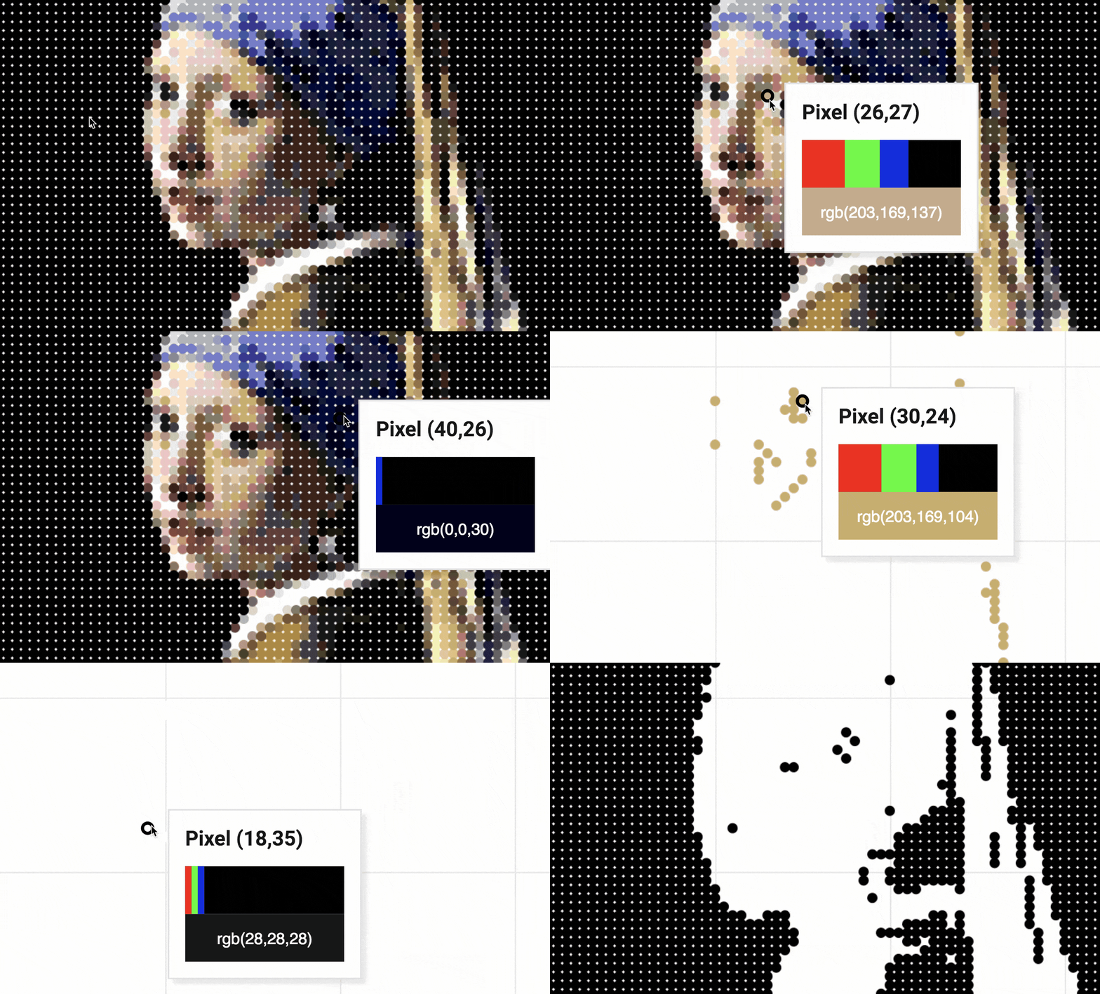
I then imported my csv file into Datawrapper. And out popped… a big blue square.
Not quite what I was after! I still had to customize the colors. I could have done this by hand, but with 133 different color groups, I decided to use Datawrapper’s API instead.

A little further adjustment of my axes, and then I was pretty much done. But I wasn’t quite satisfied. What about the tooltip? Well, I decided to get a little creative there too, and with a bit of CSS, I was able to visualize the percentages of red, green and blue for each pixel directly within the tooltip.

And that’s it! Hover over the chart and click Edit this chart if you want play with the final result directly in Datawrapper.
Hope you guys enjoyed this not so charty weekly chart! Stay tuned for next week when Lisa will be back, with possibly fewer Baroque paintings, and a little bit more data!
Comments