

The world could be your oyster, but it depends on your passport
October 10th, 2024
4 min
This article is brought to you by Datawrapper, a data visualization tool for creating charts, maps, and tables. Learn more.
This is Lisa, responsible for the blog and general communication at Datawrapper. For this Weekly Chart, let’s talk tooltips.
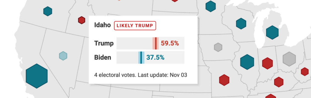
A few weeks before the U.S. election (remember that election? That was quite something), I prepared a few maps for an article on our blog called “How to visualize polls & results of the U.S. elections with Datawrapper”. One of these maps shows the following when you hover over it:
This tooltip was fun to work on. It’s the younger brother of a tooltip I created for my last Weekly Chart Map in August:
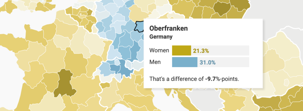
I created both tooltips with HTML tags: Basically <div>’s with a certain width, stacked next to each other:
<div style="width:{{ 1.3*women }}px; background-color:#BFA817; ..."></div>
<div style="width:{{ 130-(1.3*women) }}px; background-color:#F2F2F2; ..."></div>(You can learn more about how to create these bar charts tooltips in an Academy article I wrote about them.)
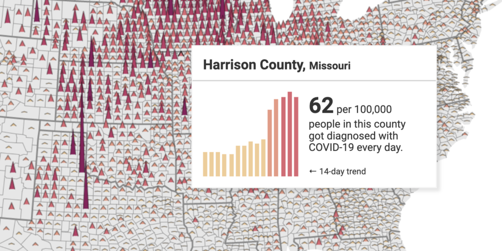
But bar charts are easy. “What about column charts?” I asked myself, “and what about extra tricky column charts that show vastly different heights in different regions?” So I got to it. Here they are:
But first, a few words about this map. It shows the same data as this New York Times map. (Thanks, New York Times, for opening up your data!) And it’s a crazy map. It looks like hundreds and thousands of people got COVID in the middle of the U.S., and barely anybody at the coasts – while that’s not necessarily true, as Los Angeles demonstrates. The New York Times tries to compensate for this dilemma by shading out the “parts of counties with population density lower than 10 people per square mile”. But that’s only halfway successful.
I don’t have a solution for this, either. I’m just saying: Take this map with a spoon of salt.
Alright, back to our column chart friends. For the rest of this article, I’ll explain how I created them.
After some trial and error, I decided to go with Flexbox, which a way of layouting with CSS.
To tell our column-<div>’s to use Flexbox, we wrap them in another <div> and give it the attribute: display: flex:
<div style="height:80px; width:100%; display:flex; align-items:flex-end; justify-content:space-between">
	<div></div> // 1st column
	<div></div> // 2nd column
</div>
align-items:flex-end makes our columns align at the bottom, not at the top. And width:100% and justify-content:space-between are good ways to make sure our tooltips are responsive – meaning, also nice-looking on mobile devices.
Now we can style the columm-<div>s themselves. Here’s one of them:
<div style="height:{{100/MAX(t,t1,t2,t3,t4,t5,t6,t7,t8,t9,t10,t11,t12,t13,t14)*t14}}%; background-color: {{ t14 <= 30 ? '#ECCC9B' : t14 <= 60 ? '#e09c87' : t14 <= 120 ? '#CF6C74' : t14 <= 240 ? '#AF4364' : '#81245A' }}; width:4px;"></div>Let’s start with the height: t, t1, t2, etc. are columns I uploaded, one for each of the last 14 days. As I mentioned, they are different for each county – some counties report 1-8 cases, some 1000-2000. So we can’t define them in pixels.
That’s why, instead, we’re telling this <div> – which is responsible for creating our t14 column – that it should be as tall as a share of the biggest value among all columns in this county. If the biggest value is 800 and our t14 value is 100, then 100/MAX(t,t1,t2, ...)*t14 would result in a column that’s 12.5% tall.
Nice! Relative values are good; we want them. Each tooltip now shows a trend for the last 14 days that’s readable no matter the dimension of the data. Thank’s to the relative values, we can also resize the whole column chart just by changing the height and width in the parent <div> we defined above. Very convenient.
The rest of the column <div> is busy with the styling. With this nested if/else statement…
background-color: {{ t14 <= 30 ? '#ECCC9B' : t14 <= 60 ? '#e09c87' : t14 <= 120 ? '#CF6C74' : t14 <= 240 ? '#AF4364' : '#81245A' }};…we define the column color. And width:4px; is, well, the width of the column.
And that’s it. As always, feel free to copy (and improve!) this approach. Hover over the map above and click on “Edit this chart” in the top right to get right into the Datawrapper app. You’ll find the tooltips in the Annotate tab.
“But Lisa, there’s a far easier approach!” you might think. If so, do let me know in the comments! We’ll see you next week.


Comments