This article is brought to you by Datawrapper, a data visualization tool for creating charts, maps, and tables. Learn more.
‘This is so good you wouldn’t know it was done by a woman.’
It’s hard to be an artist. It’s even harder to be a female artist. The title of this post is a quote from 20th-century-painter Hans Hofmann and was a meant to be a “compliment” to the abstract expressionist painter Lee Krasner.
The Tate is the United Kingdom’s collection of Britsh art and consists of more than 66,000 artworks. 2,700 of these artworks were created by women. The Tate acquired two of Hans Hofman’s artworks. And only one by Lee Krasner.
4% of the artworks in the Tate collection were created by women[1] and 1% by artists with unknown gender (that’s almost always “The British School”).
A documentation of all of the pieces that the Tate acquired since its beginning in 1823 and up until the year 2013 can be found in this neat CSV for your pleasure. I analysed this data in R, and documented the process in this R Markdown on Github.
Chart Choices
Two days ago, I published an article about which colors one should use for gender data, so this week’s Weekly Chart can’t not be about color.
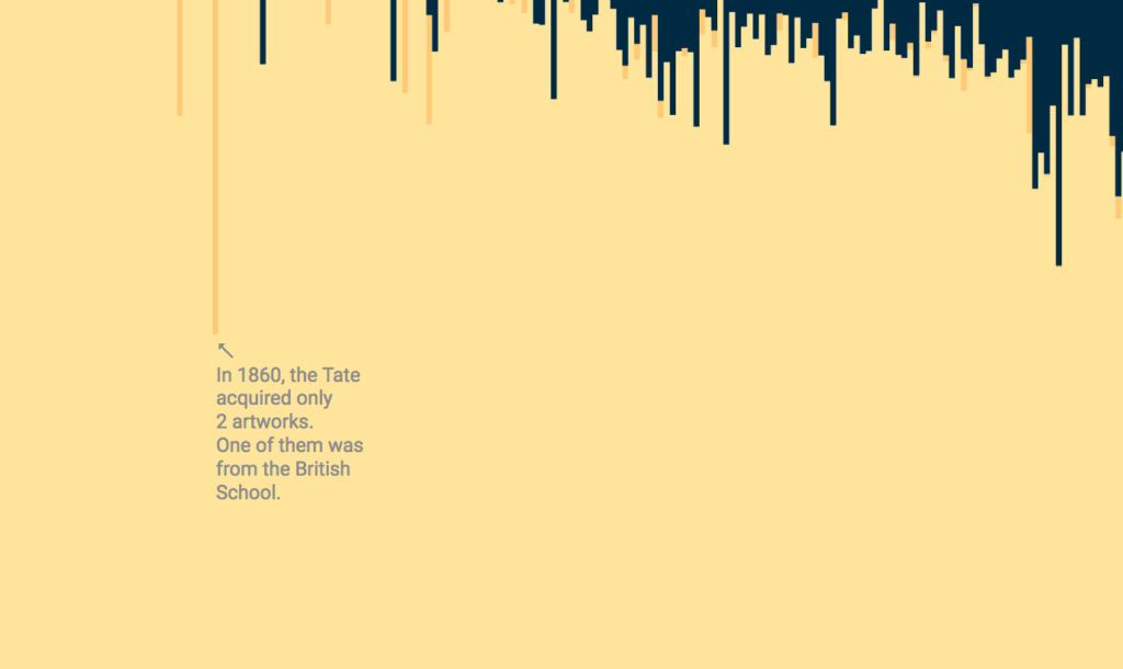
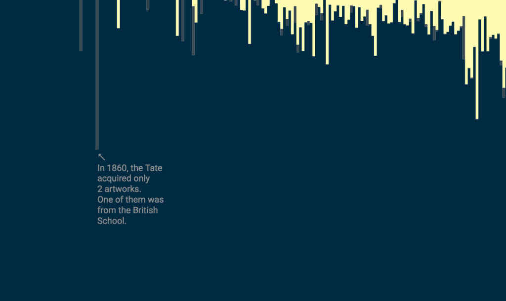
Colors are powerful. As the chart designer, I can decide if I want to let the share of women’s artworks appear bigger than it is. If I wanted to show this share optimistically, as a proud intruder into a men’s world: “It’s getting better!”. To create this effect, I would chose a darker colour for the share of women’s artwork than the share of men’s. Like I did here in the example on the left:
Or I can focus on the bleakness of the situation: 4% is a share that’s way, way, way too small. A massive dominance of male art; female artists as an afterthought. If I reverse the colors like I did in the example on the right, the big dark blue area dominates the image. The light yellow stripes seem small and pitiful in contrast.
In the end, I decided to use the dark, intimidating murky blue for the share of male art – but to counter it with a self-confident bright green for the female art. Maybe I tried to achieve too much with this color combination? Let me know what you think! How would you color this chart?
Like always, an option to “Edit this chart” will appear in the top-right corner when you hover over this chart. Click on it to try your own color combinations!
More than half of the artworks in the Tate collection were created by one single artist: Five years after his death, in 1856, the Tate got into the possession of J. M. W. Turner’s almost 40,000 artworks. If we exclude Turner’s works, 9% of the acquired Tate artworks are created by women.↩︎


Comments