This article is brought to you by Datawrapper, a data visualization tool for creating charts, maps, and tables. Learn more.
An alternative to pink & blue: Colors for gender data

A few weeks ago, I wrote an article on what to consider when choosing colors for data vis on the Datawrapper blog. In it, I noted that one should avoid the stereotypical blue for men and pink for women when visualizing gender data. John Burn-Murdoch from the Financial Times responded with a tweet, showing which newsrooms used which colors in their reporting of the UK gender pay gap data.
This article is an extension of that tweet. I’ll start off with some examples of news graphics where pink & blue were used as well as examples where they weren’t – explaining along the way why the classic pink & blue combo is an unawesome choice. Afterwards, we’ll look at two ways of moving away from this color combination in visualizing gender data. Let’s start with the bad news:
1 Pink & blue are not dead
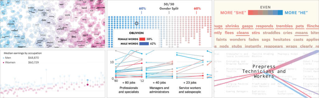
The era of pink & blue isn’t over. Surprisingly many big projects in the last four years used these colors to convey information about men and women, e.g. the New York Times, Bloomberg and the Wall Street Journal. Two The Pudding projects from 2017 that looked at gender in movies used red and blue – a third project in 2017, “Gender Representation of Comic Book Characters”, used dark blue for men and gold for women.
Why? Well, there’s an argument to be made for using pink & blue: Readers will be able to decipher charts with these stereotypical colors faster. It’s not even necessary to explain the colors first. Financial Times’ Alan Smith wrote about this in FT’s column ‘Chart Doctor’: After creating a chart about baby names in pink & blue, …
“… I justified it because the strong cultural association of the colors meant I did not need to put a separate legend on the chart. This, in turn, meant my graphic would be ‘cleaner’, something to which all designers aspire.”
Alan Smith
So what’s the problem with pink & blue? In our western culture, these colors come with the whole gender stereotype baggage. Pink means weak, shy girls who play with dolls and don’t deserve as much as boys. Blue stands for boys who need to be strong & rough. When we create a chart with pink & blue, we endorse gender stereotypes.[1] Especially when we chart gender (pay) gaps, that’s often the opposite of what we want to achieve.
2 Many newsrooms stay away from pink & blue
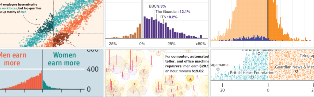
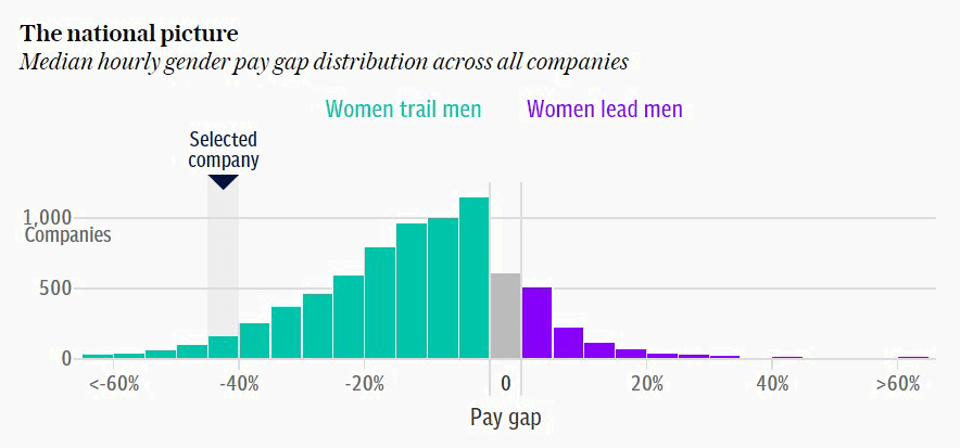
Here’s the good news: While some still use it, pink & blue isn’t the norm anymore, at least not in big news organizations. When the gender pay gap data came out in the UK this year, graphics reporters used a very diverse color palette. I had assumed they would still use blue for men and just a rather warm color for women. But I was surprised: The Economist, Guardian, Telegraph, Washington Post, and others used a cooler color for women than for men. Respect! You can’t go further away from the norm. Here are some examples (not exclusively from this year’s gender pay gap data).
3 There’s no consistency within newsrooms
I love the diversity of colors for gender data across newsrooms. But there is this mantra in Data Vis: In an article, the same colors should represent the same things. If your first chart uses a blue color to show data about men, that same blue shouldn’t show data about women in the second chart. Maybe this should be true even across all visualisations of the same publication?
Apparently, graphics reporters don’t see the need for this. When we look at the colors that designers use within the same newsroom to show gender data, we don’t find much consistency. The colors for gender data are decided for each article individually. The following example shows chart colors by Bloomberg – but I could have chosen any other newsroom, the New York Times, Guardian, ZEIT Online, etc.
But even in a newsroom with normally consistent colors, the assignment to the sexes is unclear. The main colors used in all Quartz charts are pink & blue, so I was wondering which colors they used to show gender data. Turns out: They wonder that themselves. Almost all chart authors at Quartz have agreed on that the pink & blue should be used, but they haven’t quite decided which color should represent which gender:
I’m afraid that this is dangerous. Charts that flip the stereotypical colors can be hard to read: If readers see pink & blue in a chart about sexes, they won’t be very likely to consult the legend.

Showing pink for men and blue for women for gender gap charts can quickly backfire: Instead of challenging stereotypes, they can lead to intuitive interpretations of “Oh, the situation for women is actually better than for men”. That’s especially true if readers are used to the same newsroom showing stereotypical colors “the right way round”.
4 How to choose colors: The Telegraph case
Out of curiosity as to how The Telegraph decided on their purple for women and green for men , I asked Fraser Lyness, Director of Graphic Journalism at The Telegraph. His answer impressed me:
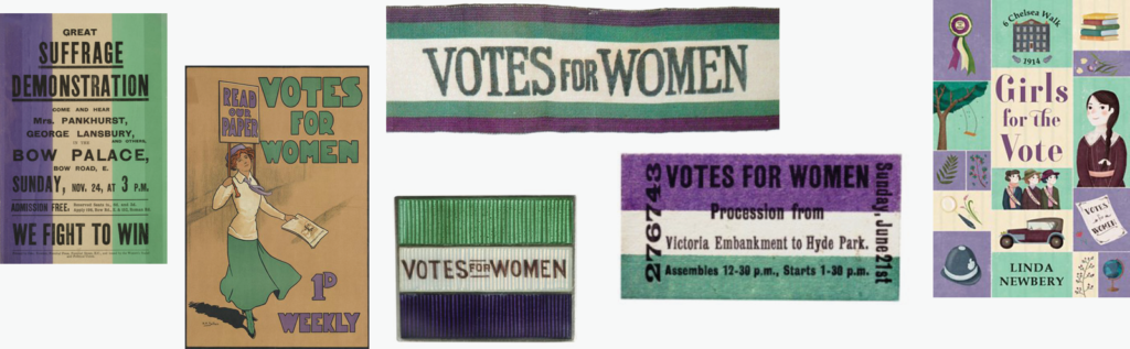
The colors are inspired by the “Votes for Women” campaign in the UK as part of the initial suffrage movement in the early 20th century. At the heart of this movement were “Sylvia Pankhurst and
Emmeline Pethick-Lawrence and essentially the colors were their choice (apparently symbolizing; purple for freedom and dignity, white for purity, green for hope).”
Fraser and his team brought these colors into their charts on the gender gap, making a subtle but unmistakable statement about gender equality.
In the final graphics (for example here (Paywall) or in this scrollytelling article “Born equal. Treated unequally”), women are represented with the purple and men with green. But how was this decision made?
“When deciding which gender aligned with which color, it was more a case of trying to prioritize women in the order of genders. Against white, purple registers with far greater contrast and so should attract more attention when putting alongside the green, not by much but just enough to tip the scales. In a lot of the visualisations men largely outnumber women, so it was a fairly simple method of bringing them back into focus.”
Fraser Lyness
One can see this effect very well in graphics like this one:

Doing research pays off. Fraser was not only able to decide on two beautiful colors but was also able to communicate a reason for this decision: “Having a reference to the suffrage movement helped seal the deal”, he told me.
And did co-workers complain that the faster readable colors pink & blue were not used? Apparently not:
“Essentially no one objected to the idea that genders couldn’t be easily identified by not using commonly referred to combinations like pink & blue. If anything they felt it would harm the message they were hoping to convey.”
Fraser Lyness
5 Rebranding pink & blue
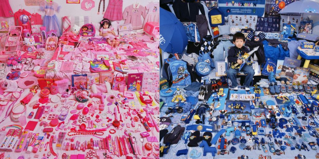
Moving away from pink & blue for gender data is an endeavor from two sides: On the one side, gender data should be communicated with other colors. On the other side, the combination of pink & blue also needs to change its image. I’m happy to see data vis that attempts that. The first three of the following data visualizations all won a Kantar Information is Beautiful Awards 2017 (and the last one is by John Burn-Murdoch, who doesn’t need an Information is Beautiful Award). All of them reinterpret pink & blue. None of them show gender data:

I’m glad to see many newsrooms are moving away from pink & blue. Thanks to everyone who reconsiders their colors before hitting “publish”! Thanks to everyone who goes wild with gender colors, even if it feels a bit wrong in the beginning. You deserve a round of applause. Also, thanks to John Burn-Murdoch for the inspiration and Fraser Lyness for answering my questions about the Telegraph colors.
Edit 11/07/2018: I removed the colors for Bloomberg Quint and Bloomberg Gadfly and added two more color combinations that Bloomberg used in 2018.
Not surprisingly, especially women seem to care. Andy Kirk from visualisingdata.com asked 126 data vis designers (76 male, 50 female) in 2015 which colors they would assign to gender values. 41% of men but only 14% of women would use pink and blue. ↩︎


Comments